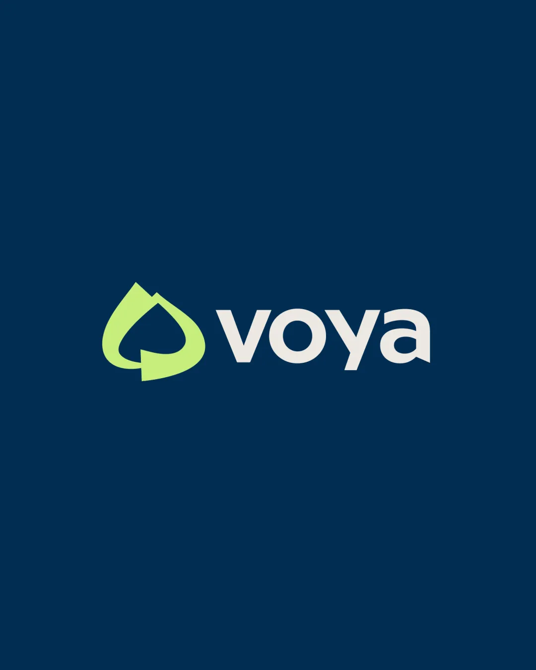
voya logo review
4.3 / 5
Logo score
Logo review of

Voya

Review the detailed scores below to see what is working and what should be refined first.

Combination Mark Modern, Geometric, Flat Financial
5/5
Legibility
3/5
Originality
5/5
Misread
4/5
Balance
4/5
Scale
Detailed review

Logo performance breakdown

5/5

Legibility

Checkmark icon The typeface is highly readable with sufficient letter spacing.
Checkmark icon High contrast between text and background enhances visibility.
3/5

Originality

Checkmark icon Abstract mark is distinctive and not overtly generic.
Checkmark icon Negative space is cleverly used to form a shape with dual interpretation (spade/leaf).

Warning icon Arrow-based recycling/loop motifs are common in the finance and sustainability sectors, reducing uniqueness.
Warning icon Does not break new ground for highly original logos.

5/5

Color harmony

Checkmark icon Limited color palette is harmonious and contemporary.
Checkmark icon Strong contrast between symbol, text, and background.

Prussian Blue
#223A55

Sulu
#A2E267

White
#FFFFFF

4/5

Balance alignment

Checkmark icon Good visual alignment between the symbol and the wordmark.
Checkmark icon Weight of the logomark closely matches the wordmark.

Warning icon Slight optical imbalance due to the larger visual mass of the green symbol compared to the lighter wordmark; symbol draws slightly more attention.

logo 200x250 pixels scalability test alignment grid overlay
4/5

Scalability

Checkmark icon Logo is bold and simple enough to scale well for most applications such as signage, printed materials, and digital use.
Checkmark icon The symbol is distinct and recognizable even at smaller sizes.

Warning icon Some thinner angled portions in the arrow may lose clarity at extremely small scales, such as embroidery or app favicons.

logo 200x250 pixels scalability test

200x250 px

logo 100x125 pixels scalability test

100×125 px

logo 50x62 pixels scalability test

50×62 px

5/5

Misinterpretations

Checkmark icon No inappropriate or unintended shapes detected.
Checkmark icon Abstract form invokes both a spade/leaf and a cyclical arrow, both positive for finance/sustainability.

4 / 5

Symbol & text fit

Checkmark icon Logo symbol and wordmark style are harmonious.
Checkmark icon Both parts maintain a consistent modern, approachable feel.

Warning icon Minor mismatch in perceived weight—symbol slightly overpowers wordmark.

Try your own review

Wondering how your logo performs?

Get a clear logo score, key risks, and priority fix ideas before your client or audience sees it.

Review my logo