 View review
Logo score
Logo review of
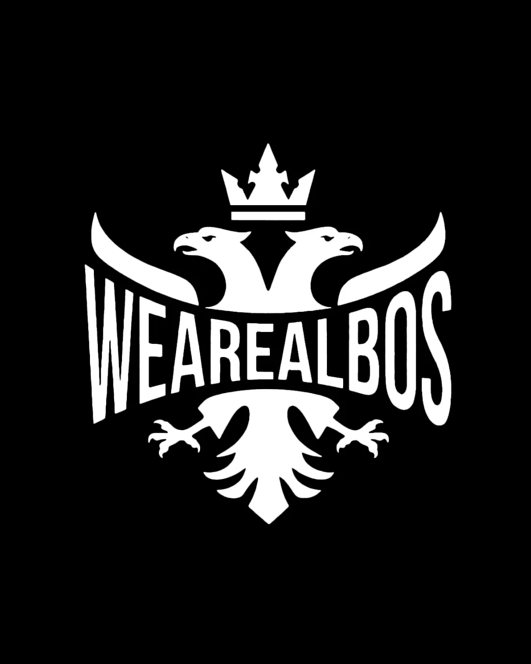
Wearealbos
Distinctive, confident emblem with strong presence—minor type and scale adjustments will elevate it to a fully professional mark.
Objective AI feedback. Your creative decision.
Legibility
Originality
Misread
Balance
Scale
Action plan
What to fix first
The most important fixes to handle before polishing the full presentation.
1
Refine type shaping for improved legibility and harmony with the eagle motif.
High priorityCurved, stretched text hampers instant word recognition and creates slight disharmony.
Impact: Ensures The Logo Is Effortless To Read At A Glance And Strengthens Overall Visuals. · Effort: Medium
2
Develop a simplified version for small-scale use.
Medium priorityCurrent detail and thin shapes may break down at small sizes.
Impact: Expands The Logo's Practical Applications While Maintaining Recognizability. · Effort: Medium
Detailed review
Logo performance breakdown
Legibility
 Wordmark is generally clear and impactful Consistent bold type commands attention
 Stretching and curvature of some letters slightly impacts quick readability
Originality
Modern spin on traditional eagle emblem; custom type adds character
Double-headed eagle is a known heraldic motif, so concept isn't entirely unique
Balance alignment
Well-centered composition; good integration of eagle, crown, and type
Letterform arcs create slight tension near the eagle's heads; wings may feel slightly disproportionate

Scalability
Solid, high-contrast design suitable for various applications
Detailed eagle and thin lines at small sizes may lose definition; may need a more simplified version for very small uses
200x250 px
100×125 px
50×62 px
Misinterpretations
No obvious negative secondary interpretations
Logo structure & brief match
Type and mark are visually locked together; concept is unified
The arc distortion slightly interrupts harmony between symbol and text
Industry/style: Bold, urban emblem suits streetwear or lifestyle brands.
Try your own review
Review my logo
Wondering how your logo performs?
Get a clear logo score, key risks, and priority fix ideas before your client or audience sees it.
Keep exploring