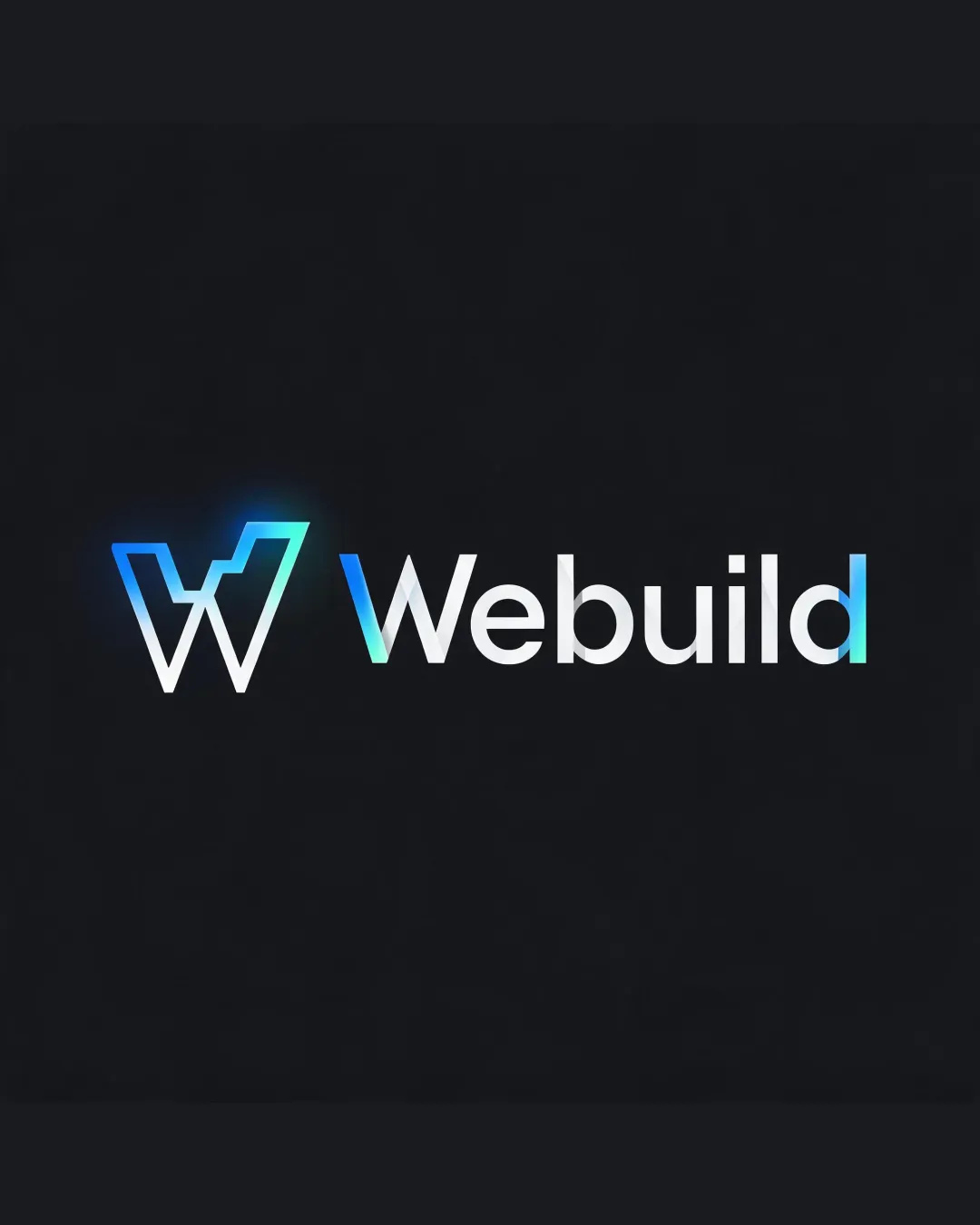
Webuild logo review
3.7 / 5
Logo score
Logo review of

Webuild

Solid execution but not yet sufficiently original for a standout tech brand.

Combination Mark Tech Minimalist, Geometric Gradient Technology
5/5
Legibility
3/5
Originality
5/5
Misread
5/5
Balance
4/5
Scale
Action plan

What to fix first

The most important fixes to handle before polishing the full presentation.

1

Increase mark distinctiveness for better originality.

High priority

The geometric 'W' form is generic and common in tech branding, risking loss of brand memorability.

Impact: High · Effort: Medium

2

Test flat/single color adaptation for print and small-scale use.

Medium priority

Gradients may not translate well to all media; ensure logo remains effective in one-color and grayscale applications.

Impact: Medium · Effort: Low

Detailed review

Logo performance breakdown

5/5

Legibility

Checkmark icon Text 'Webuild' is highly readable
Checkmark icon Well-chosen sans-serif font

3/5

Originality

Checkmark icon Cohesive, modern look

Warning icon Geometric 'W' mark is common; similar concepts widely used in tech branding

4/5

Color harmony

Checkmark icon Cool-toned gradients fit tech context and create visual interest

Warning icon Gradients may limit reproduction versatility across all media

Cyan
#00E4FF

Turquoise
#23FF82

White
#FFFFFF

Raisin Black
#181A1B

Your palette is close. Refine the color roles and combinations before updating the logo.

Build brand colors
5/5

Balance alignment

Checkmark icon Strong alignment between icon and text
Checkmark icon Consistent baseline and clear optical balance

logo 200x250 pixels scalability test alignment grid overlay
4/5

Scalability

Checkmark icon Minimalist 'W' icon holds up at small sizes
Checkmark icon Simple shapes and few details

Warning icon Subtle gradients may lose vibrancy in monochrome or print versions

logo 200x250 pixels scalability test

200x250 px

logo 100x125 pixels scalability test

100×125 px

logo 50x62 pixels scalability test

50×62 px

5/5

Misinterpretations

Checkmark icon No inappropriate shapes or unintended readings

Beta

No AI design signals found

Likely designed by a human

Construction is deliberate, with clean geometry and no obvious AI artifacts.

  • Consistent letterforms and gradients
  • Purposeful geometric alignment

Visual assessment; not definitive proof of authorship.

5 / 5

Logo structure & brief match

Checkmark icon Gradient color harmony and alignment connect icon and wordmark

Checkmark icon Detected Industry: Geometric icon, modern typography, and gradient palette strongly fit the tech/software sector.

Try your own review

Wondering how your logo performs?

Get a clear logo score, key risks, and priority fix ideas before your client or audience sees it.

Review my logo