Wondering how your logo performs? 🧐
Get professional logo reviews in seconds and catch design issues in time.
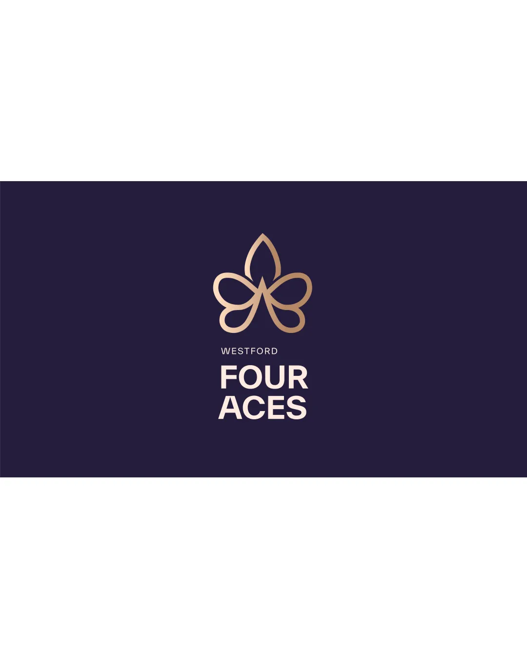
Try it Now!Logo review of WESTFORD FOUR ACES
 Logo analysis by AI
Logo type:
Style:
Detected symbol:
Negative space:
Detected text:
Business industry:
Review requested by Iamvaishnavi.patil
**If AI can recognize or misinterpret it, so can people.
Structured logo review
Legibility
![]() Text is crisp, highly readable, and clear on a dark background.
Text is crisp, highly readable, and clear on a dark background.![]() Good separation between type sizes for clear hierarchy.
Good separation between type sizes for clear hierarchy.
Scalability versatility
![]() Logo mark maintains clarity at reduced sizes due to its minimal lines.
Logo mark maintains clarity at reduced sizes due to its minimal lines.![]() Simple color palette aids versatility.
Simple color palette aids versatility.
![]() Gradient may lose impact or be difficult to reproduce in some print applications.
Gradient may lose impact or be difficult to reproduce in some print applications.![]() Fine lines in the logomark could be lost on embroidery or very small digital icons.
Fine lines in the logomark could be lost on embroidery or very small digital icons.
200x250 px
100×125 px
50×62 px
Balance alignment
![]() Mark is perfectly centered above the wordmark, achieving optical balance.
Mark is perfectly centered above the wordmark, achieving optical balance.![]() Type aligns with the mark, ensuring a cohesive structure.
Type aligns with the mark, ensuring a cohesive structure.

Originality
![]() Creatively melds a four-leaf/clover form with a stylized 'A' in the negative space.
Creatively melds a four-leaf/clover form with a stylized 'A' in the negative space.![]() Abstract mark is less generic than standard symbols.
Abstract mark is less generic than standard symbols.
![]() Clover/floral icons are somewhat common and the mark could still be mistaken for unrelated motifs.
Clover/floral icons are somewhat common and the mark could still be mistaken for unrelated motifs.
Logomark wordmark fit
![]() Curved, open style of the mark is complemented by the geometric sans-serif wordmark.
Curved, open style of the mark is complemented by the geometric sans-serif wordmark.![]() Both elements are harmonized in scale and visual style.
Both elements are harmonized in scale and visual style.
Aesthetic look
![]() Minimal lines and balanced geometry provide a premium, modern aesthetic.
Minimal lines and balanced geometry provide a premium, modern aesthetic.![]() Refined gradient in the mark adds elegance without being overbearing.
Refined gradient in the mark adds elegance without being overbearing.
Dual meaning and misinterpretations
![]() No inappropriate visual connotations detected.
No inappropriate visual connotations detected.![]() Symbol is abstract but safe.
Symbol is abstract but safe.
Color harmony
![]() Gold gradient pairs elegantly with deep blue, conveying luxury.
Gold gradient pairs elegantly with deep blue, conveying luxury.![]() Limited palette avoids distraction and supports brand recall.
Limited palette avoids distraction and supports brand recall.
Midnight Blue
#241E3B
Light Gold Gradient
#D6B286