 View review
Logo score
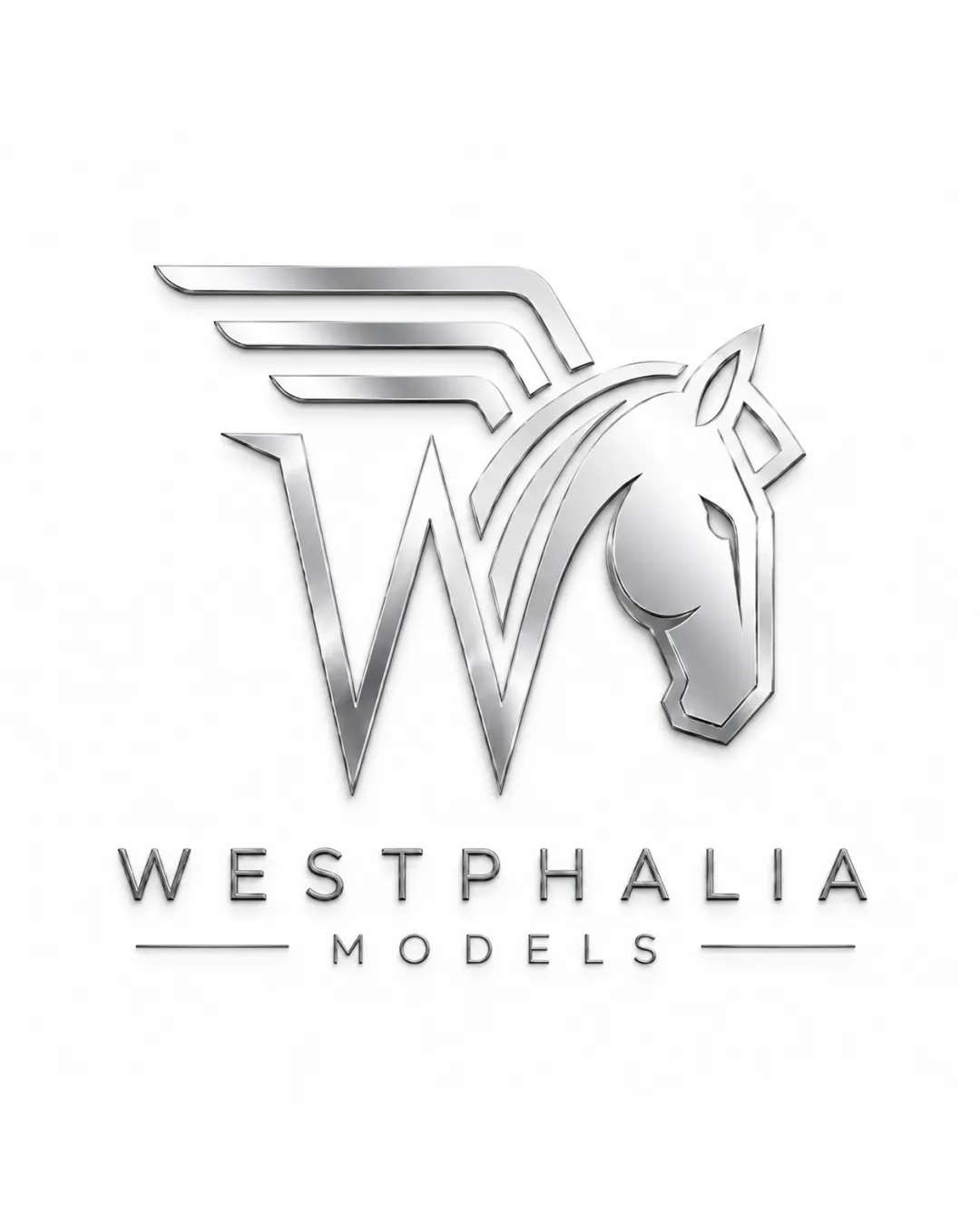
Logo review ofWestphalia Models
Review the detailed scores below to see what is working and what should be refined first.
Legibility
Originality
Misread
Balance
Scale
Detailed review
Logo performance breakdown
Legibility
![]() Text is rendered in a clean, sans-serif font with ample spacing, ensuring excellent readability.
Text is rendered in a clean, sans-serif font with ample spacing, ensuring excellent readability.![]() Hierarchy between 'WESTPHALIA' and 'MODELS' is clear due to size and weight differences.
Hierarchy between 'WESTPHALIA' and 'MODELS' is clear due to size and weight differences.
Originality
![]() Unique integration of a horse head and the 'W', which distinguishes the brand identity.
Unique integration of a horse head and the 'W', which distinguishes the brand identity.![]() Wing lines add an elegant and aspirational touch suitable for the fashion or modeling industry.
Wing lines add an elegant and aspirational touch suitable for the fashion or modeling industry.
![]() Horse imagery is fairly common in logos aiming for elegance; although well-executed, refinement could make the concept even more unique.
Horse imagery is fairly common in logos aiming for elegance; although well-executed, refinement could make the concept even more unique.
Color harmony
![]() Monochromatic palette ensures cohesion and modernity.
Monochromatic palette ensures cohesion and modernity.![]() Metallic silver gives a luxurious impression appropriate for the industry.
Metallic silver gives a luxurious impression appropriate for the industry.
![]() Heavy reliance on metallic gradients may cause problems if grayscale or single-color reproduction is needed.
Heavy reliance on metallic gradients may cause problems if grayscale or single-color reproduction is needed.
Silver
#BBBABB
White
#FFFFFF
Dark Gray
#181818
Your palette is close. Explore sharper color combinations with Colorfly.design before updating the logo.
Explore palettesBalance alignment
![]() Visual weight feels evenly distributed between the logomark and wordmark.
Visual weight feels evenly distributed between the logomark and wordmark.![]() Central alignment between symbol and text creates solid structure.
Central alignment between symbol and text creates solid structure.
![]() Top-heavy structure with wing elements might draw more attention than the rest of the composition, slightly affecting vertical balance.
Top-heavy structure with wing elements might draw more attention than the rest of the composition, slightly affecting vertical balance.

Scalability
![]() Simple, linear shapes allow moderate scalability.
Simple, linear shapes allow moderate scalability.![]() Works well for digital applications and print in larger formats such as website headers or magazine covers.
Works well for digital applications and print in larger formats such as website headers or magazine covers.
![]() Thin metallic lines may lose detail or clarity at very small sizes, especially in contexts like business cards or embroidery.
Thin metallic lines may lose detail or clarity at very small sizes, especially in contexts like business cards or embroidery.![]() Gradient and metallic effects will not reproduce well in black-and-white or single-color formats.
Gradient and metallic effects will not reproduce well in black-and-white or single-color formats.
200x250 px
100×125 px
50×62 px
Misinterpretations
![]() No inappropriate or misleading visual elements detected.
No inappropriate or misleading visual elements detected.![]() Compositional intent remains clear and professional.
Compositional intent remains clear and professional.
Symbol & text fit
![]() Styles complement each other well—both modern and sleek.
Styles complement each other well—both modern and sleek.
![]() Proportion between the wordmark and icon is harmonious.
Proportion between the wordmark and icon is harmonious.
Try your own review
Review my logo
Wondering how your logo performs?
Get a clear logo score, key risks, and priority fix ideas before your client or audience sees it.
Keep exploring


