 View review
Logo score
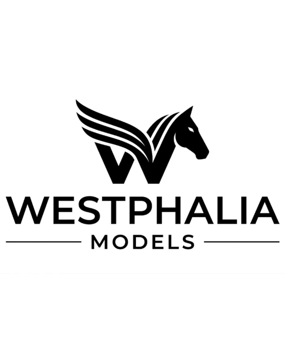
Logo review ofWestphalia Models
Review the detailed scores below to see what is working and what should be refined first.
Legibility
Originality
Misread
Balance
Scale
Detailed review
Logo performance breakdown
Legibility
![]() Clear, all-caps sans serif font enhances readability.
Clear, all-caps sans serif font enhances readability.![]() Text hierarchy is obvious with 'WESTPHALIA' dominant and 'MODELS' subtler but still readable.
Text hierarchy is obvious with 'WESTPHALIA' dominant and 'MODELS' subtler but still readable.
Originality
![]() Creative integration of the letter 'W', a horse head, and wings into a unified mark demonstrates originality.
Creative integration of the letter 'W', a horse head, and wings into a unified mark demonstrates originality.![]() Effective use of negative space shows unique thinking.
Effective use of negative space shows unique thinking.
![]() Horse and wing motifs have some precedent in luxury and heraldic branding, so this is not wholly unique to the industry.
Horse and wing motifs have some precedent in luxury and heraldic branding, so this is not wholly unique to the industry.
Color harmony
![]() Limited to black and white, ensuring maximum contrast and versatility.
Limited to black and white, ensuring maximum contrast and versatility.![]() Color simplicity aligns with luxury and premium branding.
Color simplicity aligns with luxury and premium branding.
Black
#000000
White
#FFFFFF
Balance alignment
![]() Logomark is well-centered above the wordmark, creating a stable composition.
Logomark is well-centered above the wordmark, creating a stable composition.![]() Text is aligned with the logo, and use of horizontal lines adds structural balance.
Text is aligned with the logo, and use of horizontal lines adds structural balance.
![]() Upper portion (wing and head) feels visually larger than the 'W' base, causing slight top-heaviness.
Upper portion (wing and head) feels visually larger than the 'W' base, causing slight top-heaviness.

Scalability
![]() Bold, simple logomark will scale well for most applications including social media, print, and merchandise.
Bold, simple logomark will scale well for most applications including social media, print, and merchandise.![]() Minimal details reduce risk of detail loss at small scale.
Minimal details reduce risk of detail loss at small scale.
![]() Thin lines of the wings may lose some sharpness or detail when reduced to a very small size or when embroidered.
Thin lines of the wings may lose some sharpness or detail when reduced to a very small size or when embroidered.
200x250 px
100×125 px
50×62 px
Misinterpretations
![]() No inappropriate visual connotations or overt misinterpretations observed.
No inappropriate visual connotations or overt misinterpretations observed.
Symbol & text fit
![]() Type choice harmonizes well with the modern, geometric logomark.
Type choice harmonizes well with the modern, geometric logomark.
![]() Sizing between logomark and wordmark feels appropriate and connected by visual weight.
Sizing between logomark and wordmark feels appropriate and connected by visual weight.
Try your own review
Review my logo
Wondering how your logo performs?
Get a clear logo score, key risks, and priority fix ideas before your client or audience sees it.
Keep exploring


