Wondering how your logo performs? 🧐
Get professional logo reviews in seconds and catch design issues in time.
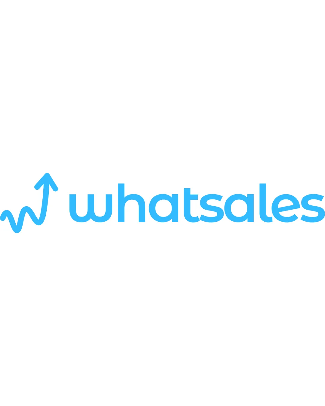
Try it Now!Logo review of whatsales
 Logo analysis by AI
Logo type:
Style:
Detected symbol:
Detected text:
Business industry:
Review requested by Shazyim
**If AI can recognize or misinterpret it, so can people.
Structured logo review
Legibility
![]() Text is clear and easy to read in all lowercase sans-serif font.
Text is clear and easy to read in all lowercase sans-serif font.![]() Good spacing between letters prevents crowding.
Good spacing between letters prevents crowding.
Scalability versatility
![]() Simple line-based graphic and clean text work on large formats like web banners, posters, or digital platforms.
Simple line-based graphic and clean text work on large formats like web banners, posters, or digital platforms.
![]() Thin lines in logomark may lose clarity at small scales such as app icons or embroidery.
Thin lines in logomark may lose clarity at small scales such as app icons or embroidery.![]() Lack of distinct iconography might reduce recognizability in standalone or favicon applications.
Lack of distinct iconography might reduce recognizability in standalone or favicon applications.
200x250 px
100×125 px
50×62 px
Balance alignment
![]() Logomark aligns well with the baseline of the wordmark.
Logomark aligns well with the baseline of the wordmark.![]() Visual weight is generally balanced between the symbol and wordmark.
Visual weight is generally balanced between the symbol and wordmark.
![]() Slight imbalance as the logomark doesn’t fully match the visual weight of the thicker letterforms, which can feel light by comparison.
Slight imbalance as the logomark doesn’t fully match the visual weight of the thicker letterforms, which can feel light by comparison.

Originality
![]() Upward arrow combined with a w-like trendline suits the theme and feels contextually relevant.
Upward arrow combined with a w-like trendline suits the theme and feels contextually relevant.
![]() Arrow/graph motif is common in tech/sales industries, making the symbol feel somewhat generic.
Arrow/graph motif is common in tech/sales industries, making the symbol feel somewhat generic.![]() No standout unique twist or negative space integration.
No standout unique twist or negative space integration.
Logomark wordmark fit
![]() The flowing line and curve of the symbol echoes the rounded sans-serif forms in the text, creating visual continuity.
The flowing line and curve of the symbol echoes the rounded sans-serif forms in the text, creating visual continuity.
![]() The thinner visual style of the logomark does not perfectly match the thickness and weight of the wordmark, which may weaken overall cohesion.
The thinner visual style of the logomark does not perfectly match the thickness and weight of the wordmark, which may weaken overall cohesion.
Aesthetic look
![]() Modern, clean, and professional with friendly rounded edges.
Modern, clean, and professional with friendly rounded edges.![]() No clutter or unnecessary decorations.
No clutter or unnecessary decorations.
![]() The logo lacks a strong memorable characteristic; feels a bit generic overall.
The logo lacks a strong memorable characteristic; feels a bit generic overall.
Dual meaning and misinterpretations
![]() No inappropriate dual meanings or accidental associations detected.
No inappropriate dual meanings or accidental associations detected.
Color harmony
![]() Consistent use of a single shade of blue, which conveys trust and professionalism.
Consistent use of a single shade of blue, which conveys trust and professionalism.![]() Color contrast with white background is very strong.
Color contrast with white background is very strong.
SkyBlue
#43C6FF
White
#FFFFFF