Wondering how your logo performs? 🧐
Get professional logo reviews in seconds and catch design issues in time.
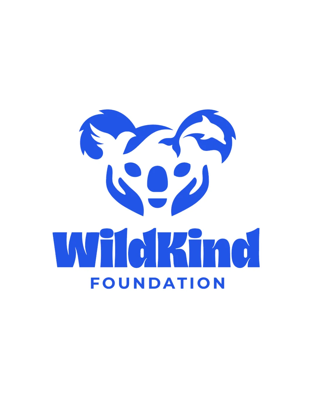
Try it Now!Logo review of WildKind FOUNDATION
 Logo analysis by AI
Logo type:
Style:
Detected symbol:
Negative space:
Detected text:
Business industry:
Review requested by Graphstorm
**If AI can recognize or misinterpret it, so can people.
Structured logo review
Legibility
![]() Text is bold, clear, and easily readable at multiple sizes
Text is bold, clear, and easily readable at multiple sizes![]() Good color contrast between text and background
Good color contrast between text and background
Scalability versatility
![]() Simple blue-and-white palette supports use across print and digital
Simple blue-and-white palette supports use across print and digital![]() Distinct shapes ensure recognizability in various sizes
Distinct shapes ensure recognizability in various sizes
![]() Fine details in the animal shapes within the koala’s ears may lose clarity at very small sizes or on embroidery
Fine details in the animal shapes within the koala’s ears may lose clarity at very small sizes or on embroidery![]() Multiple elements in the mark may not translate well to small favicons
Multiple elements in the mark may not translate well to small favicons
200x250 px
100×125 px
50×62 px
Balance alignment
![]() Symmetrical koala face creates a balanced visual center above the wordmark
Symmetrical koala face creates a balanced visual center above the wordmark![]() Text sits well-proportioned beneath the stylized icon
Text sits well-proportioned beneath the stylized icon
![]() The stylized text ‘WildKind’ is thicker compared to the thinner ‘FOUNDATION’, potentially causing visual imbalance
The stylized text ‘WildKind’ is thicker compared to the thinner ‘FOUNDATION’, potentially causing visual imbalance

Originality
![]() Creative integration of multiple animal and hand symbols into one cohesive icon
Creative integration of multiple animal and hand symbols into one cohesive icon![]() Distinctive approach that cleverly uses negative space
Distinctive approach that cleverly uses negative space
Logomark wordmark fit
![]() Strong thematic alignment between the friendly, rounded font and the protective/wildlife symbolism in the icon
Strong thematic alignment between the friendly, rounded font and the protective/wildlife symbolism in the icon
![]() Minor disconnect between the playful ‘WildKind’ font weight and the thinner, more sterile ‘FOUNDATION’ text
Minor disconnect between the playful ‘WildKind’ font weight and the thinner, more sterile ‘FOUNDATION’ text
Aesthetic look
![]() Modern illustrative style is visually appealing and emotionally resonant
Modern illustrative style is visually appealing and emotionally resonant![]() Effective monochrome palette keeps the design professional and uncluttered
Effective monochrome palette keeps the design professional and uncluttered
Dual meaning and misinterpretations
![]() Symbolic use of animal forms and hands strongly communicates the foundation’s mission without risk of misinterpretation
Symbolic use of animal forms and hands strongly communicates the foundation’s mission without risk of misinterpretation
Color harmony
![]() Single color ensures simplicity and strong brand recognition
Single color ensures simplicity and strong brand recognition![]() Blue conveys trust, compassion, and reliability, appropriate for a foundation
Blue conveys trust, compassion, and reliability, appropriate for a foundation
Blue
#2563EB
White
#FFFFFF