1
Category Fit
Good fitVery strong for conservation and animal-focused nonprofits.
Visual theme clearly signals mission.
Well-executed and memorable logo for conservation/charity use. Minor refinements to detail clarity and warmth will maximize versatility.
The most important fixes to handle before polishing the full presentation.
Interior details may lose coherence at smaller sizes.
Impact: Ensures Logo Clarity And Impact Across Digital Touchpoints. · Effort: Medium
Adds emotional warmth and versatility.
Impact: Broadens Brand Use And Approachability In Wider Fundraising Or Community Contexts. · Effort: Low
Lockups adapt logo to different spatial constraints.
Impact: Improves Flexibility For Varied Branding Applications (banners, Print, Web). · Effort: Medium
![]() Main wordmark 'WildKind' is bold and clear even at small sizes.
Main wordmark 'WildKind' is bold and clear even at small sizes.![]() 'FOUNDATION' is set in all caps and is easily readable.
'FOUNDATION' is set in all caps and is easily readable.
![]() Creative use of negative space to form multiple animal silhouettes.
Creative use of negative space to form multiple animal silhouettes.![]() Memorable combination of animal faces in one mark.
Memorable combination of animal faces in one mark.
![]() Animal-face/negative-space combo is somewhat familiar in the nonprofit sector.
Animal-face/negative-space combo is somewhat familiar in the nonprofit sector.
![]() Consistent, nature-appropriate blue palette promotes trust and clarity.
Consistent, nature-appropriate blue palette promotes trust and clarity.![]() Effective contrast aids readability.
Effective contrast aids readability.
![]() Palette could appear cold for certain conservation causes; warmth might enhance approachability.
Palette could appear cold for certain conservation causes; warmth might enhance approachability.
Seashell
#F5F2EA
Picton Blue
#33A3F7
Science Blue
#086AE3
Cetacean Blue
#002150
![]() Strong central alignment and proportional balance between mark and wordmark.
Strong central alignment and proportional balance between mark and wordmark.![]() Visual weight is evenly distributed, supporting professional presence.
Visual weight is evenly distributed, supporting professional presence.

![]() Logo is highly simplified and works in a single color.
Logo is highly simplified and works in a single color.![]() Bold forms ensure good legibility and impact at small sizes.
Bold forms ensure good legibility and impact at small sizes.
![]() Small interior details (like animal shapes in the mark) may be less recognizable at favicon scale.
Small interior details (like animal shapes in the mark) may be less recognizable at favicon scale.
200x250 px
100×125 px
50×62 px
![]() No inappropriate visual resemblances or obvious misinterpretations.
No inappropriate visual resemblances or obvious misinterpretations.
![]() Logomark and wordmark styles are cohesive and complementary in execution.
Logomark and wordmark styles are cohesive and complementary in execution.
![]() Nonprofit/Animal Conservation: Logo clearly targets animal and wildlife conservation causes through combined animal/nature iconography and approachable typography.
Nonprofit/Animal Conservation: Logo clearly targets animal and wildlife conservation causes through combined animal/nature iconography and approachable typography.
Strong and differentiated for the conservation/nonprofit sector.
Well-differentiated symbol/story, though style echoes common nonprofit cues. Stands out due to animal integration.
Very strong for conservation and animal-focused nonprofits.
Visual theme clearly signals mission.
Moderate differentiation: negative-space animal marks are somewhat common, but executed in a distinctive way.
Could blend in at a glance, though mark has unique fusion.
Trusted, approachable due to the blue palette and friendly font.
Conveys organizational reliability.
Where the logo is ready to use, where it needs adjustment, and where it may break in real applications.
Bold text and symbol ensure instant recognition.
Detail may be lost; simplified mini-mark recommended.
Shape is strong and recognizable in single color.
Distinct animal mark reads well at avatar size.
High contrast and weight suit print applications.
A practical checklist of the logo versions to prepare before sending the final files to a client or team.
Core identity as shown in sample.
Essential for versatile applications.
Reduces interior detail for best small-scale clarity.
Enhances adaptability for banner, print, and digital layouts.
Required for budget print or grayscale scenarios.
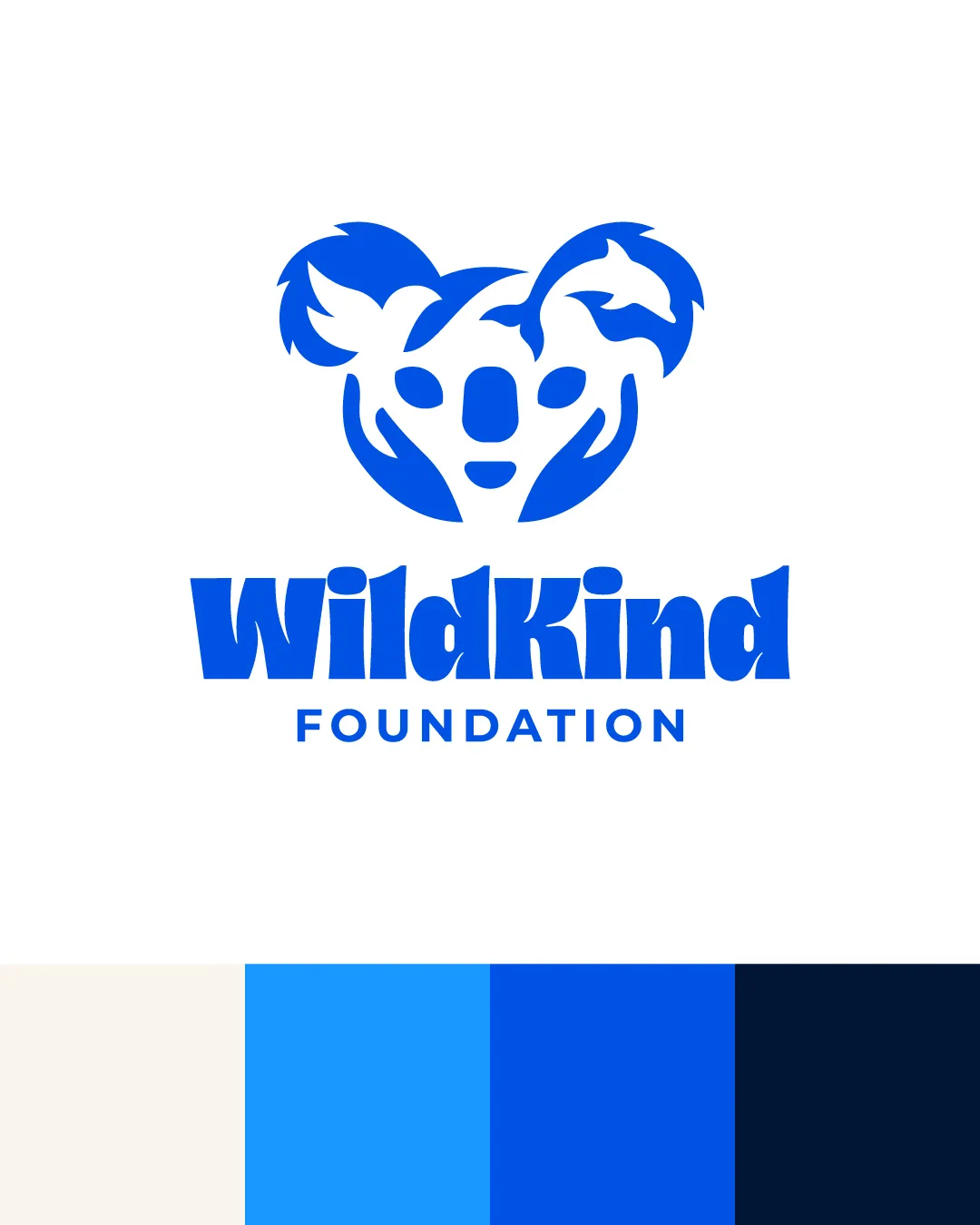
A bold, single-color combination mark featuring a koala face formed by negative space animal silhouettes, paired with a heavy, playful 'WildKind' wordmark and clean sans-serif 'FOUNDATION' underline.
The word 'WildKind' appears in a thick, custom sans-serif with organic playfulness, while 'FOUNDATION' is set in a neat geometric sans.
Koala head silhouette cleverly constructed from animal shapes including a bird and a dolphin, encapsulating inclusivity and environmental focus.
Palette showcases vibrant to deep blues for trust and optimism, with a neutral base for breadth of application.
A bold, cohesive identity that unifies key animal silhouettes—instantly communicating your mission to protect diverse wildlife.
The koala face made of multiple animals symbolizes holistic care for different wild species.
The confident blue palette and bold wordmark create trust and memorability.
Get a clear logo score, key risks, and priority fix ideas before your client or audience sees it.