 View review
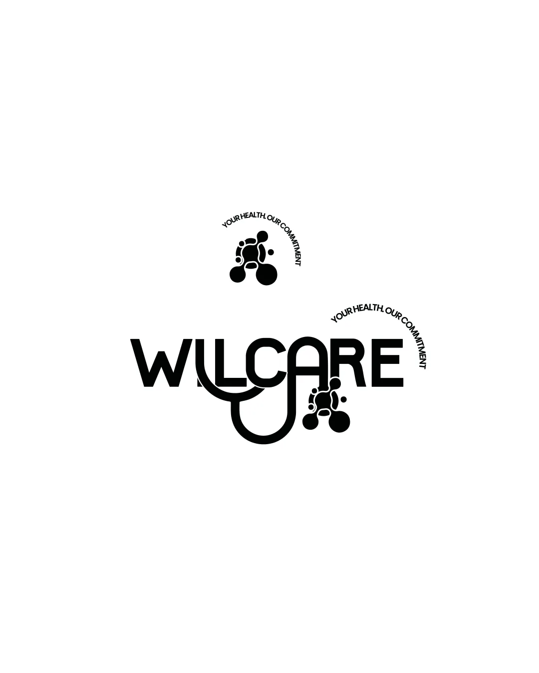
Logo score
Logo review of
Willcare Your Health. Our Commitment.
Serviceable identity for healthcare, but visual clarity and distinctiveness would benefit from focused improvements.
Objective AI feedback. Your creative decision.
Legibility
Originality
Misread
Balance
Scale
Action plan
What to fix first
The most important fixes to handle before polishing the full presentation.
1
Refine stethoscope integration to clarify wordmark readability, especially 'L', 'C', 'A'.
High priorityCurrently disrupts reading flow and may confuse on first glance.
Impact: Improves Both Impact And Legibility For Practical Usage. · Effort: Medium
2
Develop a stronger, more distinctive stand-alone mark that tightly reflects the wordmark style.
Medium priorityCurrent abstract mark is generic and disconnected from aided wordmark style.
Impact: Boosts Brand Cohesion And Memorability Across Applications. · Effort: Medium
Detailed review
Logo performance breakdown
Legibility
 Wordmark is mostly clear and readable
 Stethoscope integration disrupts the flow and clarity of the 'L', 'C', and 'A' Small tagline font may be hard to read small
Originality
Stethoscope integration, abstract mark unique to healthcare
Abstract figure is somewhat generic and resembles common healthcare motifs
Balance alignment
Centrally aligned with curves integrated
Stethoscope extension creates bottom-heavy visual weight

Scalability
Simple, bold forms are robust for most sizes
Fine tagline and mark details could be lost at smaller sizes
200x250 px
100×125 px
50×62 px
Misinterpretations
No clear misinterpretation or confusion
Logo structure & brief match
Both healthcare-themed, similar style
Mark and wordmark could be better unified in visual language, stethoscope in text is not mirrored in stand-alone mark
Industry: Visually communicates healthcare well via stethoscope and human form
Try your own review
Review my logo
Wondering how your logo performs?
Get a clear logo score, key risks, and priority fix ideas before your client or audience sees it.
Keep exploring