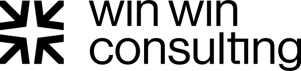
win win consulting logo review
4.2/5
Logo score
Logo review of

Win Win Consulting

A distinctive, modern consulting logo with strong concept and clarity—minor spatial refinement will enhance polish.

Combination Modern Minimal Geometric Consulting
5/5
Legibility
4/5
Originality
5/5
Misread
4/5
Balance
5/5
Scale
Your next steps

What to fix first

Focus on the changes that matter. Keep what makes the logo work.

1

symbol and wordmark

Reduce the space between the symbol and wordmark.

Optional refinement Medium priority Low effort
Area to inspectApproximate location

The visual gap between the symbol and the wordmark feels slightly wide, which weakens their connection and unity as a logo.

How to check

Preview the logo with a narrower gap and compare cohesion.

See the category review
Detailed review

Logo performance breakdown

5/5

Brief & logo match

Based on your brief
Compared with

Logo for executive mentoring; client values guidance (old compass), clarity, and security.

Excellent alignment with the brief—the mark and clean typography express the guiding and supportive qualities described.

  • Guidance And Clarity

    The abstract compass mark effectively suggests direction, aligning with the coaching for clarity and leadership development.

  • Security

    The geometric, symmetrical design communicates stability and reliability, addressing the client's security goal.

5/5

Legibility

  • Clean, modern font is highly readable.
  • Consistent baseline and spacing.
4/5

Originality

  • The geometric compass mark is distinctive and conceptually relevant.
4/5

Balance alignment

  • Both elements are visually balanced and aligned.
  • The visual gap between the symbol and the wordmark feels slightly wide, which weakens their connection and unity as a logo.

    Optional refinement symbol and wordmark

    Try: Reduce the space between the symbol and wordmark.

    Check: Preview the logo with a narrower gap and compare cohesion.

    Area to inspectApproximate location
Uploaded logoAlignment guide overlay

Inspect spacing with the guide. Optical balance may differ from geometric centering.

5/5

Scalability

  • Monochrome vector style ensures strong reproduction at any size.
Uploaded logo at 200 pixels wide
200 × 250 px
Uploaded logo at 100 pixels wide
100 × 125 px
Uploaded logo at 50 pixels wide
50 × 63 px

Compare the detail at different sizes. Labels show the full image dimensions.

5/5

Misinterpretations

  • No unintended readings detected.
4/5

Symbol & text fit

  • Symbol complements the consulting theme and works alongside the name.

Black & white

Does the shape still work without color?

Preparing artwork...

Background contrast

Find the surfaces where your logo stays clear.

Compare the mark and lettering on each surface.

Blur & silhouette

A 3px blur softens fine details so you can check whether the overall shape stays recognizable. If key gaps close or elements merge, the logo may rely too heavily on detail.

Original
3px blur

Look for clear separation between shapes and a distinctive outline.

Try your own review

Wondering how your logo performs?

Get a clear logo score, key risks, and priority fix ideas before your client or audience sees it.

Review my logo