WOSEVEN logo review
4.3/5
Logo score
Logo review of

Woseven

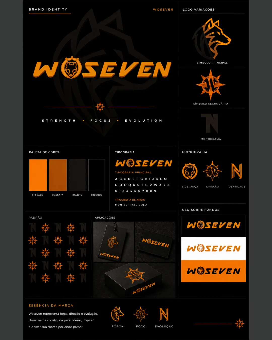
A distinctive and cohesive logo system with strong visual impact and clear industry alignment. Slight detail and spacing tweaks will perfect its utility.

Combination Mark Bold Angular, Modern Sport/tech Sports/fitness
4/5
Legibility
4.5/5
Originality
5/5
Misread
4/5
Balance
4/5
Scale
Your next steps

What to fix first

Focus on the changes that matter. Keep what makes the logo work.

1

Ensure wolf face in 'O' remains legible at small scales or create an alternate minimal version.

High priority Medium effort

Key brand element could become unclear in compact uses.

Improves usability and recognizability in all applications.
2

Slightly increase letter spacing in the wordmark to enhance instant readability, especially the integration of the wolf face.

Medium priority Low effort

Detail can run together, especially at reduced size or poor print.

Boosts rapid recognition and prevents character blending.

Detailed review

Logo performance breakdown

Not scored

Brief & logo match

From the original review
  • Industry

    Strong connection to sports, leadership, direction, or fitness—visual elements and brand promises fit a high-performance context.

  • Brand Values

    Concept supports 'strength', 'focus', and 'evolution' through wolf and compass symbolism.

4/5

Legibility

  • Strong, readable typography with distinctive characters
  • Wordmark maintains clarity at various scales
  • Slight tightness and complexity in the letter 'O' (wolf face integration) could reduce instant readability at small sizes
4.5/5

Originality

  • Original use of wolf head and compass, custom typography
  • Distinctive monogram and graphic approach
  • Sport/tech genre visual language is strong but not entirely unique
4/5

Color harmony

  • Rich, energetic orange-black palette with good contrast
  • Could benefit from one more accent or variation for flexibility
Orange#FF7A00
Dark Orange#B25417
Near Black#1A1614
Black#000000

Estimated colors. Use the original design file for exact values.

Create a full color palette using these colors

Create new palette

4/5

Balance alignment

  • Consistent weight and spacing; balanced mark-wordmark relationships
  • Unified visual system across all variants
  • Minor tension where illustrated elements overlap text
Uploaded logoAlignment guide overlay

Inspect spacing with the guide. Optical balance may differ from geometric centering.

4/5

Scalability

  • Works in single color and on multiple backgrounds
  • Logo versions enable versatile use
  • Wolf-face-in-'O' detail may be lost at very small sizes
Uploaded logo at 200 pixels wide
200 × 250 px
Uploaded logo at 100 pixels wide
100 × 125 px
Uploaded logo at 50 pixels wide
50 × 63 px

Compare the detail at different sizes. Labels show the full image dimensions.

5/5

Misinterpretations

  • No negative hidden shapes or confusing overlaps; symbols are clear
5/5

Symbol & text fit

  • Wolf symbol and type design feel fully integrated, both conceptually and stylistically

Black & white

Does the shape still work without color?

These tests are available only for logos uploaded in vector (SVG) format.

Background contrast

Find the surfaces where your logo stays clear.

These tests are available only for logos uploaded in vector (SVG) format.

Blur & silhouette

A 3px blur softens fine details so you can check whether the overall shape stays recognizable. If key gaps close or elements merge, the logo may rely too heavily on detail.

These tests are available only for logos uploaded in vector (SVG) format.

Try your own review

Wondering how your logo performs?

Get a clear logo score, key risks, and priority fix ideas before your client or audience sees it.

Review my logo



