1
Category Fit
Good fitWine and hospitality imagery is direct and on-theme.
No risk of audience confusion.
Distinctive, memorable, and well aligned for a wine/leisure venue with minimal minor issues.
The most important fixes to handle before polishing the full presentation.
Fine details risk being lost or blurring when scaled down.
Impact: Improves Readability And Logo Clarity In Web Icons And Print. · Effort: Low
Current brown is usable, but richer tones may boost shelf and sign impact.
Impact: Enhances Brand Differentiation And Visual Warmth. · Effort: Low
Script W may be visually ambiguous in some cases.
Impact: Addresses Minor Legibility At Micro Scale If Targeting App Or Favicon Uses. · Effort: Medium
![]() Primary script 'Wulpine' is easy to read.
Primary script 'Wulpine' is easy to read.![]() Wine Garden in all-caps is clear when scaled moderately.
Wine Garden in all-caps is clear when scaled moderately.
![]() Script 'Wulpine' could be difficult to read at very small sizes due to fine connections.
Script 'Wulpine' could be difficult to read at very small sizes due to fine connections.
![]() Wolf and wine combination is both memorable and contextually aligned.
Wolf and wine combination is both memorable and contextually aligned.![]() Custom script gives character.
Custom script gives character.
![]() Wolf silhouette style is not unique in broader wine/food or mascot logo fields.
Wolf silhouette style is not unique in broader wine/food or mascot logo fields.
![]() Green and brown fit nature/wine garden theme.
Green and brown fit nature/wine garden theme.![]() Softer neutral adds balance.
Softer neutral adds balance.
![]() Palette may feel a bit generic; brown could be made richer or more distinct.
Palette may feel a bit generic; brown could be made richer or more distinct.
Japanese Laurel
#16801C
Serenade
#FCF0DF
Metallic Bronze
#5B3A09
Your palette is close. Explore sharper color combinations with Colorfly.design before updating the logo.
Explore palettes![]() Cohesive symbol and typography placement.
Cohesive symbol and typography placement.![]() Good weight distribution in both mark and wordmark.
Good weight distribution in both mark and wordmark.

![]() Simple, solid fills assist in reduction.
Simple, solid fills assist in reduction.![]() Separate icon and monogram versions provided.
Separate icon and monogram versions provided.
![]() Vine detail and the wine glass stem may be lost at tiny sizes.
Vine detail and the wine glass stem may be lost at tiny sizes.
200x250 px
100×125 px
50×62 px
![]() No awkward negative spaces or inappropriate misreadings noticed.
No awkward negative spaces or inappropriate misreadings noticed.
![]() Mark integrates vine into the wolf narrative, directly relating to the wordmark theme.
Mark integrates vine into the wolf narrative, directly relating to the wordmark theme.
![]() Theme/message: The wolf and wine glass directly communicate a playful yet sophisticated wine garden venue.
Theme/message: The wolf and wine glass directly communicate a playful yet sophisticated wine garden venue.
![]() Target Audience: Likely appeals to adults seeking a unique, casual wine experience, blending nature with leisure.
Target Audience: Likely appeals to adults seeking a unique, casual wine experience, blending nature with leisure.
Good fit with clear differentiation opportunity.
The wolf wine motif is playful yet not overused; visual narrative supports a unique brand voice in the wine garden/hospitality space.
Wine and hospitality imagery is direct and on-theme.
No risk of audience confusion.
Wolf is less common in this segment than grapes or glasses alone.
Possible mild similarity to generic animal/mascot marks, but wine context is unique.
Fresh, welcoming, slightly quirky—not overly formal.
Appeals to casual and experience-seeking wine enthusiasts.
Where the logo is ready to use, where it needs adjustment, and where it may break in real applications.
Solid color and clear wordmark perform well online.
Delicate vine details may blur at tiny scale; simplify for this use.
Logo functions effectively in single color due to strong shape logic.
Wolf icon is strong as a standalone avatar.
Clear silhouettes perform reliably in print or signage.
A practical checklist of the logo versions to prepare before sending the final files to a client or team.
Main lockup for most brand uses.
Ideal for avatars, merch, or favicon with minor adjustment.
Flexible option for space-constrained applications.
Essential for embroidery, etching, or single-color print.
Needed for signage or spatial constraints.
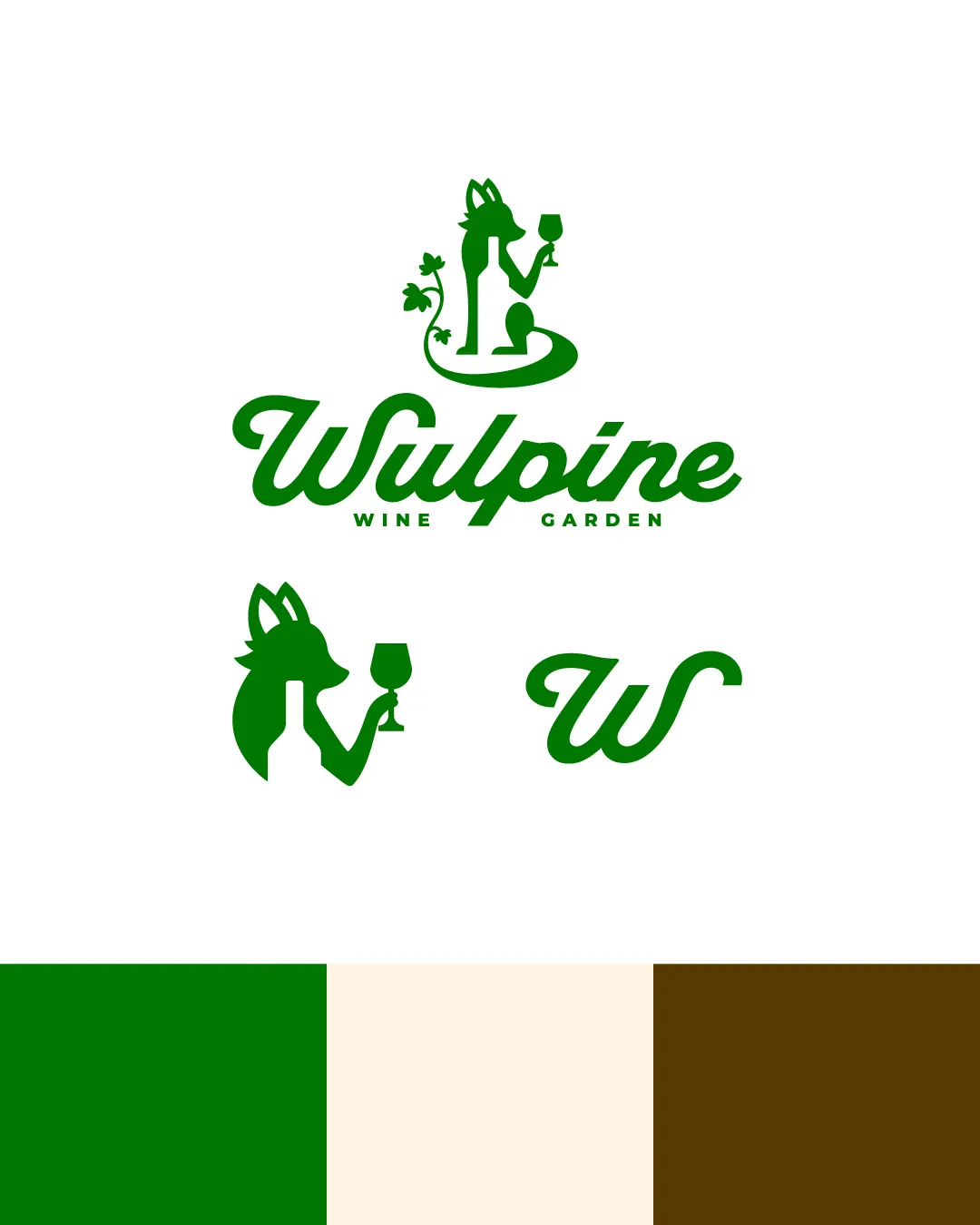
The main logo features a stylized wolf holding a wine glass, entwined with a vine motif, paired with a flowing script wordmark 'Wulpine' and the description 'Wine Garden' below.
The wordmark uses a custom, elegant script for 'Wulpine,' adding approachability and flair.
The mascot logomark depicts the wolf holding a wine glass, with a trailing vine, combining sophistication with playful charm.
A natural palette of rich green, creamy off-white, and deep brown, reflecting organic, earthy, and welcoming sensibilities.
A playful, inviting mark blending the elegance of wine culture with the wild spirit of the wolf, perfect for a boutique wine garden experience.
The wolf mascot embodies character and uniqueness; the wine glass and vine reinforce the brand's wine garden narrative.
Green and natural tones emphasize freshness and a welcoming outdoor space.
Get a clear logo score, key risks, and priority fix ideas before your client or audience sees it.