Wondering how your logo performs? 🧐
Get professional logo reviews in seconds and catch design issues in time.
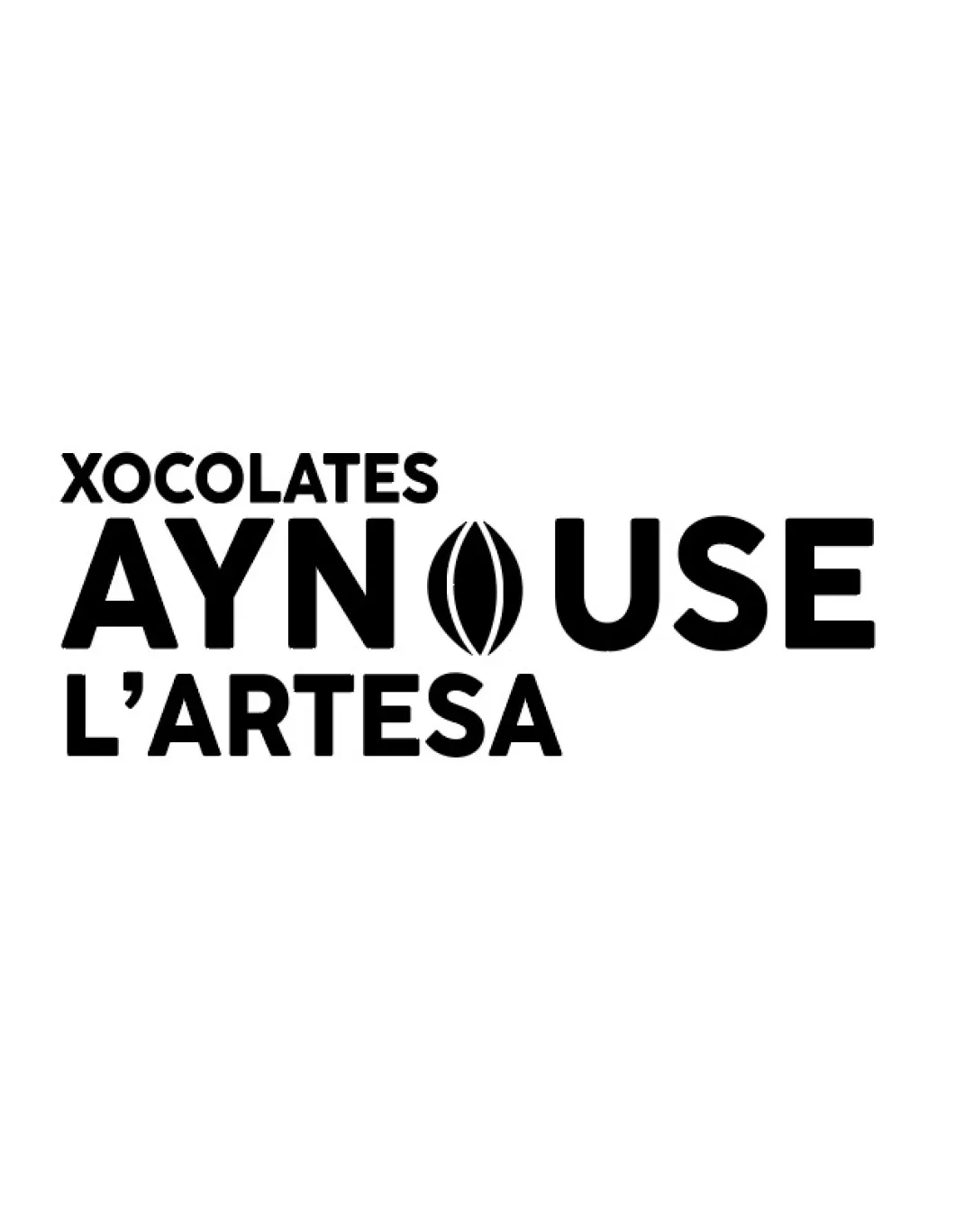
Try it Now!Logo review of XOCOLATES AYNOUSE L'ARTESA
 Logo analysis by AI
Logo type:
Style:
Detected symbol:
Detected text:
Business industry:
Review requested by Zuca
**If AI can recognize or misinterpret it, so can people.
Structured logo review
Legibility
![]() All text elements are clear and bold.
All text elements are clear and bold.![]() High contrast between text and background ensures readability.
High contrast between text and background ensures readability.
Scalability versatility
![]() Bold sans-serif fonts and simple icon ensure clarity at large and small sizes.
Bold sans-serif fonts and simple icon ensure clarity at large and small sizes.![]() Single-color execution supports use on a variety of backgrounds.
Single-color execution supports use on a variety of backgrounds.
![]() The detailed cocoa bean icon may lose some sharpness at very small sizes (e.g., as a favicon or small packaging label).
The detailed cocoa bean icon may lose some sharpness at very small sizes (e.g., as a favicon or small packaging label).
200x250 px
100×125 px
50×62 px
Balance alignment
![]() Centered alignment with proportional spacing between lines.
Centered alignment with proportional spacing between lines.![]() The cocoa bean icon is visually centered within 'AYNOUSE'.
The cocoa bean icon is visually centered within 'AYNOUSE'.
![]() The thickness/visual weight of the bean icon is slightly lighter compared to the boldness of the letters, causing a subtle imbalance.
The thickness/visual weight of the bean icon is slightly lighter compared to the boldness of the letters, causing a subtle imbalance.

Originality
![]() Integrates a cocoa bean illustration into the wordmark for industry relevance.
Integrates a cocoa bean illustration into the wordmark for industry relevance.
![]() Cocoa bean as a symbol for chocolate brands is a widely used trope.
Cocoa bean as a symbol for chocolate brands is a widely used trope.![]() No distinctive custom letterforms or unique stylistic approach beyond the icon integration.
No distinctive custom letterforms or unique stylistic approach beyond the icon integration.
Logomark wordmark fit
![]() Cocoa bean icon visually connects with the product and the 'O', blending seamlessly with the wordmark.
Cocoa bean icon visually connects with the product and the 'O', blending seamlessly with the wordmark.
![]() Slight disconnect in visual weight between the rounded icon and the angular, heavy type.
Slight disconnect in visual weight between the rounded icon and the angular, heavy type.
Aesthetic look
![]() Minimalistic and bold aesthetic communicates confidence and modernity.
Minimalistic and bold aesthetic communicates confidence and modernity.![]() Black-and-white palette maintains sophistication.
Black-and-white palette maintains sophistication.
![]() The 'O' icon’s organic curves are slightly at odds with the structured letterforms.
The 'O' icon’s organic curves are slightly at odds with the structured letterforms.
Dual meaning and misinterpretations
![]() Cocoa bean symbol is straightforward for the chocolate industry.
Cocoa bean symbol is straightforward for the chocolate industry.
![]() The stylized cocoa bean might be misread as a vulva or another anatomical feature, leading to unintended sexual connotations.
The stylized cocoa bean might be misread as a vulva or another anatomical feature, leading to unintended sexual connotations.
Color harmony
![]() Monochrome palette creates high contrast and ensures great visibility.
Monochrome palette creates high contrast and ensures great visibility.![]() Timeless black-and-white scheme fits most branding applications.
Timeless black-and-white scheme fits most branding applications.
Black
#000000
White
#FFFFFF