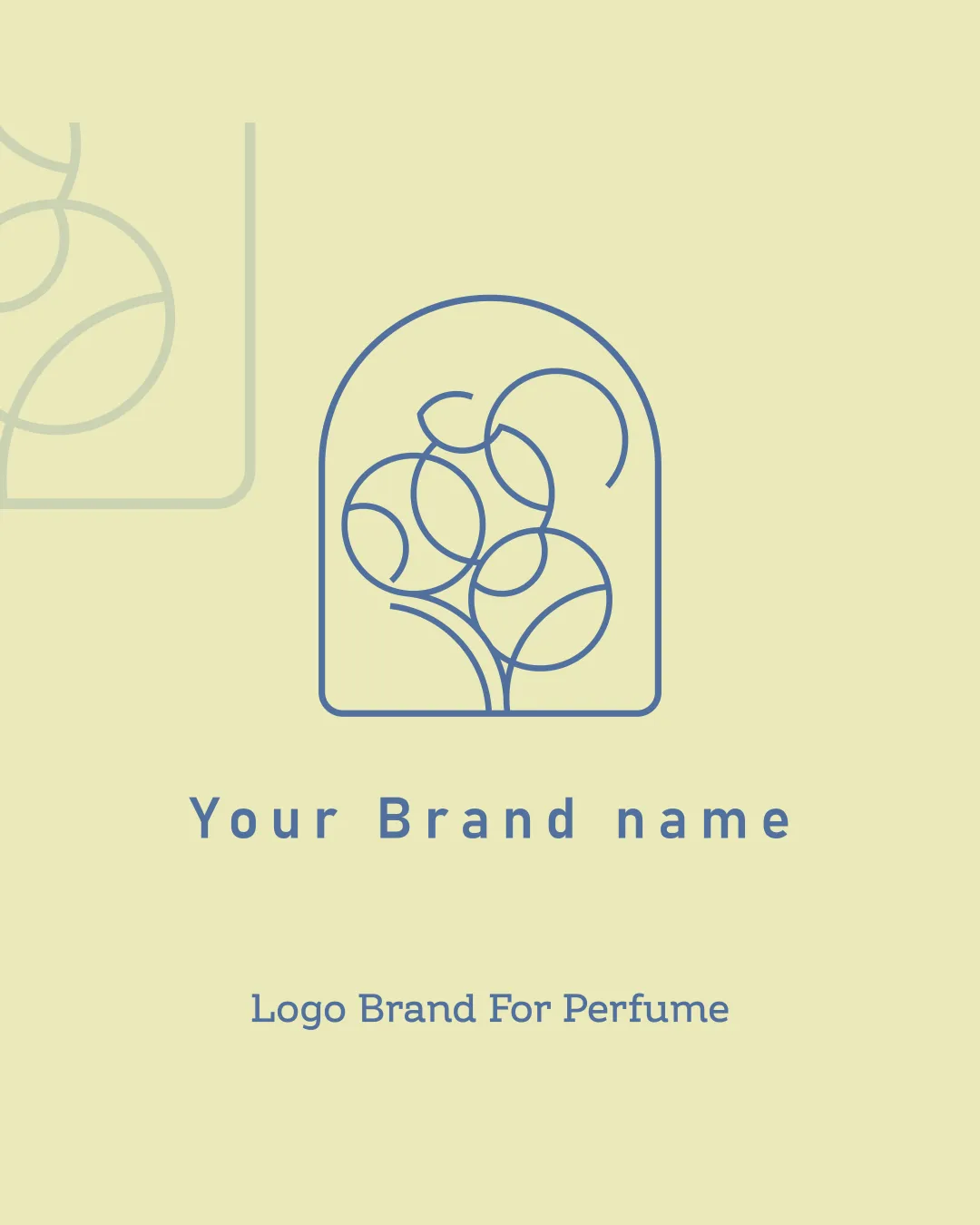
Your Brand name logo review
4.1 / 5
Logo score

Logo review ofYour Brand Name

Review the detailed scores below to see what is working and what should be refined first.

Combination Mark Minimalist Perfume
4/5
Legibility
3/5
Originality
5/5
Misread
5/5
Balance
4/5
Scale
Review next
Detailed review

Logo performance breakdown

4/5

Legibility

Checkmark icon Clear and easy to read
Checkmark icon Good contrast with background

Warning icon Slight ambiguity in letter spacing

3/5

Originality

Checkmark icon Creative abstract design

Warning icon Somewhat generic floral theme

4/5

Color harmony

Checkmark icon Consistent and calming color palette

Warning icon Limited contrast might lack visual impact

Your palette is close. Explore sharper color combinations with Colorfly.design before updating the logo.

Explore palettes
5/5

Balance alignment

Checkmark icon Well-balanced composition
Checkmark icon Symmetrical alignment

logo 200x250 pixels scalability test alignment grid overlay
4/5

Scalability

Checkmark icon Simple lines ensure good scalability
Checkmark icon Can work well on packaging

Warning icon Thin lines might lose clarity at very small sizes

logo 200x250 pixels scalability test

200x250 px

logo 100x125 pixels scalability test

100×125 px

logo 50x62 pixels scalability test

50×62 px

5/5

Misinterpretations

Checkmark icon No inappropriate imagery detected

Try your own review

Wondering how your logo performs?

Get a clear logo score, key risks, and priority fix ideas before your client or audience sees it.

Review my logo