 View review
Logo score
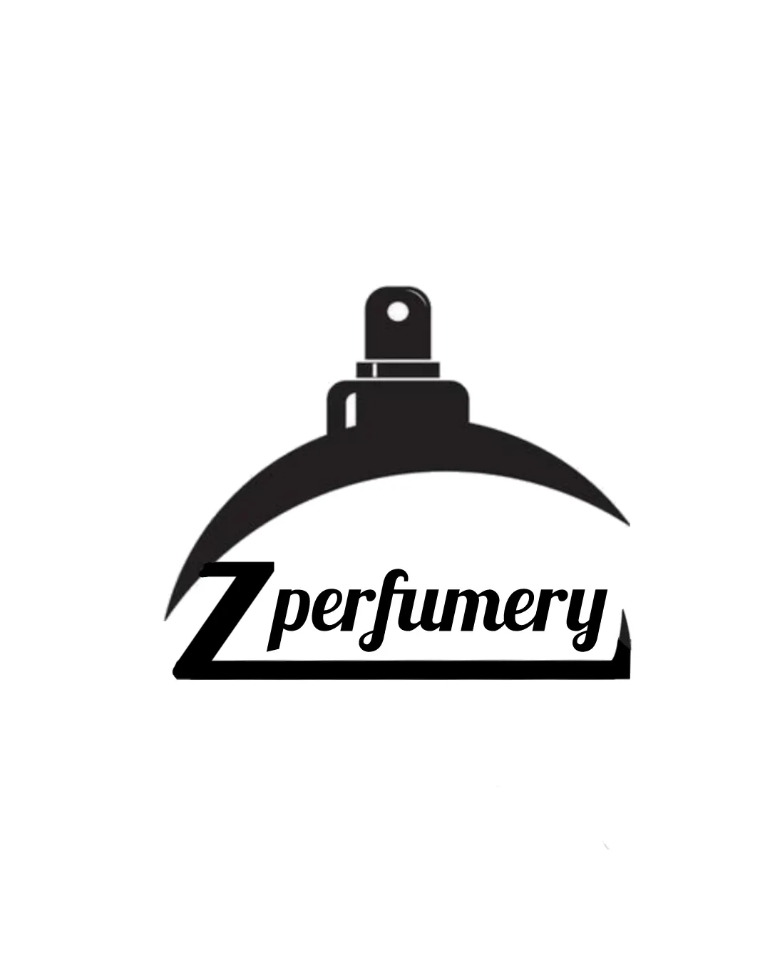
Logo review ofZ Perfumery
Review the detailed scores below to see what is working and what should be refined first.
Legibility
Originality
Balance
Scale
Detailed review
Logo performance breakdown
Legibility
![]() The text 'Z perfumery' is clear and easy to read.
The text 'Z perfumery' is clear and easy to read.![]() The font choice complements the modern style.
The font choice complements the modern style.
![]() The italic style of 'perfumery' can be slightly harder to read at smaller sizes.
The italic style of 'perfumery' can be slightly harder to read at smaller sizes.
Originality
![]() The combination of a letter with a specific industry symbol is unique.
The combination of a letter with a specific industry symbol is unique.
![]() The use of a perfume bottle is somewhat common in fragrance branding.
The use of a perfume bottle is somewhat common in fragrance branding.
Color harmony
![]() Effective use of monochrome ensures versatile application.
Effective use of monochrome ensures versatile application.
Balance alignment
![]() The elements are well balanced with the text fitting nicely within the silhouette.
The elements are well balanced with the text fitting nicely within the silhouette.
![]() The large 'Z' might slightly overpower the rest of the text.
The large 'Z' might slightly overpower the rest of the text.

Scalability
![]() Simple design allows for versatility across different media.
Simple design allows for versatility across different media.
![]() Thin elements in the perfume bottle silhouette may not print well at very small sizes.
Thin elements in the perfume bottle silhouette may not print well at very small sizes.
200x250 px
100×125 px
50×62 px
Symbol & text fit
![]() The perfume bottle and text are stylistically cohesive.
The perfume bottle and text are stylistically cohesive.
![]() The larger 'Z' could be seen as slightly mismatched in size with 'perfumery'.
The larger 'Z' could be seen as slightly mismatched in size with 'perfumery'.
Try your own review
Review my logo
Wondering how your logo performs?
Get a clear logo score, key risks, and priority fix ideas before your client or audience sees it.
Keep exploring


