 View review
Logo score
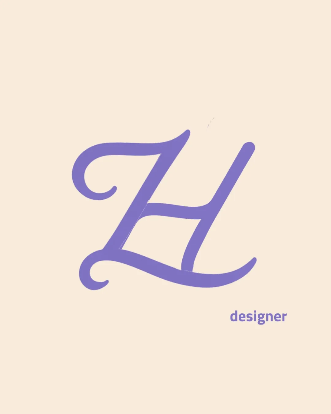
Logo review ofZh, Designer
Review the detailed scores below to see what is working and what should be refined first.
Legibility
Originality
Misread
Balance
Scale
Detailed review
Logo performance breakdown
Legibility
![]() The 'designer' wordmark is clear and easy to read.
The 'designer' wordmark is clear and easy to read.![]() The ZH monogram, while script-themed, is mostly recognizable.
The ZH monogram, while script-themed, is mostly recognizable.
![]() The flourishes in the monogram may create ambiguity between Z and H at smaller sizes or to unfamiliar viewers.
The flourishes in the monogram may create ambiguity between Z and H at smaller sizes or to unfamiliar viewers.
Originality
![]() The custom script offers some elegance and a more personal touch than most generic monograms.
The custom script offers some elegance and a more personal touch than most generic monograms.
![]() Script monograms are common in the creative field, and this lacks a unique twist or notable negative space integration.
Script monograms are common in the creative field, and this lacks a unique twist or notable negative space integration.![]() No distinctive detail makes it truly stand out from other script-based monograms.
No distinctive detail makes it truly stand out from other script-based monograms.
Color harmony
![]() Simple, complementary palette of lavender and almond keeps the design clean and modern.
Simple, complementary palette of lavender and almond keeps the design clean and modern.![]() No overwhelming color choices.
No overwhelming color choices.
Lavender
#9B8CDD
Almond
#F5E6D6
Balance alignment
![]() The ZH monogram appears visually centered.
The ZH monogram appears visually centered.![]() Overall spacing gives it room to breathe.
Overall spacing gives it room to breathe.
![]() The word 'designer' feels slightly detached and does not visually align with or echo the style of the monogram.
The word 'designer' feels slightly detached and does not visually align with or echo the style of the monogram.

Scalability
![]() Monoline weight supports mid-sized applications like web headers or personal branding collateral.
Monoline weight supports mid-sized applications like web headers or personal branding collateral.
![]() Ornate script elements and thin lines in the ZH could render poorly at very small sizes, harming clarity on business cards or favicons.
Ornate script elements and thin lines in the ZH could render poorly at very small sizes, harming clarity on business cards or favicons.![]() Low contrast may impact legibility on colored backgrounds.
Low contrast may impact legibility on colored backgrounds.
200x250 px
100×125 px
50×62 px
Misinterpretations
![]() No inappropriate shapes or unintended dual meanings are present.
No inappropriate shapes or unintended dual meanings are present.
Symbol & text fit
![]() Subtle color harmony between the symbol and wordmark.
Subtle color harmony between the symbol and wordmark.
![]() The serif script monogram and the geometric sans-serif 'designer' type do not stylistically match.
The serif script monogram and the geometric sans-serif 'designer' type do not stylistically match.
![]() Size discrepancy draws the eye away from the wordmark.
Size discrepancy draws the eye away from the wordmark.
Try your own review
Review my logo
Wondering how your logo performs?
Get a clear logo score, key risks, and priority fix ideas before your client or audience sees it.
Keep exploring


