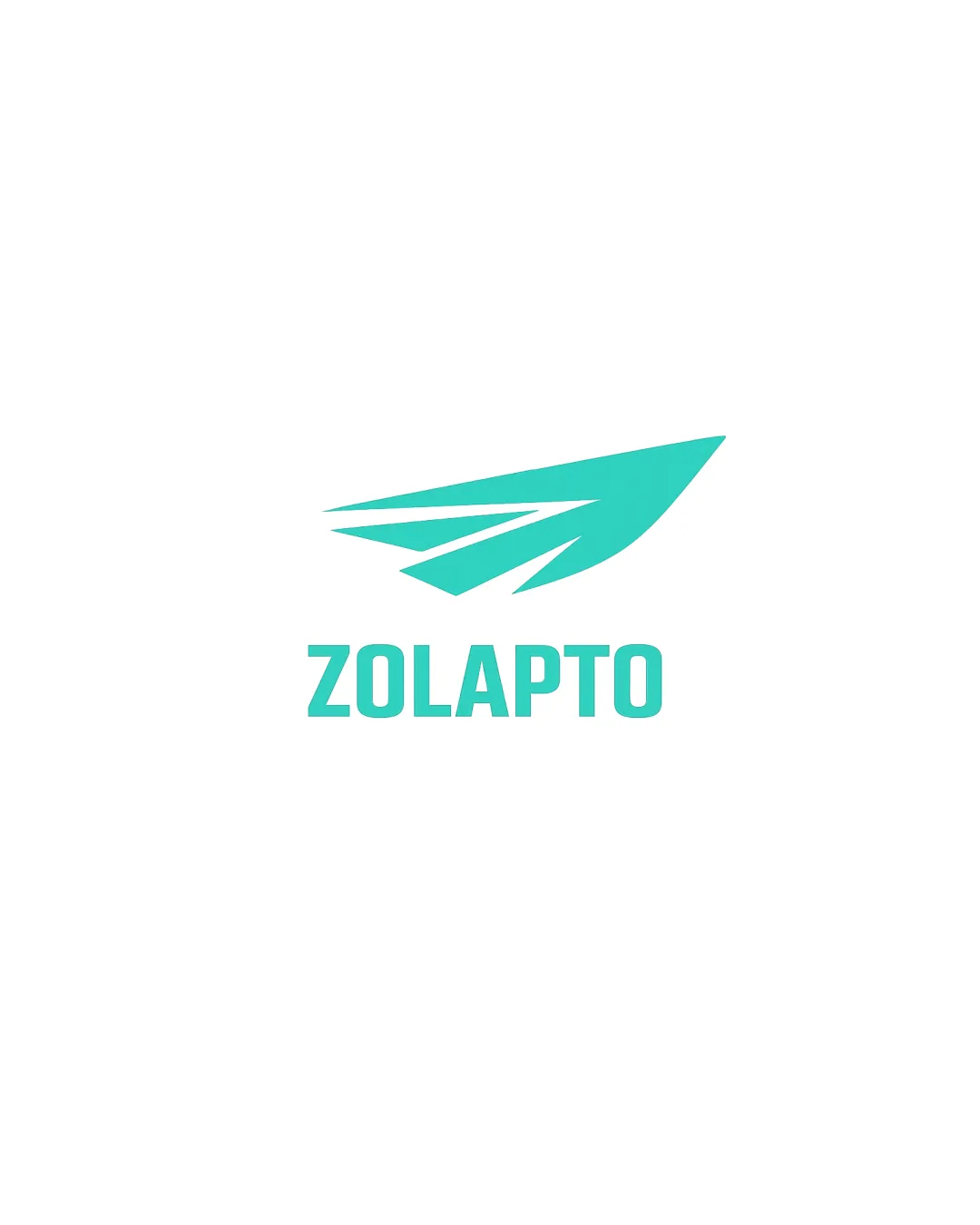
ZOLAPTO logo review
3.6 / 5
Logo score
Logo review of

Zolapto

Solid foundation with professional clarity, but requires enhancement in originality and potential color versatility for strong, market-ready impact.

Combination Mark Minimalist Geometric Technology
5/5
Legibility
3/5
Originality
5/5
Misread
4/5
Balance
5/5
Scale
Action plan

What to fix first

The most important fixes to handle before polishing the full presentation.

1

Increase originality of the symbol by introducing a distinct geometric twist or integrating a subtle brand reference.

High priority

Motif is currently generic; greater uniqueness is needed for strong brand recognition.

Impact: Creates A More Memorable And Differentiating Mark. · Effort: Medium

2

Experiment with dual-color or negative-space treatments for more versatility across backgrounds.

Medium priority

Single-color approach, though modern, can limit adaptability.

Impact: Improves Real-world Usability And Expands Application Range. · Effort: Low

Detailed review

Logo performance breakdown

5/5

Legibility

Checkmark icon Text is clear, bold, and extremely readable.

3/5

Originality

Checkmark icon Clean and modern presentation.

Warning icon Wing or paper plane motif is somewhat common and lacks strong unique elements.

4/5

Color harmony

Checkmark icon Monochrome turquoise is energetic, clean, and modern.

Warning icon Single color limits flexibility for some backgrounds or printing needs.

Turquoise
#37D8C8

Your palette is close. Refine the color roles and combinations before updating the logo.

Build brand colors
4/5

Balance alignment

Checkmark icon Mark and text are visually balanced and well-aligned.

Warning icon Slightly top-heavy; symbol could overpower wordmark at very small sizes.

logo 200x250 pixels scalability test alignment grid overlay
5/5

Scalability

Checkmark icon Simple geometric form scales well and maintains clarity at small sizes.

logo 200x250 pixels scalability test

200x250 px

logo 100x125 pixels scalability test

100×125 px

logo 50x62 pixels scalability test

50×62 px

5/5

Misinterpretations

Checkmark icon No inappropriate or confusing dual meanings detected.

Beta

No AI design signals found

Likely designed by a human

Logo exhibits deliberate geometry, consistent text, and coherent symbol construction.

  • All characters are well-formed and consistent.
  • Geometric mark lacks generative or random artifacts.

Visual assessment; not definitive proof of authorship.

4 / 5

Logo structure & brief match

Checkmark icon Mark and wordmark have matching geometric styles and weights.

Warning icon Symbol's abstractness limits immediate connection to the name.

Checkmark icon Detected Industry: Modern wing/plane motif and clean type are appropriate for a technology or transport-related industry.

Try your own review

Wondering how your logo performs?

Get a clear logo score, key risks, and priority fix ideas before your client or audience sees it.

Review my logo