Concept & direction
A crown merged with a speech bubble suggests leading news or discourse, fitting for a digital media brand.
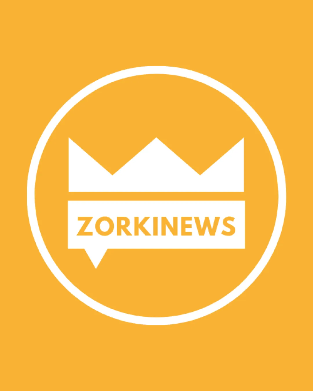
Clear, legible, and appropriate for digital media, though visually generic; refinements for smoother integration would strengthen the mark for professional rollout.
This logo lockup has a workable foundation; improving visual balance is the clearest next step.
Focus on the changes that matter. Keep what makes the logo work.
A crown merged with a speech bubble suggests leading news or discourse, fitting for a digital media brand.
Logo preview unavailable. The written feedback is still available on this card.
central mark and wordmark alignment
The crown shape sits directly atop a speech bubble containing the name, but the base of the crown and top of the wordmark bar compete visually, making the transition appear slightly abrupt and blocky.
See the category reviewThe logo signals authority and digital communication through its crown and speech bubble motif, matching core digital media themes, but lacks distinctiveness among competitors.
Wordmark 5/5 · Layout 4/5
Symbol 4/5 · Wordmark 4/5 · Layout 4/5
Symbol 3/5 · Wordmark 3/5
Crown and speech bubble are common symbols in news/media; combination adds mild distinctiveness but feels generic.
Symbol 3/5 · Wordmark 3/5 · Layout 3/5
The crown shape sits directly atop a speech bubble containing the name, but the base of the crown and top of the wordmark bar compete visually, making the transition appear slightly abrupt and blocky.
Try: Refine the transition between crown and wordmark bar to create a more cohesive visual flow.
Logo preview unavailable. The written feedback is still available on this card.

Inspect spacing with the guide. Optical balance may differ from geometric centering.
Mark and text share weight and style, but the modular stacking and heavy boxing break flow between shapes.
Get a clear logo score, key risks, and priority fix ideas before your client or audience sees it.
More credits needed
Add credits to continue without losing your work.
Then $7/month. Cancel anytime.
Essential logo review with AI
Estimated progress