Wondering how your logo performs? 🧐
Get professional logo reviews in seconds and catch design issues in time.
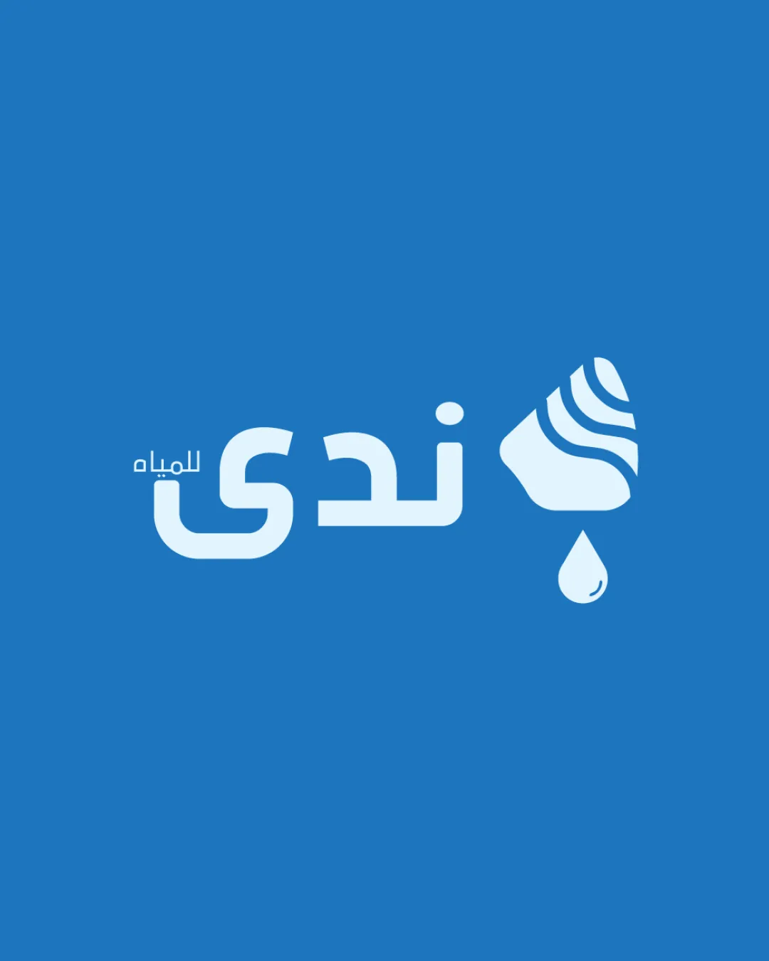
Try it Now!Logo review of ندى للمياه
 Logo analysis by AI
Logo type:
Style:
Detected symbol:
Detected text:
Business industry:
Review requested by Tiew049605
**If AI can recognize or misinterpret it, so can people.
Structured logo review
Legibility
![]() Text is clear and uses a bold, geometric sans-serif Arabic font that is easy to read.
Text is clear and uses a bold, geometric sans-serif Arabic font that is easy to read.![]() Good contrast between text and background ensures optimal readability.
Good contrast between text and background ensures optimal readability.
Scalability versatility
![]() Simple icon and solid typography maintain clarity when scaled down.
Simple icon and solid typography maintain clarity when scaled down.![]() Works well for bottle labels, digital assets, and signage.
Works well for bottle labels, digital assets, and signage.
![]() Small wave pattern details in the symbol may lose clarity at favicon or embroidery sizes.
Small wave pattern details in the symbol may lose clarity at favicon or embroidery sizes.![]() Monotone color limits usage on dark or non-blue backgrounds without adaptation.
Monotone color limits usage on dark or non-blue backgrounds without adaptation.
200x250 px
100×125 px
50×62 px
Balance alignment
![]() Good horizontal alignment between text and symbol.
Good horizontal alignment between text and symbol.![]() Logomark size is proportionate to text and adds visual interest without overwhelming it.
Logomark size is proportionate to text and adds visual interest without overwhelming it.
![]() Slight misalignment in vertical centering between the text baseline and the logomark/drip which could make the design feel less harmonious.
Slight misalignment in vertical centering between the text baseline and the logomark/drip which could make the design feel less harmonious.![]() Small secondary Arabic text is under-emphasized and feels visually detached.
Small secondary Arabic text is under-emphasized and feels visually detached.

Originality
![]() Uses stylized wave lines within a water droplet, connecting directly to the water industry.
Uses stylized wave lines within a water droplet, connecting directly to the water industry.![]() Good integration of industry symbolism.
Good integration of industry symbolism.
![]() Wave-in-droplet symbolism is highly common in water-related brands and lacks distinctive qualities.
Wave-in-droplet symbolism is highly common in water-related brands and lacks distinctive qualities.![]() No usage of negative space or unique letter manipulation to stand out in the category.
No usage of negative space or unique letter manipulation to stand out in the category.
Logomark wordmark fit
![]() Styles are cohesive, both using smooth, rounded elements.
Styles are cohesive, both using smooth, rounded elements.![]() Color treatment is unified.
Color treatment is unified.
![]() Slight scale difference between logomark and wordmark; icon could be refined to feel less heavy compared to the lightweight font.
Slight scale difference between logomark and wordmark; icon could be refined to feel less heavy compared to the lightweight font.
Aesthetic look
![]() Clean, modern aesthetic with appropriate use of white space.
Clean, modern aesthetic with appropriate use of white space.![]() Professional and approachable, fits well within the water industry.
Professional and approachable, fits well within the water industry.
![]() Visual approach is predictable; nothing strikingly original to create a memorable impact.
Visual approach is predictable; nothing strikingly original to create a memorable impact.![]() Could be misconstrued as any generic water brand without the Arabic text.
Could be misconstrued as any generic water brand without the Arabic text.
Dual meaning and misinterpretations
![]() No inappropriate or ambiguous imagery detected.
No inappropriate or ambiguous imagery detected.![]() Symbolism is clear and universally understandable.
Symbolism is clear and universally understandable.
Color harmony
![]() Limited, harmonious color palette (blue and white) supports industry perception.
Limited, harmonious color palette (blue and white) supports industry perception.![]() High contrast ensures readability.
High contrast ensures readability.
Denim Blue
#2585CA
White
#FFFFFF


