Wondering how your logo performs? 🧐
Get professional logo reviews in seconds and catch design issues in time.
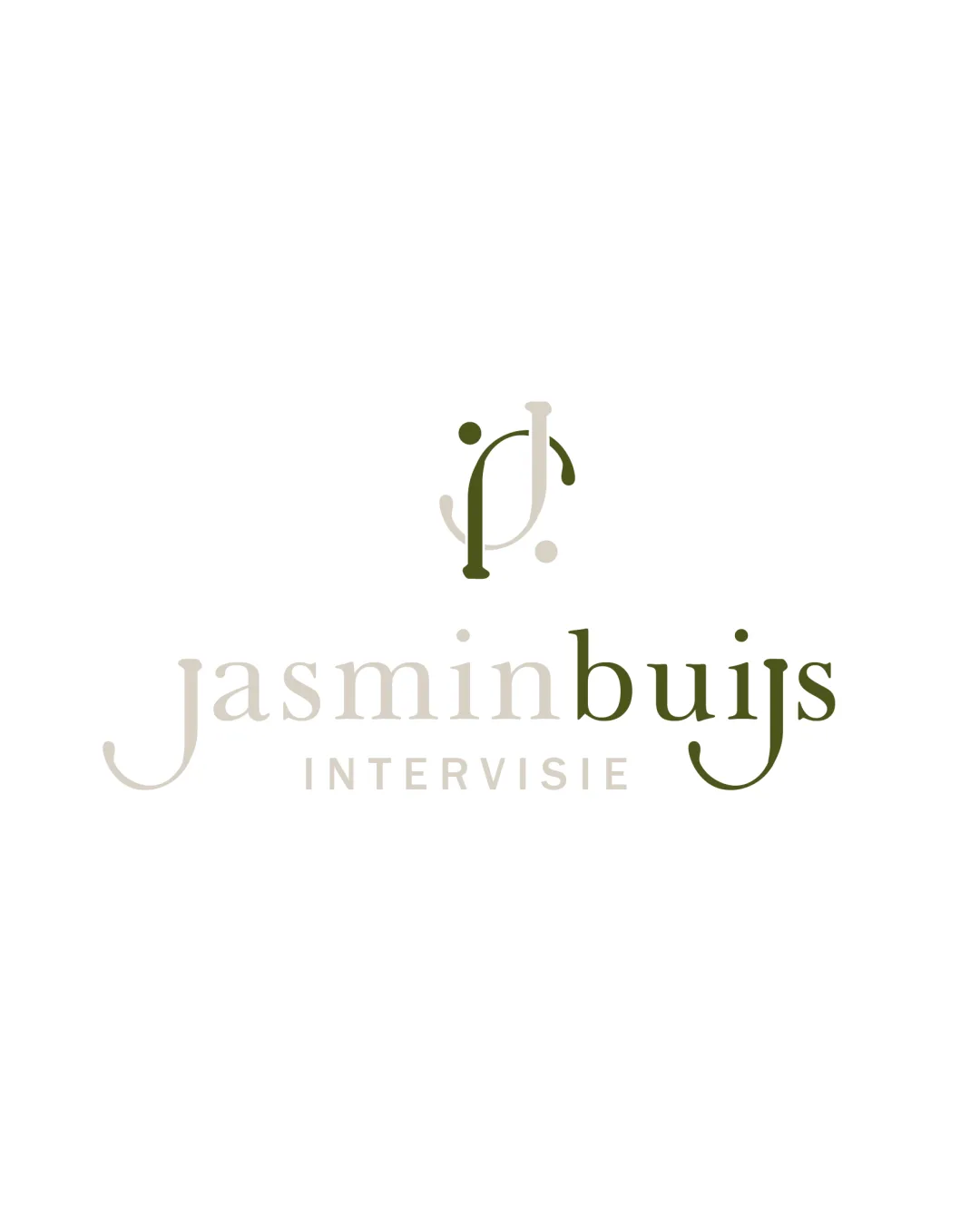
Try it Now!Logo review of jasminbuijs INTERVISIE
 Logo analysis by AI
Logo type:
Style:
Detected symbol:
Negative space:
Detected text:
Business industry:
Review requested by Veronikke
**If AI can recognize or misinterpret it, so can people.
Structured logo review
Legibility
Primary brand name 'jasminbuijs' is readable with good spacing.
'INTERVISIE' is clear in all caps and good contrast.
Color difference between 'jasmin' and 'buijs' slightly affects quick recognition.
Low contrast for 'jasmin' and 'INTERVISIE' in small sizes may hinder readability.
Scalability versatility
Simple monogram can work well for social icons and letterheads.
Logo is not overly complex and should render well in medium sizes.
Thin monogram lines and low contrast washes out at small scales or embroidery.
'INTERVISIE' could become illegible when scaled down.
Fine lines may be lost on business cards, favicons, or embroidered apparel.

200x250 px

100×125 px

50×62 px
Balance alignment
Wordmark and monogram are visually centered vertically.
Typography is evenly spaced with a balanced look.
The monogram alignment above the wordmark feels slightly off due to uneven weights.
Different densities between left ('jasmin') and right ('buijs') stress visual equilibrium.


Originality
JP monogram integrates stylized human figures, adding uniqueness.
Abstract approach is not immediately generic and incorporates some originality.
Monogram approach is not entirely unique in consultancy, and overlapping letters are a common trope.
Logomark wordmark fit
Monogram and wordmark share similar serif characteristics and style.
Color palette is consistent between the elements.
Slight disconnect in visual weight between the monogram and lighter 'jasminbuijs'.
Monogram appears bolder than main text, attracting more attention than ideal.
Aesthetic look
Elegant serif font and minimal design result in a sophisticated and upscale look.
Muted earth tones lend a calming and professional feel.
Split color treatment and the inclusion of dots may distract or clutter the logomark at small sizes.
Dual meaning and misinterpretations
No inappropriate or unintended shapes detected.
Abstract representation is easily interpreted as human connection, which fits consultancy.
Color harmony
Natural tones are harmonious and pleasing.
Soft contrast fits the consultancy/mental health field tone.
Color distinction between main wordmark parts ('jasmin' and 'buijs') may not provide enough visual impact.
Muted palette may not stand out on all backgrounds or print processes.
Light taupe
#CAC9B8
Olive green
#5F6643
White
#FFFFFF

