Wondering how your logo performs? 🧐
Get professional logo reviews in seconds and catch design issues in time.
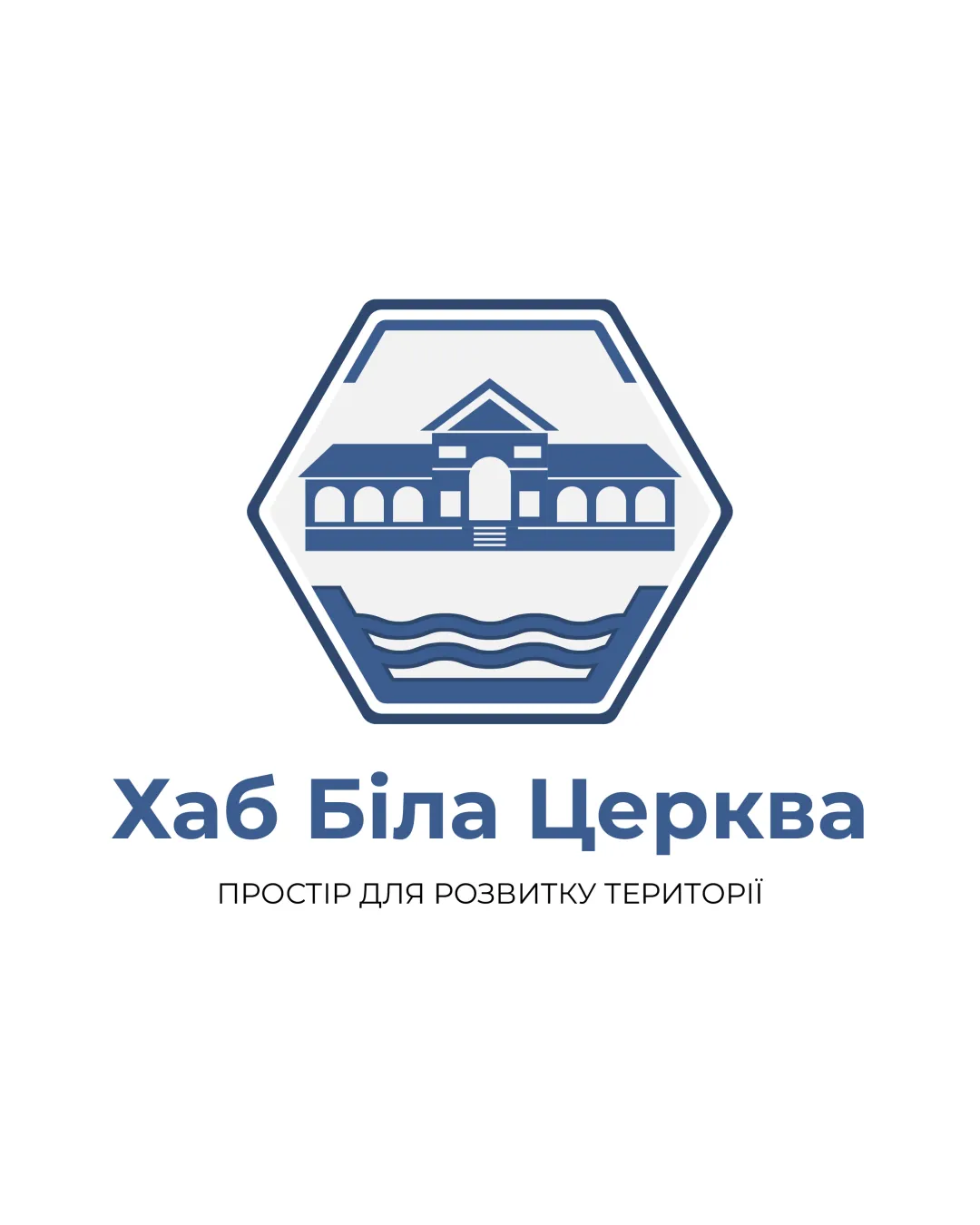
Try it Now!Logo review of Хаб Біла Церква, ПРОСТІР ДЛ�..
 Logo analysis by AI
Logo type:
Style:
Detected symbol:
Detected text:
Business industry:
Review requested by Pito
**If AI can recognize or misinterpret it, so can people.
Structured logo review
Legibility
![]() All text is highly readable and employs a clear geometric sans-serif typeface.
All text is highly readable and employs a clear geometric sans-serif typeface.![]() Font size for the main title is generous, enhancing visibility.
Font size for the main title is generous, enhancing visibility.
Scalability versatility
![]() Logo maintains visual integrity at moderate sizes such as signage or websites.
Logo maintains visual integrity at moderate sizes such as signage or websites.![]() Text and symbol separation allows flexible layout.
Text and symbol separation allows flexible layout.
![]() Level of architectural detail may get lost at small sizes, such as favicons or embroidery.
Level of architectural detail may get lost at small sizes, such as favicons or embroidery.![]() Fine lines and building features will not translate well to small, one-color prints.
Fine lines and building features will not translate well to small, one-color prints.
200x250 px
100×125 px
50×62 px
Balance alignment
![]() Hexagonal mark is perfectly centered above the wordmark, creating a unified composition.
Hexagonal mark is perfectly centered above the wordmark, creating a unified composition.![]() All elements are vertically aligned, resulting in a stable visual hierarchy.
All elements are vertically aligned, resulting in a stable visual hierarchy.

Originality
![]() Building symbol is somewhat customized to the locale or context, giving faint uniqueness.
Building symbol is somewhat customized to the locale or context, giving faint uniqueness.![]() Hexagon frame is less generic than a simple circle or square.
Hexagon frame is less generic than a simple circle or square.
![]() The illustrative building and water motif are standard in community or municipal logos—lacks a distinctive signature.
The illustrative building and water motif are standard in community or municipal logos—lacks a distinctive signature.![]() No creative twist or integration between text and symbol.
No creative twist or integration between text and symbol.
Logomark wordmark fit
![]() Type style and icon both use geometric forms, creating an overall cohesive look.
Type style and icon both use geometric forms, creating an overall cohesive look.![]() Color palette matches in both symbol and text, supporting unity.
Color palette matches in both symbol and text, supporting unity.
Aesthetic look
![]() Color palette is tasteful and harmonious, improving visual appeal.
Color palette is tasteful and harmonious, improving visual appeal.![]() Hexagonal shape and architecture evoke professionalism and locality.
Hexagonal shape and architecture evoke professionalism and locality.
![]() Composition is a bit stiff and formulaic, lacking emotional warmth or a modern edge.
Composition is a bit stiff and formulaic, lacking emotional warmth or a modern edge.
Dual meaning and misinterpretations
![]() No inappropriate or confusing visual metaphors detected.
No inappropriate or confusing visual metaphors detected.![]() Image content is clear and context-appropriate.
Image content is clear and context-appropriate.
Color harmony
![]() Limited palette of blue and white, ensuring elegance.
Limited palette of blue and white, ensuring elegance.![]() Contrast between text and background is appropriate.
Contrast between text and background is appropriate.
Jelly Bean Blue
#42608A
White
#FFFFFF
Black
#000000