Wondering how your logo performs? 🧐
Get professional logo reviews in seconds and catch design issues in time.
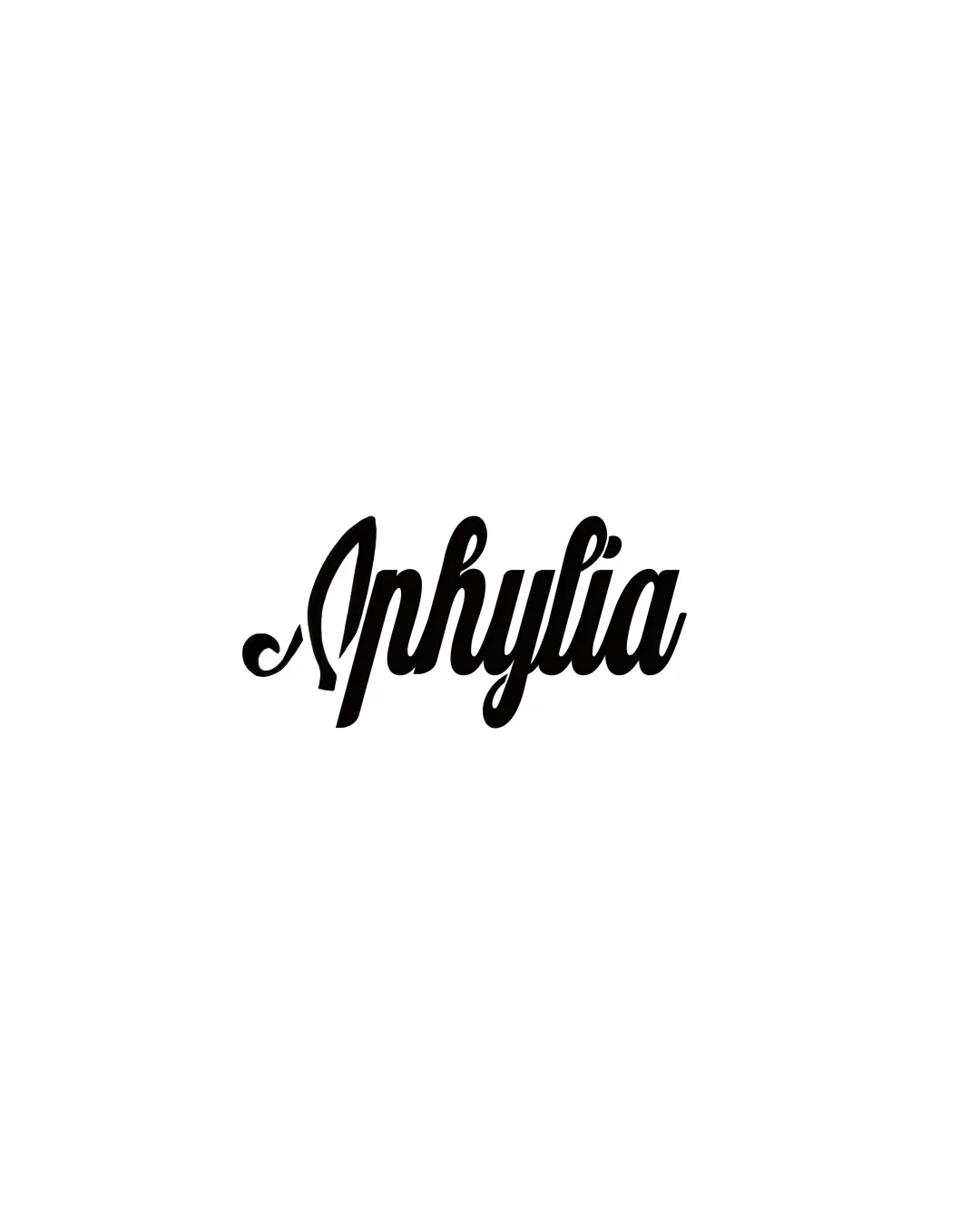
Try it Now!Logo review of Aphylia
 Logo analysis by AI
Logo type:
Style:
Detected text:
Business industry:
Review requested by Chanchanou
**If AI can recognize or misinterpret it, so can people.
Structured logo review
Legibility
![]() Distinct and stylish script gives personality.
Distinct and stylish script gives personality.![]() High contrast between the logo and the background.
High contrast between the logo and the background.
![]() The ornate script reduces legibility, particularly with the capital 'A' and the way letters connect.
The ornate script reduces legibility, particularly with the capital 'A' and the way letters connect.![]() Some characters like 'h' and 'y' blend into each other, which may confuse at smaller sizes.
Some characters like 'h' and 'y' blend into each other, which may confuse at smaller sizes.
Scalability versatility
![]() Monochrome color scheme is versatile for most print and web uses.
Monochrome color scheme is versatile for most print and web uses.![]() No thin strokes that would disappear entirely in scaling.
No thin strokes that would disappear entirely in scaling.
![]() Script and closely connected letters may lose clarity in small formats like favicons or embroidery.
Script and closely connected letters may lose clarity in small formats like favicons or embroidery.![]() Would struggle to retain personality on very small merchandise or digital avatars.
Would struggle to retain personality on very small merchandise or digital avatars.
200x250 px
100×125 px
50×62 px
Balance alignment
![]() Design feels visually balanced with a consistent baseline and equilibrium within the letterforms.
Design feels visually balanced with a consistent baseline and equilibrium within the letterforms.![]() Weight distribution remains even throughout the wordmark.
Weight distribution remains even throughout the wordmark.

Originality
![]() Custom script style adds some unique flair compared to generic typefaces.
Custom script style adds some unique flair compared to generic typefaces.
![]() Script wordmarks are common in the fashion and beauty sectors, reducing distinctiveness.
Script wordmarks are common in the fashion and beauty sectors, reducing distinctiveness.![]() No symbolic or abstract element present for memorable impact.
No symbolic or abstract element present for memorable impact.
Aesthetic look
![]() The script is visually pleasing and stylish, fitting for fashion-oriented brands.
The script is visually pleasing and stylish, fitting for fashion-oriented brands.![]() Clean, minimal use of color lets the letterform details stand out.
Clean, minimal use of color lets the letterform details stand out.
![]() Ornateness could be polarizing for more minimal or modern tastes.
Ornateness could be polarizing for more minimal or modern tastes.
Dual meaning and misinterpretations
![]() No accidental suggestive shapes or problematic associations detected.
No accidental suggestive shapes or problematic associations detected.
Color harmony
![]() Monochrome palette is always harmonious.
Monochrome palette is always harmonious.![]() Excellent high contrast ensures visibility across applications.
Excellent high contrast ensures visibility across applications.
Black
#000000
White
#FFFFFF