Wondering how your logo performs? 🧐
Get professional logo reviews in seconds and catch design issues in time.
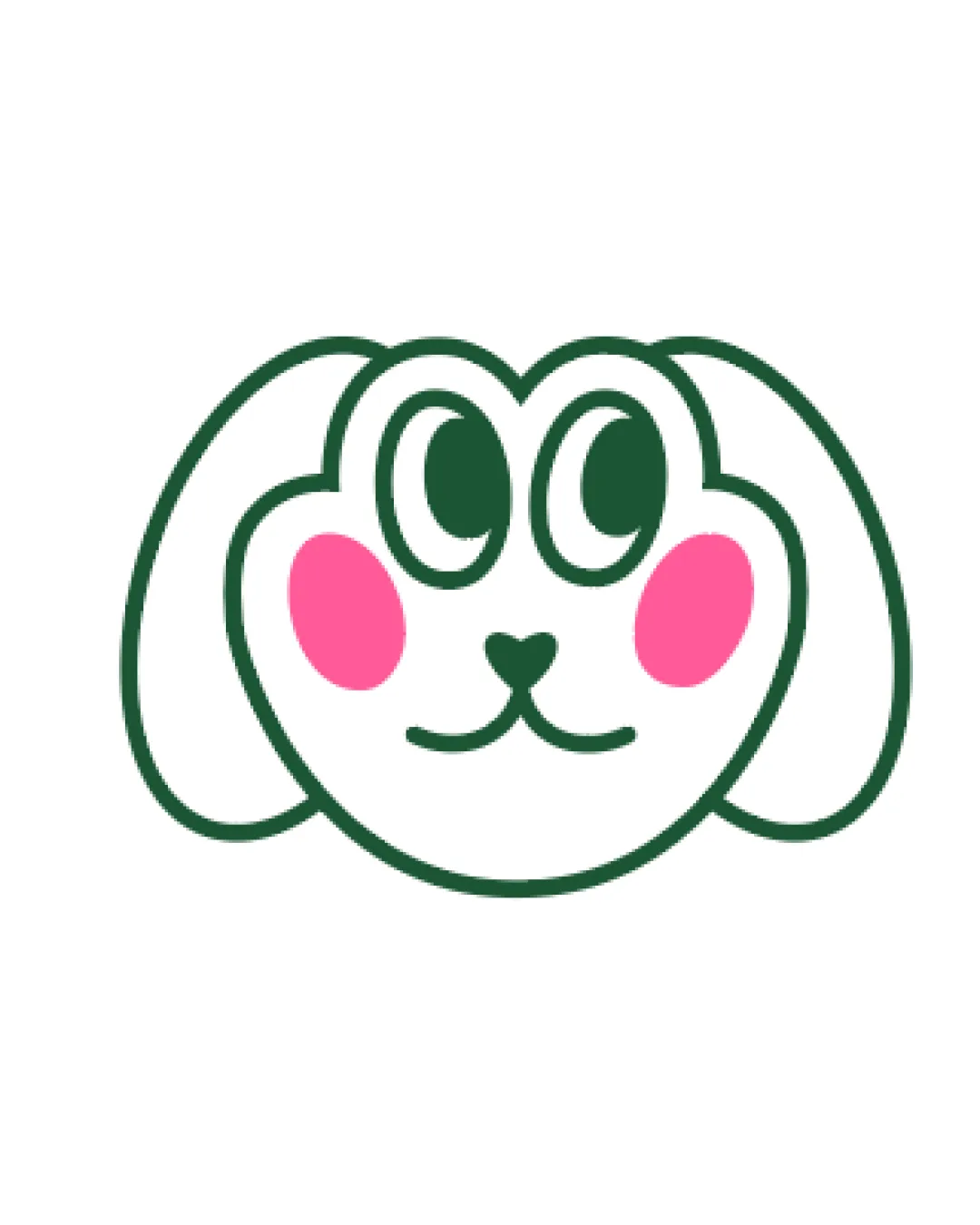
Try it Now!Logo review of cartoon bunny or dog face with exaggerated eyes an..
 Logo analysis by AI
Logo type:
Style:
Detected symbol:
Business industry:
Review requested by Anna_designn
**If AI can recognize or misinterpret it, so can people.
Structured logo review
Scalability versatility
Simple, thick outlines maintain clarity at various sizes.
Limited color palette aids reproduction on merchandise, signs, or app icons.
Fine facial features (nose/mouth) may blur when scaled very small, potentially losing expression on embroidery or favicon formats.

200x250 px

100×125 px

50×62 px
Balance alignment
Overall head shape and cheek placement are symmetrical and visually pleasing.
Eyes are evenly centered, providing good facial balance.
Slight visual heaviness due to overlapping eye shapes makes the top half feel busier than the lower half.


Originality
Playful eye style adds some distinct character.
Heart-shaped nose is a unique touch.
Animal face icons with chunky outlines are very common in child-related and pet industries; lacks a truly distinctive twist.
General style is reminiscent of widely used sticker and mascot aesthetics.
Aesthetic look
Friendly and non-threatening visual tone aligns with children’s products.
Vivid but limited use of pink cheeks adds charm without overwhelming.
Slightly generic–could be mistaken for both a dog and bunny, so lacks clear animal identity.
Some may find the exaggerated eyes too whimsical or awkward.
Dual meaning and misinterpretations
No inappropriate or ambiguous symbolism detected.
Friendly and approachable impression.
Color harmony
Only three main colors used, ensuring a harmonious and calm palette.
High contrast between outline, fill, and cheeks helps details pop.
DarkGreen
#205436
Pink
#FF78AA
White
#FFFFFF


