Wondering how your logo performs? 🧐
Get professional logo reviews in seconds and catch design issues in time.
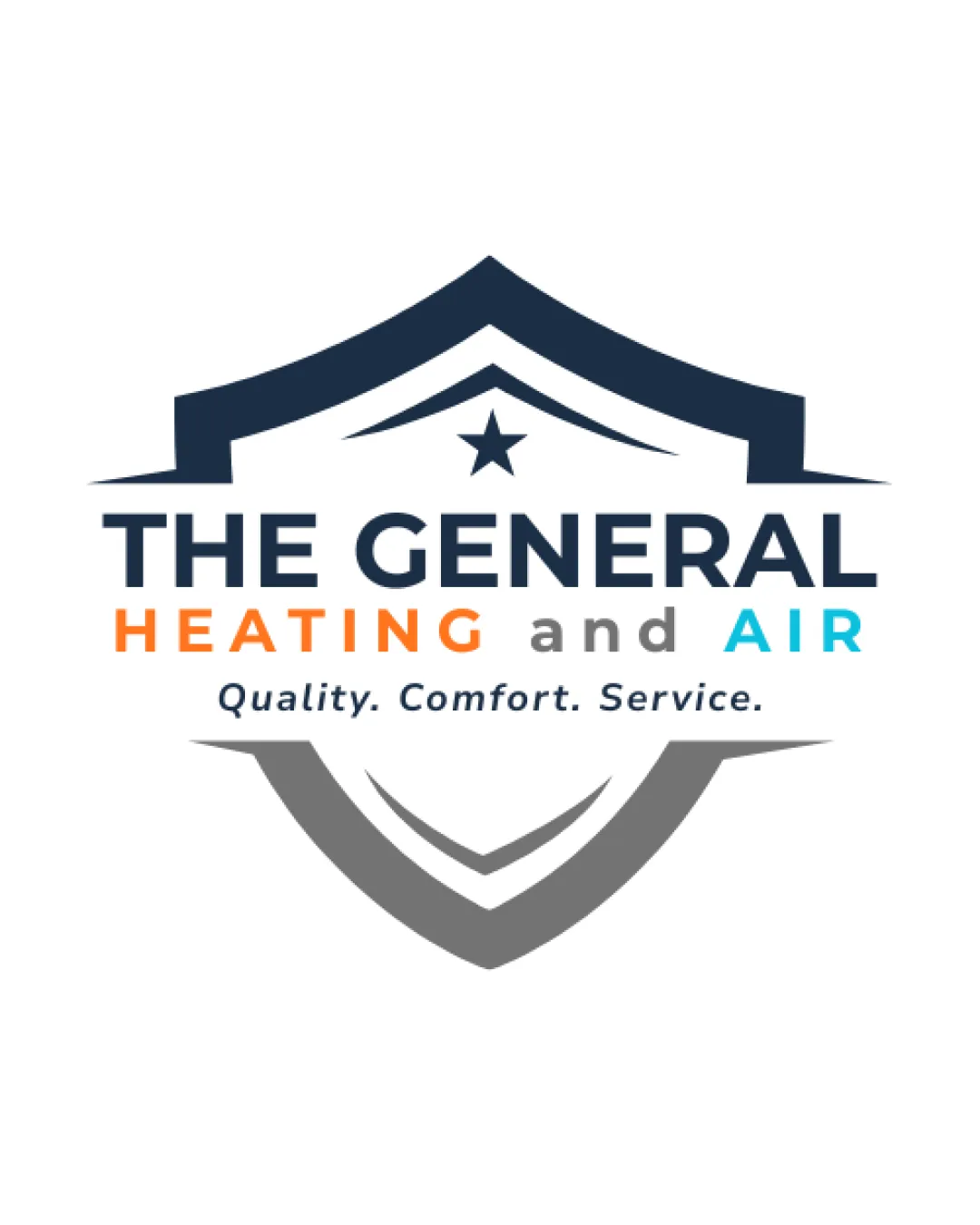
Try it Now!Logo review of THE GENERAL HEATING and AIR Quality. Comfort. Serv..
 Logo analysis by AI
Logo type:
Style:
Detected symbol:
Negative space:
Detected text:
Business industry:
Review requested by Hello12345
**If AI can recognize or misinterpret it, so can people.
Structured logo review
Legibility
![]() Text is bold, clear, and easy to read.
Text is bold, clear, and easy to read.![]() Good contrast between background and text colors.
Good contrast between background and text colors.![]() Different colors used for emphasis are highly visible.
Different colors used for emphasis are highly visible.
Scalability versatility
![]() Main logo form (shield and text) is reasonably simple and will reduce well for print and digital use.
Main logo form (shield and text) is reasonably simple and will reduce well for print and digital use.![]() Distinct layers help with recognition at mid sizes.
Distinct layers help with recognition at mid sizes.
![]() Long tagline may be illegible at small scales (e.g., business cards, favicons).
Long tagline may be illegible at small scales (e.g., business cards, favicons).![]() Thin lines within shield and tagline will disappear in embroidery or at small sizes.
Thin lines within shield and tagline will disappear in embroidery or at small sizes.![]() Multiple text elements increase complexity for smaller applications.
Multiple text elements increase complexity for smaller applications.
200x250 px
100×125 px
50×62 px
Balance alignment
![]() Overall symmetrical shield and text placement feels balanced.
Overall symmetrical shield and text placement feels balanced.![]() Text alignment is centered under the symbol, creating a cohesive vertical flow.
Text alignment is centered under the symbol, creating a cohesive vertical flow.
![]() Slight visual heaviness on top due to bold shield compared to lighter bottom elements.
Slight visual heaviness on top due to bold shield compared to lighter bottom elements.![]() Grey curve at base is thinner and visually recedes compared to top section.
Grey curve at base is thinner and visually recedes compared to top section.

Originality
![]() Combines industry-relevant shield and star imagery with corporate typography.
Combines industry-relevant shield and star imagery with corporate typography.
![]() The shield + star is a very generic combination, highly common across security, service, and authority design themes.
The shield + star is a very generic combination, highly common across security, service, and authority design themes.![]() Color-blocked text divisions (orange and blue) are standard for HVAC, lacking a unique twist.
Color-blocked text divisions (orange and blue) are standard for HVAC, lacking a unique twist.
Logomark wordmark fit
![]() Bold, geometric wordmark pairs well with the strong shield shape.
Bold, geometric wordmark pairs well with the strong shield shape.
![]() Typographic and symbolic weight is slightly disjointed—shield is more angular and dynamic, text remains static.
Typographic and symbolic weight is slightly disjointed—shield is more angular and dynamic, text remains static.![]() Minimal integration between logomark and wordmark (stacked vs interwoven approach).
Minimal integration between logomark and wordmark (stacked vs interwoven approach).
Aesthetic look
![]() Shield provides a professional, trustworthy appearance.
Shield provides a professional, trustworthy appearance.![]() Color hierarchy is visually appealing and modern.
Color hierarchy is visually appealing and modern.
![]() Design feels formulaic and lacks a distinct visual character.
Design feels formulaic and lacks a distinct visual character.![]() Multiple lines and text blocks add busyness and reduce elegance.
Multiple lines and text blocks add busyness and reduce elegance.
Dual meaning and misinterpretations
![]() No unintended suggestive imagery or inappropriate associations.
No unintended suggestive imagery or inappropriate associations.
Color harmony
![]() Color palette is well-coordinated and relevant to industry (cool blues for air, warm orange for heating).
Color palette is well-coordinated and relevant to industry (cool blues for air, warm orange for heating).![]() Strong contrast for primary text.
Strong contrast for primary text.
![]() Use of both blue and orange is typical to HVAC and reduces brand distinctiveness.
Use of both blue and orange is typical to HVAC and reduces brand distinctiveness.![]() Having four main colors plus a background could complicate reproduction in limited-color print situations.
Having four main colors plus a background could complicate reproduction in limited-color print situations.
Bunting
#213345
Grey
#828588
Orange
#FF7D1B
Cyan
#31C6F6
White
#FFFFFF