Wondering how your logo performs? 🧐
Get professional logo reviews in seconds and catch design issues in time.
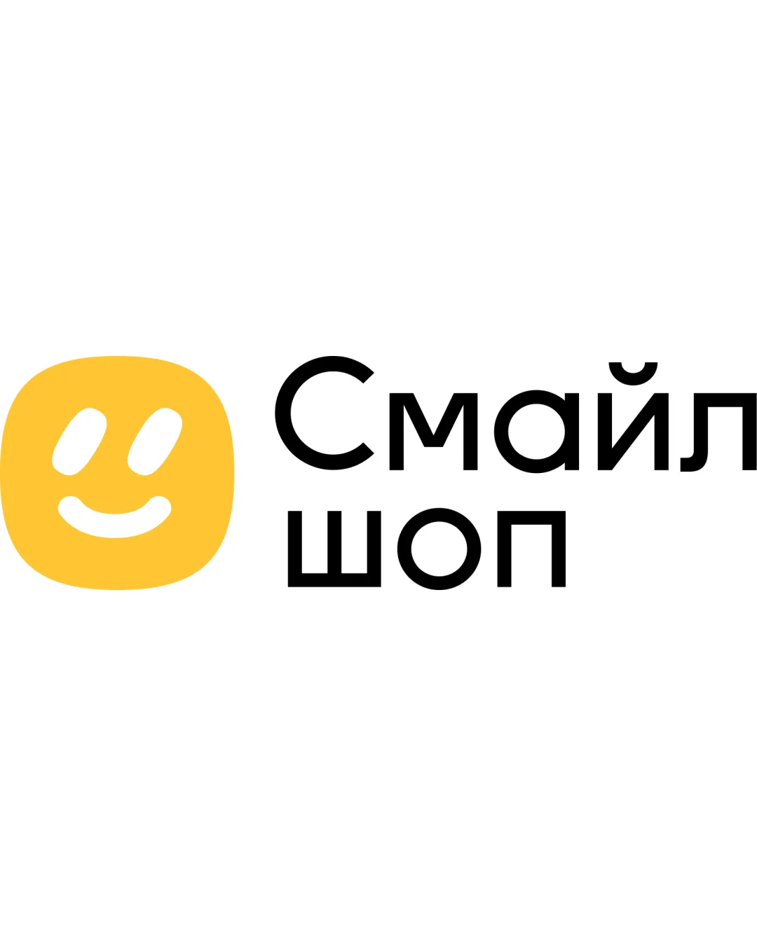
Try it Now!Logo review of Смайл шоп
 Logo analysis by AI
Logo type:
Style:
Detected symbol:
Detected text:
Business industry:
Review requested by Vova
**If AI can recognize or misinterpret it, so can people.
Structured logo review
Legibility
![]() Cyrillic text is extremely clean and easy to read.
Cyrillic text is extremely clean and easy to read.![]() Good use of kerning and font weight for high contrast and visibility.
Good use of kerning and font weight for high contrast and visibility.
Scalability versatility
![]() Minimalist design ensures recognizability in small sizes and on various mediums.
Minimalist design ensures recognizability in small sizes and on various mediums.![]() Strong contrast allows the mark to stand out across backgrounds.
Strong contrast allows the mark to stand out across backgrounds.
![]() The face/smile detail may begin to lose distinction at favicon or embroidery size, slightly compromising clarity, especially with thin lines for the mouth and eyes.
The face/smile detail may begin to lose distinction at favicon or embroidery size, slightly compromising clarity, especially with thin lines for the mouth and eyes.
200x250 px
100×125 px
50×62 px
Balance alignment
![]() Well-balanced spatial relationship between symbol and wordmark.
Well-balanced spatial relationship between symbol and wordmark.![]() Visual weight distribution is mostly harmonious.
Visual weight distribution is mostly harmonious.
![]() There is slight tension between the compact symbol and the comparatively airy wordmark, making the left side feel slightly heavier.
There is slight tension between the compact symbol and the comparatively airy wordmark, making the left side feel slightly heavier.

Originality
![]() The smiling face in a yellow square is approachable and reflects the brand idea directly.
The smiling face in a yellow square is approachable and reflects the brand idea directly.
![]() The smiley motif is highly generic and widely used in retail and tech, resulting in limited distinctiveness.
The smiley motif is highly generic and widely used in retail and tech, resulting in limited distinctiveness.![]() No unique twist or clever element sets it apart from other smile-based logos.
No unique twist or clever element sets it apart from other smile-based logos.
Logomark wordmark fit
![]() Font style and icon both have rounded, friendly geometry for good brand cohesion.
Font style and icon both have rounded, friendly geometry for good brand cohesion.
![]() Slight disconnect between the playfulness of the mark and the geometric rigidity of the type. An ever-so-slight mismatch in energy.
Slight disconnect between the playfulness of the mark and the geometric rigidity of the type. An ever-so-slight mismatch in energy.
Aesthetic look
![]() Looks clean, modern and visually inviting.
Looks clean, modern and visually inviting.![]() Good spacing gives a fresh, open feel.
Good spacing gives a fresh, open feel.
![]() Lacks unique aesthetic signature—feels a bit generic.
Lacks unique aesthetic signature—feels a bit generic.
Dual meaning and misinterpretations
![]() No inappropriate or accidental shapes present in mark or wordmark.
No inappropriate or accidental shapes present in mark or wordmark.
Color harmony
![]() Color palette is simple and harmonious.
Color palette is simple and harmonious.![]() Yellow conveys friendliness and draws attention, black text offers excellent contrast.
Yellow conveys friendliness and draws attention, black text offers excellent contrast.
Yellow
#FFD237
White
#FFFFFF
Black
#000000