Wondering how your logo performs? 🧐
Get professional logo reviews in seconds and catch design issues in time.
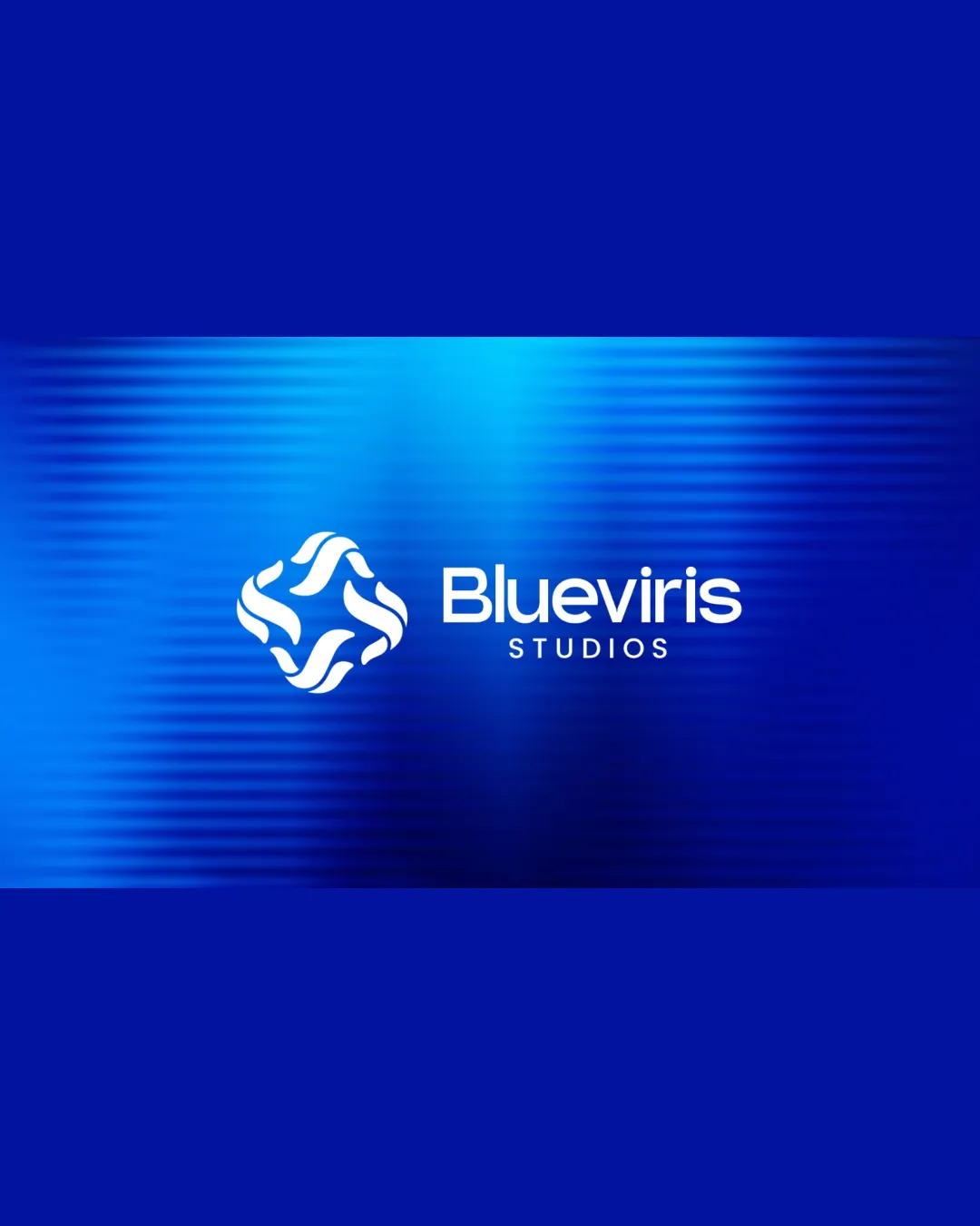
Try it Now!Logo review of Blueviris STUDIOS
 Logo analysis by AI
Logo type:
Style:
Detected symbol:
Negative space:
Detected text:
Business industry:
Review requested by Krishit6353
**If AI can recognize or misinterpret it, so can people.
Structured logo review
Legibility
![]() Text is clear and highly readable in both 'Blueviris' and 'STUDIOS'.
Text is clear and highly readable in both 'Blueviris' and 'STUDIOS'.![]() Color contrast between the white logotype and vibrant blue background is strong.
Color contrast between the white logotype and vibrant blue background is strong.
Scalability versatility
![]() The logo mark is simple enough to scale medium to large.
The logo mark is simple enough to scale medium to large.![]() Clean shapes without thin strokes ensure it works on digital and print.
Clean shapes without thin strokes ensure it works on digital and print.
![]() The background gradient effect may cause legibility or reproduction challenges at small sizes or in single-color applications.
The background gradient effect may cause legibility or reproduction challenges at small sizes or in single-color applications.![]() Word 'STUDIOS' may become indistinct at very small sizes.
Word 'STUDIOS' may become indistinct at very small sizes.![]() Highly detailed backgrounds will harm versatility for merchandise, embroidery, and favicons.
Highly detailed backgrounds will harm versatility for merchandise, embroidery, and favicons.
200x250 px
100×125 px
50×62 px
Balance alignment
![]() Symbol and logotype feel visually balanced in their spatial arrangement.
Symbol and logotype feel visually balanced in their spatial arrangement.![]() Text and symbol weights feel harmonious.
Text and symbol weights feel harmonious.
![]() Slight visual top-heaviness as the symbol is slightly more complex versus the geometric simplicity of the logotype, but this is not severe.
Slight visual top-heaviness as the symbol is slightly more complex versus the geometric simplicity of the logotype, but this is not severe.

Originality
![]() Symbol uses an abstract, interwoven motif which is uncommon in general media branding.
Symbol uses an abstract, interwoven motif which is uncommon in general media branding.![]() Monogram does not directly reference overly-used industry clichés.
Monogram does not directly reference overly-used industry clichés.
![]() Abstract circular marks are somewhat popular; without context this symbol could be interpreted generically. Lacks an immediate, industry-specific reference or unique visual hook.
Abstract circular marks are somewhat popular; without context this symbol could be interpreted generically. Lacks an immediate, industry-specific reference or unique visual hook.
Logomark wordmark fit
![]() The logomark and wordmark feel stylistically unified.
The logomark and wordmark feel stylistically unified.![]() Both logomark and type use curves, rounding out the overall aesthetic cohesively.
Both logomark and type use curves, rounding out the overall aesthetic cohesively.
Aesthetic look
![]() Modern, appealing, and visually clean.
Modern, appealing, and visually clean.![]() The gradient blue background and flowing shapes are attractive and appropriate for media or digital industries.
The gradient blue background and flowing shapes are attractive and appropriate for media or digital industries.
![]() The overall look flirts with being generic; a more distinctive touch in the symbol could help set it apart.
The overall look flirts with being generic; a more distinctive touch in the symbol could help set it apart.
Dual meaning and misinterpretations
![]() No inappropriate imagery or negative interpretations detected.
No inappropriate imagery or negative interpretations detected.
Color harmony
![]() Good use of monochromatic blue variants, supporting brand identity.
Good use of monochromatic blue variants, supporting brand identity.![]() High contrast between logomark/text and background.
High contrast between logomark/text and background.
![]() Heavily gradient backgrounds may clash or print poorly in some formats; multiple blue shades could reduce consistency in some mockups.
Heavily gradient backgrounds may clash or print poorly in some formats; multiple blue shades could reduce consistency in some mockups.
Cobalt Blue
#0033A1
Vivid Blue
#00AEEF
White
#FFFFFF