Wondering how your logo performs? 🧐
Get professional logo reviews in seconds and catch design issues in time.
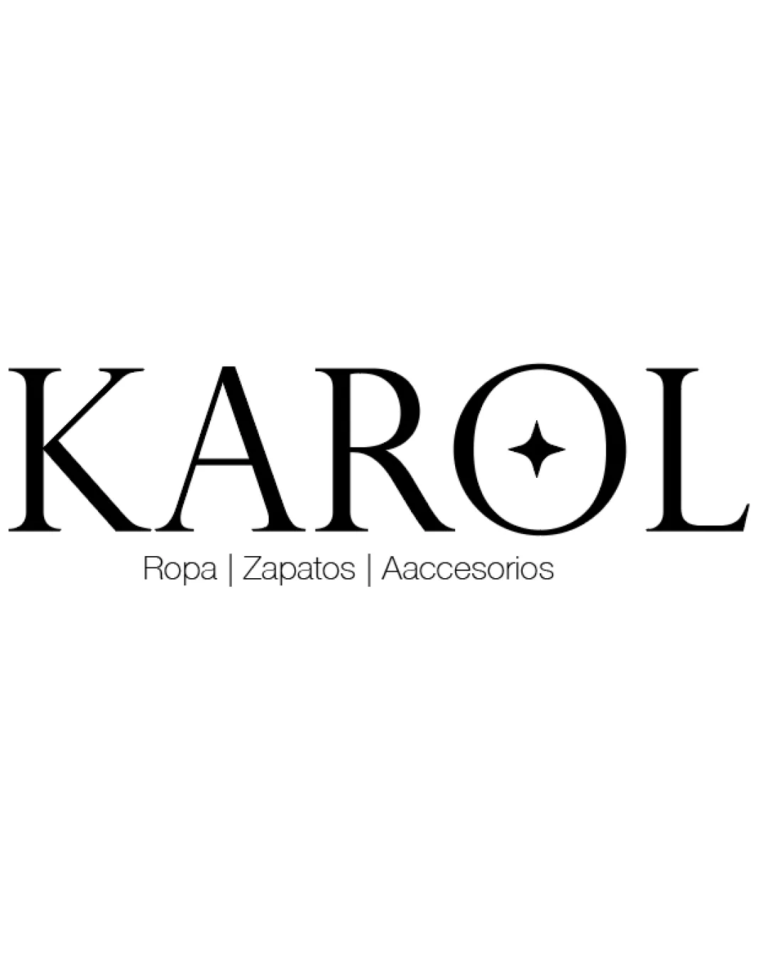
Try it Now!Logo review of KAROL, Ropa | Zapatos | Accesorios

 Logo analysis by AI
Logo type:
Style:
Detected symbol:
Detected text:
Business industry:
Review requested by Artston
**If AI can recognize or misinterpret it, so can people.
Structured logo review
Legibility
Main word 'KAROL' is highly legible with distinct, classic serif typography.
Supporting tagline is small but readable.
Scalability versatility
Logo remains clear at large and medium sizes such as on packaging or store signage.
Simple color scheme supports versatility.
The subtle feather and star details may lose clarity in very small applications or embroidery.
Tagline text may become illegible at smaller sizes, such as on social media profile icons or tags.

200x250 px

100×125 px

50×62 px
Balance alignment
Logomark and wordmark are visually aligned horizontally.
Symmetrical balance between the boxy icon and slender wordmark.
The logomark block feels slightly heavy compared to the delicate type, creating mild imbalance.


Originality
Use of hat with feather is industry relevant.
Star inside the 'O' gives a personal touch.
Hat symbols are common in fashion; execution is clean but not particularly novel.
The star-in-O trick is seen in many similar brands.
Logomark wordmark fit
Both components relate to fashion and elegance.
Serif font complements the delicate lines of the feather.
Logomark’s solid fill is visually heavier than the type, causing slight disharmony.
Icon’s modern minimalism contrasts the classic serif, dampening cohesion.
Aesthetic look
Elegant, professional, and suitable for target audience.
Simplicity promotes a luxurious feel.
Design verges on generic with expected elements; doesn't push visual boundaries.
Dual meaning and misinterpretations
No inappropriate dual meanings detected.
Symbols are clear and contextually relevant.
Color harmony
Classic black-and-white palette is timeless and stylish.
High contrast ensures visual clarity and upscale mood.
Black
#000000
White
#FFFFFF

