Wondering how your logo performs? 🧐
Get professional logo reviews in seconds and catch design issues in time.
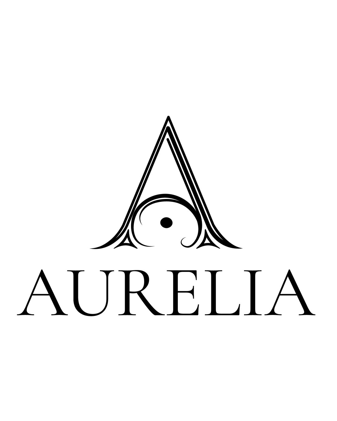
Try it Now!Logo review of AURELIA
 Logo analysis by AI
Logo type:
Style:
Detected symbol:
Detected text:
Business industry:
Review requested by IngridSpenner
**If AI can recognize or misinterpret it, so can people.
Structured logo review
Legibility
![]() The wordmark is extremely readable due to clean serif typography.
The wordmark is extremely readable due to clean serif typography.![]() Letter spacing is well-balanced and maintains clarity even at smaller sizes.
Letter spacing is well-balanced and maintains clarity even at smaller sizes.
Scalability versatility
![]() Logo design is crisp and printable at larger formats such as luxury product packaging, door signage, or event banners.
Logo design is crisp and printable at larger formats such as luxury product packaging, door signage, or event banners.![]() Single color ensures legibility and ease of reproduction.
Single color ensures legibility and ease of reproduction.
![]() Intricate linework in the monogram could lose detail at very small sizes, such as favicons or embroidery on apparel.
Intricate linework in the monogram could lose detail at very small sizes, such as favicons or embroidery on apparel.![]() Thin decorative elements might not scale well, causing visual noise when reduced.
Thin decorative elements might not scale well, causing visual noise when reduced.
200x250 px
100×125 px
50×62 px
Balance alignment
![]() Excellent central alignment between the logomark and wordmark.
Excellent central alignment between the logomark and wordmark.![]() Composition uses symmetry effectively with no elements feeling out of place.
Composition uses symmetry effectively with no elements feeling out of place.

Originality
![]() Unique integration of an eye-like dot and swirling flourish within the A makes the mark distinctive.
Unique integration of an eye-like dot and swirling flourish within the A makes the mark distinctive.![]() Combination of calligraphic ornamentation gives the logo a customized, premium feel.
Combination of calligraphic ornamentation gives the logo a customized, premium feel.
![]() Triangular monogram with decorative elements is a known luxury motif, which though elegant, isn't highly unconventional.
Triangular monogram with decorative elements is a known luxury motif, which though elegant, isn't highly unconventional.
Logomark wordmark fit
![]() Ornamental details of monogram and serif type harmonize perfectly, both conveying sophistication.
Ornamental details of monogram and serif type harmonize perfectly, both conveying sophistication.![]() The size relationship between logomark and wordmark is visually balanced and neither element overpowers the other.
The size relationship between logomark and wordmark is visually balanced and neither element overpowers the other.
Aesthetic look
![]() Elegant and luxurious look appropriate for high-end positioning.
Elegant and luxurious look appropriate for high-end positioning.![]() Minimal color usage keeps the design refined.
Minimal color usage keeps the design refined.
![]() Ornate details could make it feel slightly dated depending on target audience preferences, potentially limiting versatility for contemporary brands.
Ornate details could make it feel slightly dated depending on target audience preferences, potentially limiting versatility for contemporary brands.
Dual meaning and misinterpretations
![]() Abstract elements are tastefully done and do not evoke inappropriate associations.
Abstract elements are tastefully done and do not evoke inappropriate associations.
![]() Central dot and swirl could be mistaken for an 'eye' symbol, which may or may not be intended, but it does not create a problematic interpretation.
Central dot and swirl could be mistaken for an 'eye' symbol, which may or may not be intended, but it does not create a problematic interpretation.
Color harmony
![]() Single black-and-white palette is classic, versatile, and effective for luxury branding.
Single black-and-white palette is classic, versatile, and effective for luxury branding.
Black
#000000
White
#FFFFFF