What to preserve
Combines the brand's name '180 Beauty' with a silhouette and hair motif in the '8' character to convey beauty and transformation. Gold and black palette establishes a high-end, elegant impression.
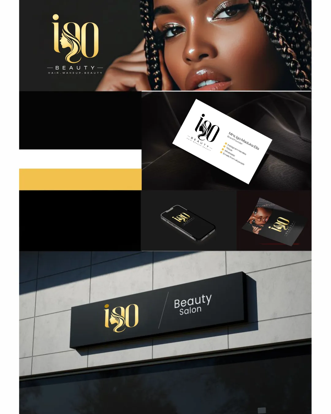
Distinctive, elegant, and directly relevant branding for the beauty sector. Fully functional on real-life applications; optimize for smallest sizes.
Focus on the changes that matter. Keep what makes the logo work.
Combines the brand's name '180 Beauty' with a silhouette and hair motif in the '8' character to convey beauty and transformation. Gold and black palette establishes a high-end, elegant impression.
Fine details may vanish at small sizes, potentially harming usability for digital icons or tiny print.
Improves readability and recognition at all sizes without losing concept.
The mark immediately fits a modern beauty salon, hair/makeup service through the palette and integrated silhouette.
Estimated colors. Use the original design file for exact values.
Create a full color palette using these colors
Create new palette
Inspect spacing with the guide. Optical balance may differ from geometric centering.
Get a clear logo score, key risks, and priority fix ideas before your client or audience sees it.
More credits needed
Add credits to continue without losing your work.
Then $7/month. Cancel anytime.
Essential logo review with AI
Estimated progress