celebrations 70 years logo logo review
3.5/5
Logo score Combination logo category

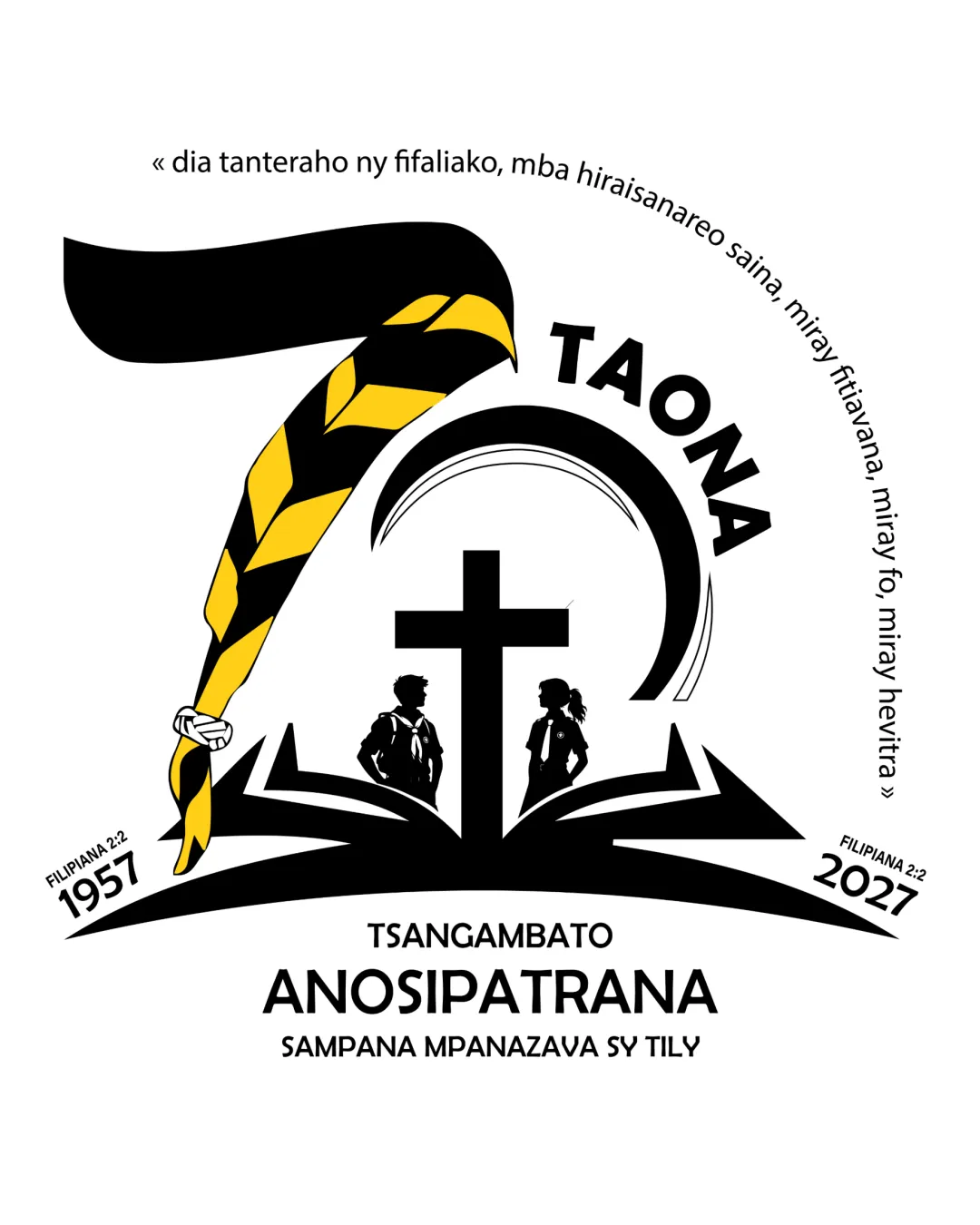
celebrations 70 years logo

creative700354 Essential logo review

A strong, memorable anniversary logo with clear thematic integration; ensure central details remain readable for all applications.

This logo lockup shows solid execution, supported by text readability and text hierarchy; improving visual balance is the clearest next step.

Combination Logo Illustrative, Flat Color Community/faith-based/anniversary
4/5
Legibility
3.6/5
Originality
3.3/5
Balance
3.4/5
Scale
3/5
Color
4/5
Style consistency
Your next steps

What to fix first

Focus on the changes that matter. Keep what makes the logo work.

What to preserve

The logo effectively commemorates the 70th anniversary by integrating recognizable symbols of faith, education, and unity in a cohesive celebratory design.

Spelling & grammar

Confirm the wording

Some text is in Malagasy; main components are legible, but special names may need checking for accuracy.


1

central details (cross, book, silhouettes)

Test at smaller size or simplify inner details if necessary.

Medium priority Visible issue Medium effort

Silhouettes and book details may lose clarity at small sizes due to their fine lines and close composition.

See the category review
Detailed review

Logo performance breakdown

4/5

Brief & logo match

The logo visually delivers on the 70th anniversary celebration theme for a faith-based community, with minor concerns over detail reduction in smaller formats.

5/5

Misinterpretations

  • No negative or ambiguous associations present.
4/5

Legibility

Wordmark 4/5 · Layout 4/5

  • Main message, anniversary year, and group name are clearly legible.
4/5

Style consistency

  • Wordmark and symbol arrangement is cohesive and clear.
3.6/5

Originality

Symbol 4/5 · Wordmark 3/5

  • Combination of milestone, faith, education, and community motifs is distinctive.
3.4/5

Scalability

Symbol 3/5 · Wordmark 4/5 · Layout 3/5

  • Distinctive at full size; some loss of detail at small scale.
  • Silhouettes and book details may lose clarity at small sizes due to their fine lines and close composition.

    Visible issue central details (cross, book, silhouettes)

    Try: Test at smaller size or simplify inner details if necessary.

3.3/5

Balance alignment

Symbol 3/5 · Wordmark 4/5 · Layout 3/5

  • Strong structure; top-heavy composition from oversized '7'.
  • The large stylized '7' leans strongly left and dominates the layout, creating slight visual imbalance against the finer elements (cross, silhouettes, book) which are tightly clustered below.

    Visible issue main composition
Uploaded logoAlignment guide overlay

Inspect spacing with the guide. Optical balance may differ from geometric centering.

3/5

Color harmony

Symbol 3/5 · Wordmark 3/5

  • Effective contrast; possible over-dominance of yellow accent.
  • Yellow and black scarf is visually strong and symbolic, but slightly overpowers the monochrome lower elements.

    Optional refinement scarf on '7'
Black#000000
Yellow#FFC72C
White#FFFFFF

Estimated colors. Use the original design file for exact values.

Create a full color palette using these colors

Create new palette
Try your own review

Wondering how your logo performs?

Get a clear logo score, key risks, and priority fix ideas before your client or audience sees it.

Review my logo