Wondering how your logo performs? 🧐
Get professional logo reviews in seconds and catch design issues in time.
Try it Now!Logo review of 20 Years Anniversary AirArabia
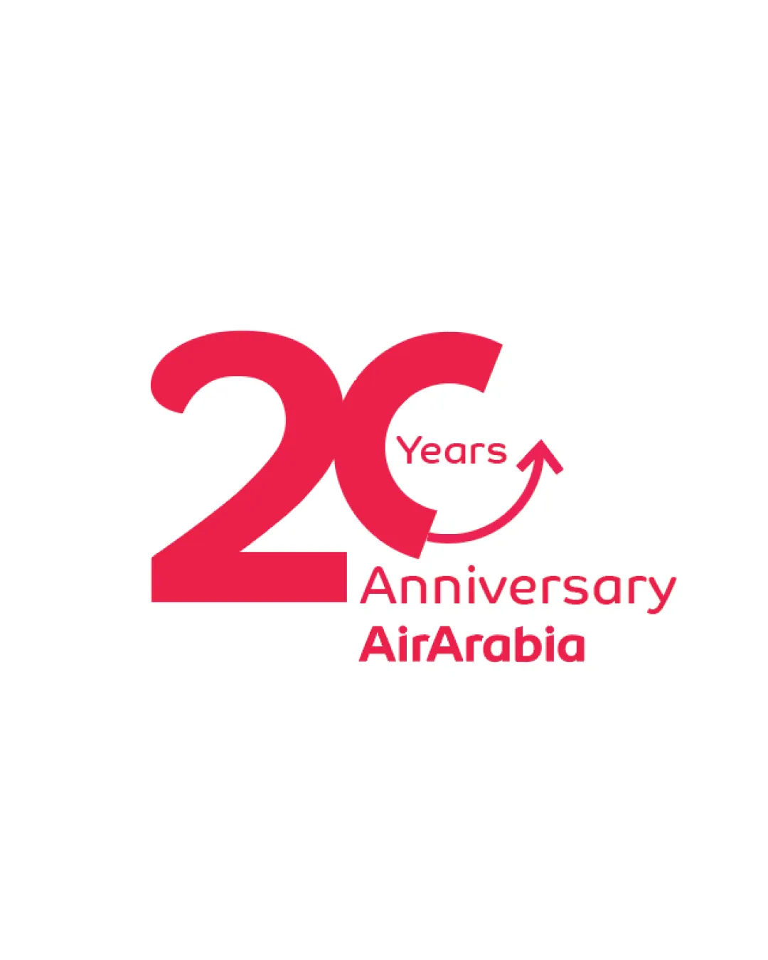
 Logo analysis by AI
Recognized style:
Logo type:
Detected symbol:
Detected text:
Business industry:
Review requested by Niazi
**If AI can recognize or misinterpret it, so can people.
Structured logo review
Legibility
Text is clear and easy to read.
Scalability versatility
Simple design ensures versatility across different sizes.
The thin arrow may not be as visible at smaller sizes.

200x250 px

100×125 px

50×62 px
Balance alignment
Elements are well-aligned and balanced.
Slight asymmetry in the arrow placement could be refined.


Originality
Unique combination of numbers and symbolic arrow.
The concept of using numbers with arrows is not entirely novel.
Logomark wordmark fit
The text and symbol are integrated cohesively.
Aesthetic look
The logo looks professional and festive.
Cultural sensitivity dual meaning
No cultural sensitivity issues detected.
Color harmony
The monochrome red palette is visually appealing and consistent.


