Wondering how your logo performs? 🧐
Get professional logo reviews in seconds and catch design issues in time.
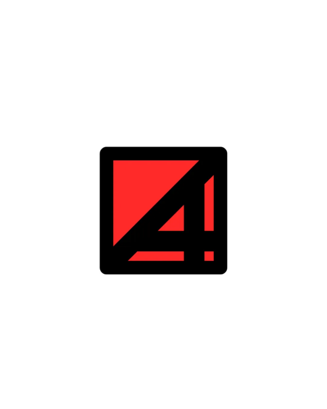
Try it Now!Logo review of 4!
 Logo analysis by AI
Logo type:
Style:
Detected symbol:
Detected text:
Business industry:
Review requested by Not_goutham_at_all
**If AI can recognize or misinterpret it, so can people.
Structured logo review
Legibility
![]() The number 4 is bold, blocky, and instantly recognizable.
The number 4 is bold, blocky, and instantly recognizable.![]() Exclamation mark is clear due to contrast and separation from the number.
Exclamation mark is clear due to contrast and separation from the number.
![]() Some viewers may initially mistake the geometric shapes for something abstract, requiring a second look to read the '4!'.
Some viewers may initially mistake the geometric shapes for something abstract, requiring a second look to read the '4!'.
Scalability versatility
![]() Simple, thick lines ensure strong visibility at small sizes such as app icons, favicons, and business cards.
Simple, thick lines ensure strong visibility at small sizes such as app icons, favicons, and business cards.![]() Design remains effective on large formats like billboards or event signage.
Design remains effective on large formats like billboards or event signage.![]() Bold color makes it stand out on any background.
Bold color makes it stand out on any background.
200x250 px
100×125 px
50×62 px
Balance alignment
![]() The geometric placement within the square yields excellent visual balance.
The geometric placement within the square yields excellent visual balance.![]() Even space between the elements and square borders adds to the logo's stability.
Even space between the elements and square borders adds to the logo's stability.

Originality
![]() Clever use of the number '4' and an exclamation mark within a square creates a unique and memorable mark.
Clever use of the number '4' and an exclamation mark within a square creates a unique and memorable mark.![]() Monogrammatic approach adds distinction.
Monogrammatic approach adds distinction.
![]() The geometric treatment is trendy in contemporary branding and has some familiarity, especially for TV or channel branding.
The geometric treatment is trendy in contemporary branding and has some familiarity, especially for TV or channel branding.
Aesthetic look
![]() Minimalist aesthetic with strong, saturated color leads to high impact.
Minimalist aesthetic with strong, saturated color leads to high impact.![]() Clean, modern lines make the logo visually appealing.
Clean, modern lines make the logo visually appealing.
![]() Slightly generic in the geometric genre; could be mistaken for any numeric or media brand without supporting context.
Slightly generic in the geometric genre; could be mistaken for any numeric or media brand without supporting context.
Dual meaning and misinterpretations
![]() Straightforward numeric and punctuation motif; no unintended imagery detected.
Straightforward numeric and punctuation motif; no unintended imagery detected.
Color harmony
![]() Simple 2-color palette provides strong contrast and visual punch.
Simple 2-color palette provides strong contrast and visual punch.![]() Red and black are a classic, powerful pairing suitable for digital and print.
Red and black are a classic, powerful pairing suitable for digital and print.
Red
#FF2424
Black
#000000
White
#FFFFFF


