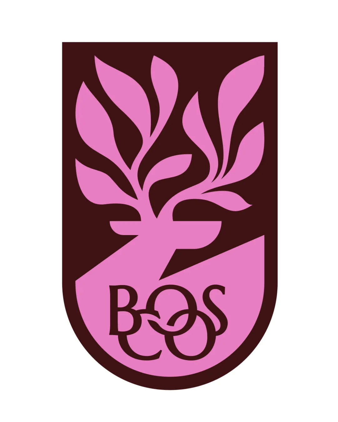
Abstract geometric ribbon symbol logo logo review
3.9/5
Logo score Symbol category

Abstract geometric ribbon symbol logo

creative214775 Essential logo review

Confident, scalable abstract symbol with strong execution; main risk is motif distinctiveness within similar brand environments.

This logomark shows solid execution, supported by clarity at smaller sizes and visual balance; improving distinctiveness is the clearest next step.

Symbol Flat, Geometric, Minimal
3/5
Originality
4/5
Balance
5/5
Scale
Your next steps

What to fix first

Focus on the changes that matter. Keep what makes the logo work.

1

whole mark

Assess whether similar motifs are widely used in relevant markets.

Medium priority Worth testing Medium effort

The mark is composed of parallelogram shapes forming an abstract figure that might resemble stylized initials (possibly 'F' or 'P'), an arrow, or ribbon/layered structure, which are common in the tech/finance/forward-thinking industry space.

How to check

Review competing brands for similar geometric ribbon/arrow logomarks to avoid visual overlap.
See the category review
Detailed review

Logo performance breakdown

Not scored

Brief & logo match

There isn't enough brand context to assess the match.

5/5

Scalability

  • Simple, bold forms will reproduce well at all sizes.
5/5

Misinterpretations

  • No clear risk of unintended or negative interpretations.
4/5

Balance alignment

Available in Advanced logo reviews
3/5

Originality

Available in Advanced logo reviews
Try your own review

Wondering how your logo performs?

Get a clear logo score, key risks, and priority fix ideas before your client or audience sees it.

Review my logo