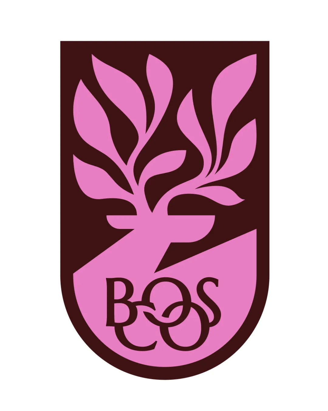
BOS kombucha shield emblem logo review
4.1/5
Logo score Emblem category

BOS kombucha shield emblem

graphstorm Advanced logo review

Original and cohesive, but custom letter overlap risks legibility and scalability for a busy retail setting.

This emblem shows strong execution, supported by distinctive construction and visual balance; improving clarity at smaller sizes is the clearest next step.

Emblem Flat, Bold, Geometric Food And Beverage
5/5
Originality
4/5
Balance
3/5
Scale
4/5
Color
Your next steps

What to fix first

Focus on the changes that matter. Keep what makes the logo work.

1

Emblem lower section (lettering)

Refine letter spacing or separation to improve instant readability.

High priority Visible issue Medium effort

The custom 'BOS' wordmark uses intertwining outlined letters, reducing immediate legibility, especially for the 'O' and overlap with the 'B' and 'S'.

See the category review
2

Full emblem, especially lower lettering

Test at multiple sizes and reduce intricate overlaps if necessary.

Medium priority Worth testing Low effort

Fine overlapping lines and detail in the lettering may congeal or become unclear at small sizes or in low-resolution applications.

See the category review
Detailed review

Logo performance breakdown

4/5

Brief & logo match

The logo successfully communicates vibrancy and originality with its electric magenta palette and bold forest imagery, but letter clarity limits instant impact.

Legibility

  • The custom 'BOS' wordmark uses intertwining outlined letters, reducing immediate legibility, especially for the 'O' and overlap with the 'B' and 'S'.

    Visible issue Emblem lower section (lettering)

    Try: Refine letter spacing or separation to improve instant readability.

5/5

Originality

  • Custom geometric plant motif and unique overlapping letterforms deliver a visually distinct and memorable brand mark.
4/5

Color harmony

  • Rich magenta and dark brown provide a vibrant, energetic contrast suiting a bold, unconventional beverage brand.
Magenta#E051A8
Dark Brown#3D2323

Estimated colors. Use the original design file for exact values.

Create a full color palette using these colors

Create new palette
4/5

Balance alignment

  • Strong overall symmetry and dynamic composition create a sense of energy and movement.
  • The magenta plant form's upper leaves come close to the edge on the right compared to the left, creating slight visual tension against the shield border.

    Optional refinement Negative space between plant motif and shield border (upper right)

    Try: Adjust leaf placements for more even spacing within the emblem enclosing shape.

Uploaded logoAlignment guide overlay

Inspect spacing with the guide. Optical balance may differ from geometric centering.

3/5

Scalability

  • Fine overlapping lines and detail in the lettering may congeal or become unclear at small sizes or in low-resolution applications.

    Worth testing Full emblem, especially lower lettering

    Try: Test at multiple sizes and reduce intricate overlaps if necessary.

5/5

Misinterpretations

This review includes a score but no supporting explanation for this category.

4/5
Market fit

Category positioning

Category fit is strong with bold, natural motifs for beverage, but complex letter overlays may reduce distinctiveness in crowded kombucha space.

1
Category Fit
Good fit

Vibrant natural imagery suits kombucha and wellness; magenta for standout appeal.

2
Differentiation Risk
Some overlap

Original plant and color theme is distinctive, but the intertwined BOS may be misread or missed at a glance.

Brand impression

Logo personality

The impression your logo creates.

The logo feels bold and energetic through its vibrant color and lively shapes, with a modern, somewhat formal attitude and creative edge.

AI interpretation of the visible design. These describe personality, not quality.

Presence

Strongly bold

How strongly it attracts attention.

UnderstatedBold

The bright magenta, bold shapes, and shield format make the logo highly attention-grabbing.

Attitude

Leans playful

How serious or lighthearted it feels.

SeriousPlayful

Playful organic leaves add energy, but structured composition keeps some seriousness.

Formality

Leans formal

How relaxed or formal it appears.

CasualFormal

The shield and geometric letterforms give a ceremonial, formal touch despite the natural theme.

Style

Strongly contemporary

Heritage cues versus a current look.

ClassicContemporary

Color palette and geometric abstraction create a distinctly contemporary visual style.

Emotional tone

Leans warm

Its emotional feel, beyond colour temperature.

WarmCool

The magenta gives a lively, warm impression, offset by deep brown for some grounding.

Positioning

Leans luxury

Everyday appeal versus luxury cues.

EverydayLuxury

Colorful, high-impact design and custom emblem convey a premium, unconventional beverage positioning.

From design file to real use

Use-case readiness

See your logo in context, then check what needs attention before production. Settings use the colors detected in your logo where available.

  • 5 look suitable
  • 3 need adjustment
  • 1 needs testing

Website header

Ready

Desktop

Mobile

Favicon

Adjust first
Before you use it

Intricate letter overlaps may become unreadable at very small sizes.

Google search

Adjust first
Before you use it

Intricate letter overlaps may become unreadable at very small sizes.

Social media avatar

Ready

Business card

Ready

Signs & signage

Needs testing
Before you use it

Large-format signage should be tested for legibility at a distance, given the fine linework in the lettering.

Packaging & labels

Ready

Embroidery

Adjust first
Before you use it

Thin, overlapping letterforms may not embroider cleanly and should be thickened or separated for this use.

One-color printing

Ready
Delivery checklist

Logo delivery checklist

Format templates · Included versions and delivery checklist
Uploaded logo
Reviewed upload

Standalone logomark or monogram

Included

The uploaded asset includes a standalone mark.

Wordmark and primary lockup

High priority Recommended

Pair the mark with a wordmark for full brand identification and wider applications.

One-color logo version

High priority Recommended

Prepare a monochrome version for restricted print and production methods.

Reversed light logo version

Medium priority Recommended

Prepare a light version for dark brand backgrounds.

Simplified small-size version

Medium priority Recommended

Use a responsive variant where fine details become fragile at small sizes.

Presentation kit

Logo presentation copy and mockup ideas

Logo presentation ideas

Hover over or select a slide to highlight its notes.

Slide 1

Positioning statement

A dynamic magenta forest emblem with expressive custom lettering positions BOS Kombucha as energetic, creative, and memorable.

Slide 2

Primary emblem

A magenta and brown shield featuring a dynamic, stylized tree with branching leaves and intricate custom BOS lettering integrated at the base.

Slide 3 · Application idea

Mockup idea 1

A kombucha glass bottle with the magenta shield emblem as a neck label wrap.

Slide 4 · Application idea

Mockup idea 2

Retail shelf display: repeat the emblem on a refrigerated case, showing the strong color contrast against dark backgrounds.

Slide 5 · Application idea

Mockup idea 3

Instagram social media avatar using just the plant motif within the shield for clarity.

Slide 6

Design rationale

The stylized tree motif reinforces the product's natural and vibrant forest theme.
Bold magenta and deep brown contrast create shelf impact and accentuate the product's unconventional flavor profile and positioning as different from competing kombucha brands.

Try your own review

Wondering how your logo performs?

Get a clear logo score, key risks, and priority fix ideas before your client or audience sees it.

Review my logo