entire mark
Test the mark at various small sizes to ensure negative space remains clear.
The negative space between the shapes is fairly thin, especially at the corners; this might merge or lose definition at small sizes.
See the category review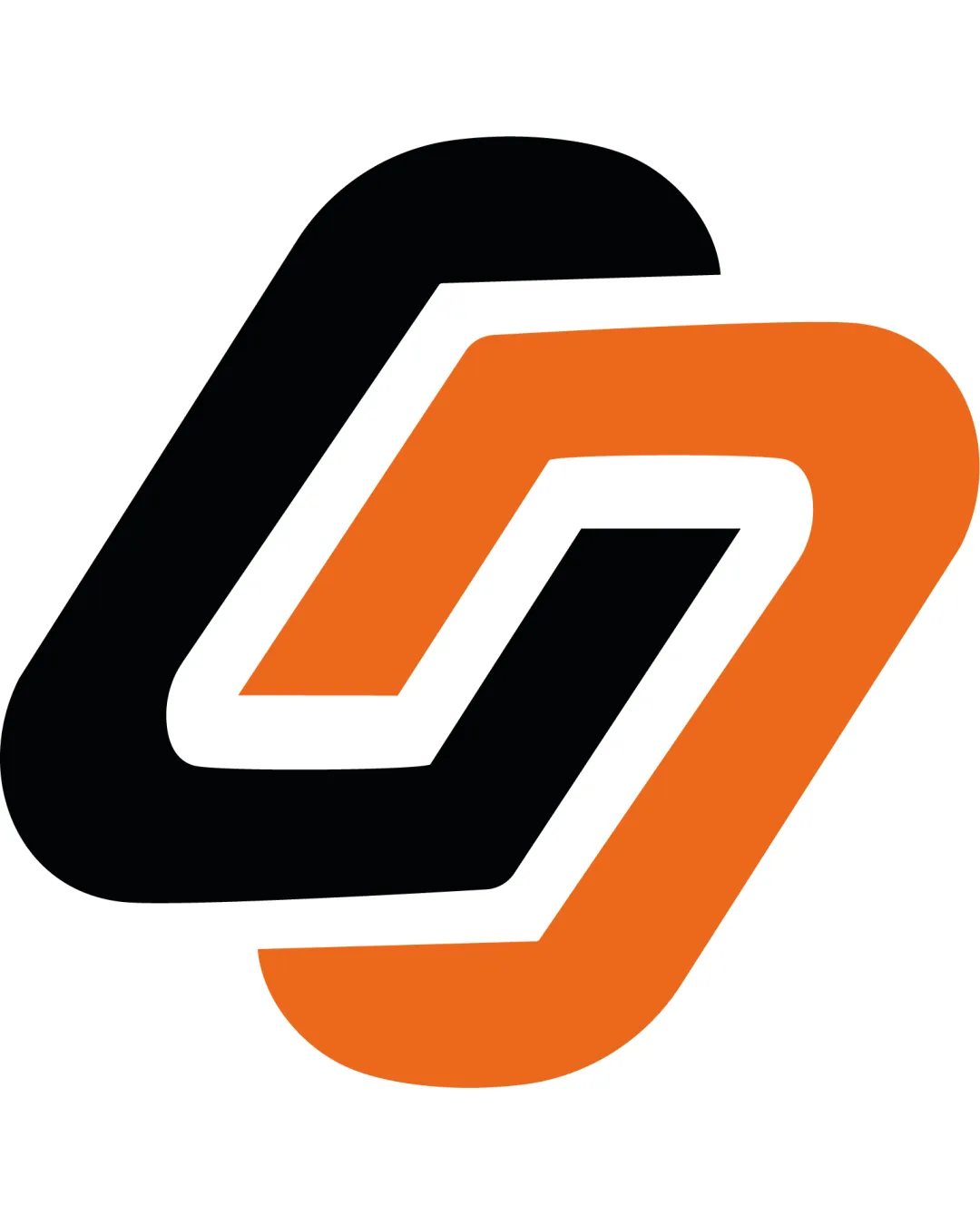
A dynamic and functional geometric symbol with modern appeal, though relatively familiar in tech/connection branding; main concerns are distinctiveness in a crowded field and clarity at small scale.
This logomark has a workable foundation; improving distinctiveness is the clearest next step.
Focus on the changes that matter. Keep what makes the logo work.
entire mark
The negative space between the shapes is fairly thin, especially at the corners; this might merge or lose definition at small sizes.
See the category reviewThe abstract interlocking symbol conveys energy or connection, which is apt for the name 'PULSO' and likely tech-related use, though similar motifs are somewhat prevalent.
Estimated colors. Use the original design file for exact values.
Create a full color palette using these colors
Create new palette
Inspect spacing with the guide. Optical balance may differ from geometric centering.
Get a clear logo score, key risks, and priority fix ideas before your client or audience sees it.
More credits needed
Add credits to continue without losing your work.
Then $7/month. Cancel anytime.
Essential logo review with AI
Estimated progress