What to preserve
The modular, geometric AAK monogram delivers a modern, memorable identity that reflects a forward-thinking design studio.
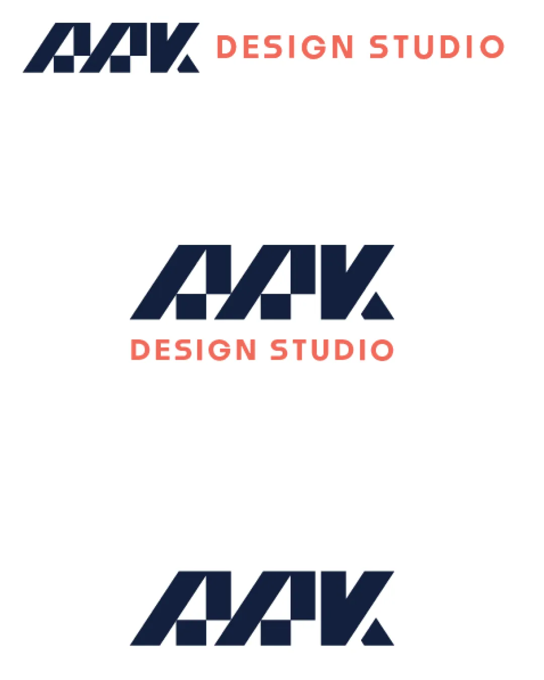
A strong, contemporary logo system with good scalability and memorable structure, but minor letter clarity and long-term distinctiveness can be further refined.
This logo set shows strong execution, supported by visual balance and text readability; improving distinctiveness is the clearest next step.
Focus on the changes that matter. Keep what makes the logo work.
The modular, geometric AAK monogram delivers a modern, memorable identity that reflects a forward-thinking design studio.
Logo preview unavailable. The written feedback is still available on this card.
monogram (all versions)
The highly stylized AAK monogram uses modular blocks and angled cuts, making the 'K' especially abstract and potentially difficult to read at a glance.
See the category reviewThe bold geometric monogram and cohesive wordmark system deliver a professional visual identity suitable for presentations, though readability refinements could strengthen distinctiveness and versatility.
Monogram 3/5 · Wordmark 5/5 · Layout 5/5
The highly stylized AAK monogram uses modular blocks and angled cuts, making the 'K' especially abstract and potentially difficult to read at a glance.
Try: Introduce subtle refinements to the K to improve immediate readability, especially in small/fast-view digital applications.
Logo preview unavailable. The written feedback is still available on this card.
Monogram 4/5 · Wordmark 5/5 · Layout 4/5
Monogram 4/5 · Wordmark 4/5 · Layout 4/5
There is good alignment and weight distribution overall, but the geometric block cuts introduce slightly more negative space after the last 'K', making the right edge feel lighter than the left; this slightly impacts overall balance, especially when paired with the wordmark below.

Inspect spacing with the guide. Optical balance may differ from geometric centering.
Monogram 4/5 · Wordmark 3/5
While the modular, stencil-like construction is visually distinct and creative, this geometric style is increasingly familiar in the design and tech industry; additional ownable detail or a revision to the 'K' could improve uniqueness.
Get a clear logo score, key risks, and priority fix ideas before your client or audience sees it.
More credits needed
Add credits to continue without losing your work.
Then $7/month. Cancel anytime.
Essential logo review with AI
Estimated progress