Concept & direction
The logo combines a modern abstract mark with bold sans-serif text to convey a contemporary retail identity.
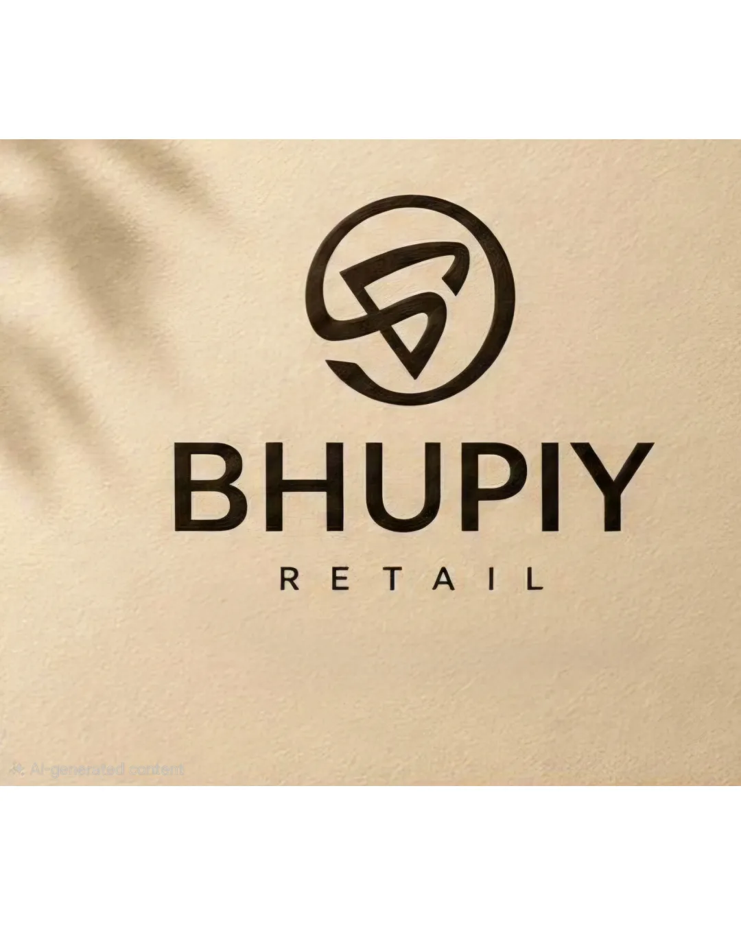
A visually appealing and well-balanced modern retail logo that could benefit from a more distinctive logomark for stronger memorability.
This logo lockup shows solid execution, supported by visual balance and text readability; improving distinctiveness is the clearest next step.
Focus on the changes that matter. Keep what makes the logo work.
The logo combines a modern abstract mark with bold sans-serif text to convey a contemporary retail identity.
Standalone mark
The mark forms an abstract 'B' inside a circle but uses a generic looping style seen in other brands, potentially limiting distinctiveness.
Gauge distinctiveness in target market.
The logo conveys a clean, modern retail presence, but could better stand out with a more unique symbol.
Wordmark 5/5 · Layout 4/5
The wordmark 'BHUPIY' is clear and readable; no immediate issues found, but inspect small-scale rendering if used in compact formats.
Symbol 4/5 · Wordmark 4/5 · Layout 4/5
Spacing between the wordmark (BHUPIY) and the tagline (RETAIL) is visually even, but the tagline is a bit small relative to the wordmark, slightly reducing visual balance.

Inspect spacing with the guide. Optical balance may differ from geometric centering.
Symbol 4/5 · Wordmark 4/5 · Layout 4/5
Symbol 3/5 · Wordmark 3/5
The mark forms an abstract 'B' inside a circle but uses a generic looping style seen in other brands, potentially limiting distinctiveness.
Try: Explore subtle modifications to the symbol for stronger uniqueness.
Check: Gauge distinctiveness in target market.
Get a clear logo score, key risks, and priority fix ideas before your client or audience sees it.
More credits needed
Add credits to continue without losing your work.
Then $7/month. Cancel anytime.
Essential logo review with AI
Estimated progress