Concept & direction
The logo integrates a cross within the 't' of 'ets' to represent theological themes, supported by a modern, flowing wordmark for the author's name.
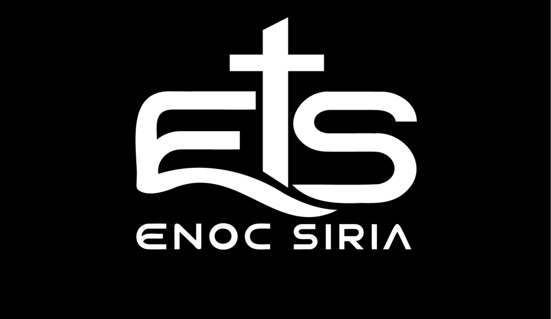
A visually striking, modern personal logo with theological cues; balance and scalability can both be incrementally improved.
The AI response was incomplete or inconsistent, so we couldn't calculate reliable scores. Your available feedback is saved below.
Focus on the changes that matter. Keep what makes the logo work.
The logo integrates a cross within the 't' of 'ets' to represent theological themes, supported by a modern, flowing wordmark for the author's name.
top monogram
The vertical of the cross 't' bisects below the baseline and overlaps the wave of the 'e', creating some imbalance and slight crowding with the 's' curve beneath.
See the category reviewThe cross-integrated monogram and clear author name strongly express a theological book writer's identity, though subtext clarity may require attention for very small uses.
The stylized 'e', 't', and 's' are mostly distinctive, but the close integration and uniform line weight reduces instant recognizability for unfamiliar viewers.
The vertical of the cross 't' bisects below the baseline and overlaps the wave of the 'e', creating some imbalance and slight crowding with the 's' curve beneath.
Try: Slightly refine the vertical spacing and wave integration for improved visual balance.
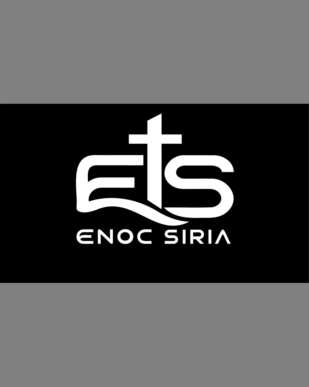

Inspect spacing with the guide. Optical balance may differ from geometric centering.
The 'ENOC SIRIA' subtext uses thin strokes which may lose clarity at small sizes or reversed use.
Get a clear logo score, key risks, and priority fix ideas before your client or audience sees it.
More credits needed
Add credits to continue without losing your work.
Then $7/month. Cancel anytime.
Essential logo review with AI
Estimated progress