Wondering how your logo performs? 🧐
Get professional logo reviews in seconds and catch design issues in time.
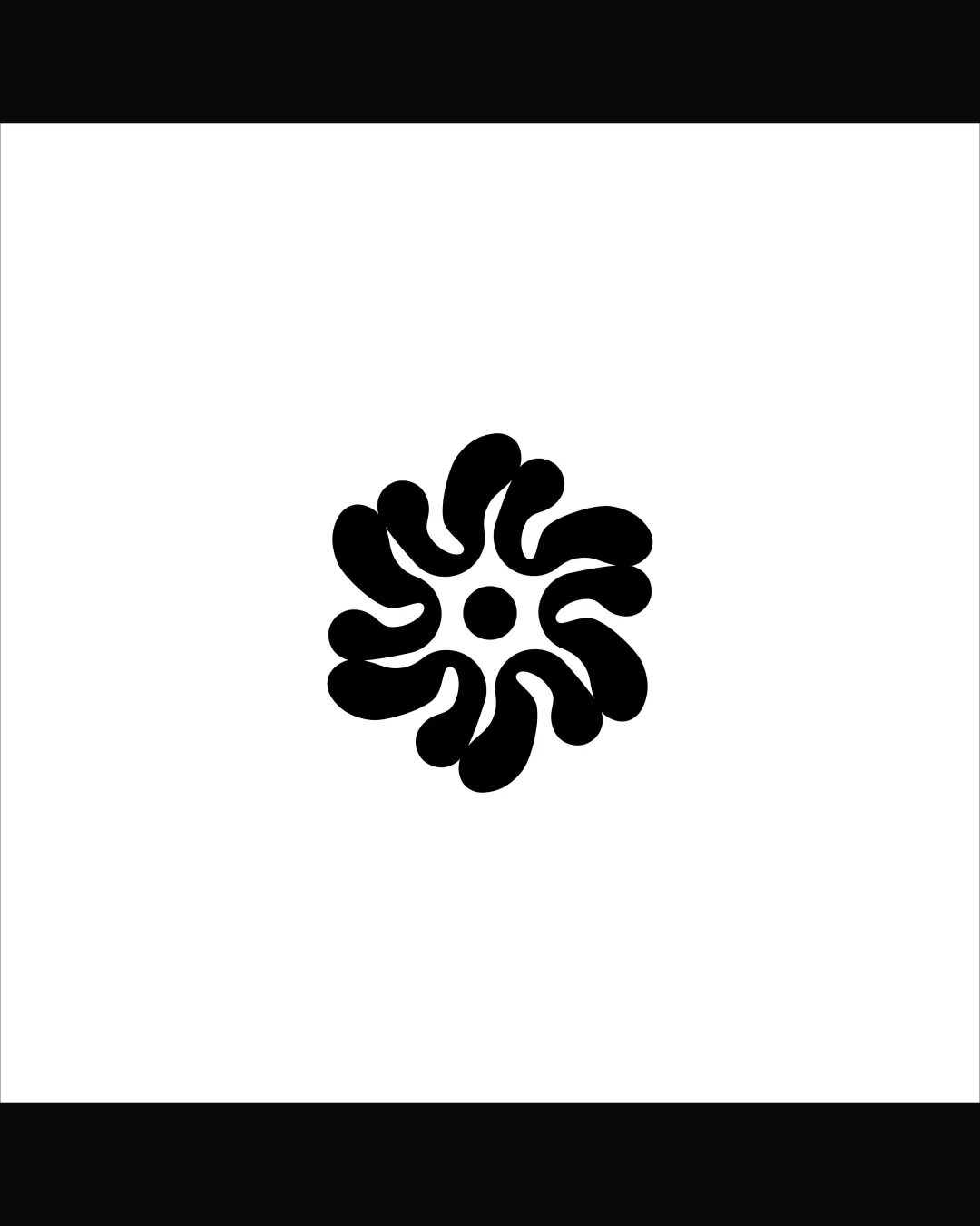
Try it Now!Logo review of abstract floral burst, radial organic petal shapes..
 Logo analysis by AI
Logo type:
Style:
Detected symbol:
Business industry:
Review requested by Jian
**If AI can recognize or misinterpret it, so can people.
Structured logo review
Scalability versatility
![]() Simple, bold shapes make it highly recognizable and legible across large formats like signage and print.
Simple, bold shapes make it highly recognizable and legible across large formats like signage and print.![]() Solid fill ensures it prints and transfers well, even on textured items or merchandise.
Solid fill ensures it prints and transfers well, even on textured items or merchandise.
![]() Fine negative curves may blur at very small sizes, such as 16x16px favicons or embroidery.
Fine negative curves may blur at very small sizes, such as 16x16px favicons or embroidery.![]() May lose distinctiveness when highly reduced due to similar thickness of shapes.
May lose distinctiveness when highly reduced due to similar thickness of shapes.
200x250 px
100×125 px
50×62 px
Balance alignment
![]() Excellent radial symmetry provides strong visual balance.
Excellent radial symmetry provides strong visual balance.![]() Central positioning and evenly distributed forms ensure proportionality.
Central positioning and evenly distributed forms ensure proportionality.

Originality
![]() Abstract petal cluster with organic curves stands out versus conventional floral or sun shapes.
Abstract petal cluster with organic curves stands out versus conventional floral or sun shapes.![]() Minimalist, non-literal approach feels modern and distinctive.
Minimalist, non-literal approach feels modern and distinctive.
![]() Visually, the symbol is reminiscent of generic organic or floral bursts seen in wellness and spa industries, which slightly limits uniqueness.
Visually, the symbol is reminiscent of generic organic or floral bursts seen in wellness and spa industries, which slightly limits uniqueness.
Aesthetic look
![]() Clean and minimal aesthetic appropriate for contemporary branding.
Clean and minimal aesthetic appropriate for contemporary branding.![]() Monochrome look prevents visual clutter.
Monochrome look prevents visual clutter.
![]() Repeated organic arms may be seen as slightly generic or uninspired for audiences seeking strong brand personality.
Repeated organic arms may be seen as slightly generic or uninspired for audiences seeking strong brand personality.
Dual meaning and misinterpretations
![]() No immediate inappropriate connotations at first glance.
No immediate inappropriate connotations at first glance.
![]() The clustered petal-like elements can be loosely interpreted as biological or cellular shapes; some might see the central dot and encircling shapes as suggestive, especially in unrelated industries. Slight risk of unintentional associations depending on brand context.
The clustered petal-like elements can be loosely interpreted as biological or cellular shapes; some might see the central dot and encircling shapes as suggestive, especially in unrelated industries. Slight risk of unintentional associations depending on brand context.
Color harmony
![]() Monochrome palette ensures maximal contrast and versatility on any background.
Monochrome palette ensures maximal contrast and versatility on any background.![]() No excessive or clashing colors.
No excessive or clashing colors.
Black
#000000
White
#FFFFFF


