Wondering how your logo performs? 🧐
Get professional logo reviews in seconds and catch design issues in time.
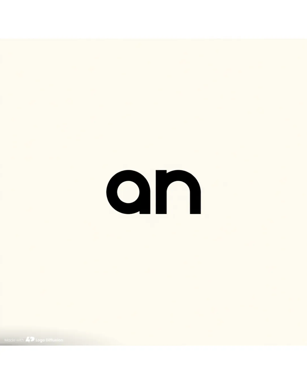
Try it Now!Logo review of abstract geometric shape possibly resembling a sty..

 Logo analysis by AI
Logo type:
Style:
Detected symbol:
Business industry:
Review requested by LoneToned
**If AI can recognize or misinterpret it, so can people.
Structured logo review
Scalability versatility
![]() Simple and bold mark is likely to retain clarity when scaled for applications such as app icons or social avatars.
Simple and bold mark is likely to retain clarity when scaled for applications such as app icons or social avatars.![]() Solid structure works well on billboards, digital banners, and signage.
Solid structure works well on billboards, digital banners, and signage.
![]() Thin horizontal stripes within the mark may blur or become indistinguishable at small sizes like business cards or embroidery.
Thin horizontal stripes within the mark may blur or become indistinguishable at small sizes like business cards or embroidery.![]() Limited adaptability for single-color applications due to lack of clear separation between background and mark.
Limited adaptability for single-color applications due to lack of clear separation between background and mark.
200x250 px
100×125 px
50×62 px
Balance alignment
![]() Overall strong geometric foundation provides visual stability.
Overall strong geometric foundation provides visual stability.![]() Consistent line weight preserves a uniform appearance.
Consistent line weight preserves a uniform appearance.
![]() The mark feels bottom-heavy with the squared element outweighing the rounded end, leading to minor visual imbalance.
The mark feels bottom-heavy with the squared element outweighing the rounded end, leading to minor visual imbalance.![]() The horizontal lines at each end are inconsistent (thicker at the lower side), creating a slight disproportion.
The horizontal lines at each end are inconsistent (thicker at the lower side), creating a slight disproportion.

Originality
![]() Abstract geometric style is less common and introduces visual intrigue.
Abstract geometric style is less common and introduces visual intrigue.![]() Unique approach to line work and shapes differs from typical industry marks.
Unique approach to line work and shapes differs from typical industry marks.
![]() The form is abstract to the point that it risks being unclear or too generic without further branding context or a supporting wordmark.
The form is abstract to the point that it risks being unclear or too generic without further branding context or a supporting wordmark.
Aesthetic look
![]() Modern, minimalist design with appealing geometric features.
Modern, minimalist design with appealing geometric features.![]() Consistent use of negative and positive space promotes a clean visual.
Consistent use of negative and positive space promotes a clean visual.
![]() Blocky composition feels slightly rigid and lacks fluidity.
Blocky composition feels slightly rigid and lacks fluidity.![]() Horizontal stripes can make the mark seem busy despite its minimalism.
Horizontal stripes can make the mark seem busy despite its minimalism.
Dual meaning and misinterpretations
![]() No overtly inappropriate forms or accidental explicit imagery detected.
No overtly inappropriate forms or accidental explicit imagery detected.
![]() Abstractness may cause viewers to search for meaning or association, possibly resulting in confusion.
Abstractness may cause viewers to search for meaning or association, possibly resulting in confusion.
Color harmony
![]() Limited, harmonious green color palette creates calm and professional tone.
Limited, harmonious green color palette creates calm and professional tone.![]() Monotone nature improves visual consistency.
Monotone nature improves visual consistency.
Finlandia
#597B5B
DarkOlive
#3B5037