Wondering how your logo performs? 🧐
Get professional logo reviews in seconds and catch design issues in time.
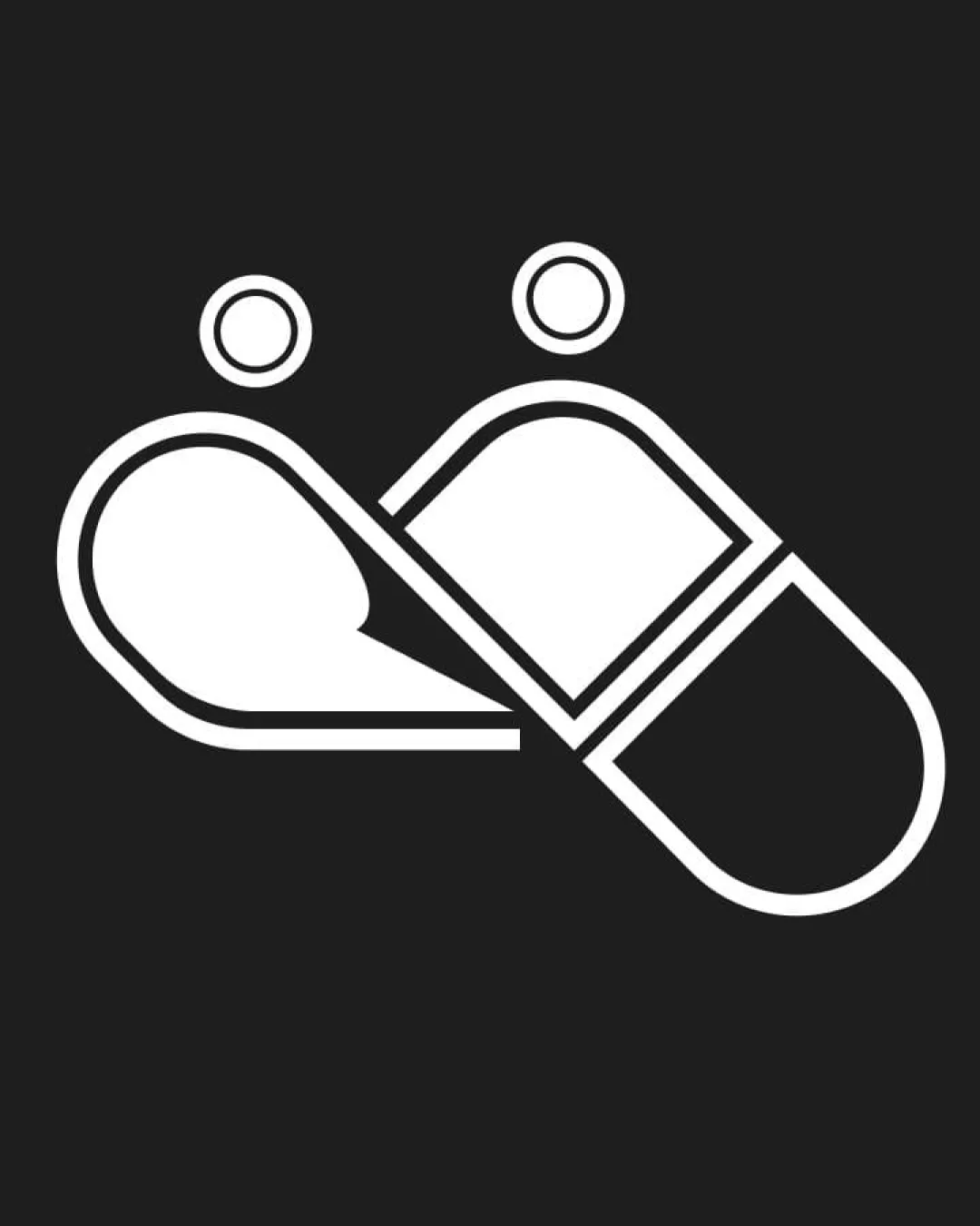
Try it Now!Logo review of Two pill capsules forming abstract human figures l..
 Logo analysis by AI
Logo type:
Style:
Detected symbol:
Negative space:
Business industry:
Review requested by Davium
**If AI can recognize or misinterpret it, so can people.
Structured logo review
Scalability versatility
![]() Thick outlines ensure good clarity at a variety of sizes.
Thick outlines ensure good clarity at a variety of sizes.![]() Minimal detail keeps the logo readable when scaled down for favicons or social media icons.
Minimal detail keeps the logo readable when scaled down for favicons or social media icons.![]() Suitable for simple mockups like pill bottle labels or clinic signage.
Suitable for simple mockups like pill bottle labels or clinic signage.
![]() Thin internal lines may lose some sharpness in embroidery or very small applications such as pens or pins.
Thin internal lines may lose some sharpness in embroidery or very small applications such as pens or pins.![]() Absence of a wordmark limits usage in certain branding materials where clarity of name is needed.
Absence of a wordmark limits usage in certain branding materials where clarity of name is needed.
200x250 px
100×125 px
50×62 px
Balance alignment
![]() Excellent geometric symmetry between both capsules.
Excellent geometric symmetry between both capsules.![]() Weight distribution and alignment are visually balanced.
Weight distribution and alignment are visually balanced.![]() Circular heads are equally sized and spaced, enhancing harmony.
Circular heads are equally sized and spaced, enhancing harmony.

Originality
![]() Abstract representation of both pills and human forms creates a clever dual meaning.
Abstract representation of both pills and human forms creates a clever dual meaning.![]() Avoids clichéd medical symbols like crosses or hearts.
Avoids clichéd medical symbols like crosses or hearts.
![]() Use of pills as figures, while creative, is not entirely groundbreaking within the healthcare industry.
Use of pills as figures, while creative, is not entirely groundbreaking within the healthcare industry.
Aesthetic look
![]() Simple, minimalist and professional aesthetic with strong visual intent.
Simple, minimalist and professional aesthetic with strong visual intent.![]() Rounded edges demonstrate a friendly, approachable feel.
Rounded edges demonstrate a friendly, approachable feel.
![]() May appear slightly sterile or cold due to lack of color or any emotional cues.
May appear slightly sterile or cold due to lack of color or any emotional cues.
Dual meaning and misinterpretations
![]() Logo effectively presents both pills and a human connection in abstract form.
Logo effectively presents both pills and a human connection in abstract form.
![]() Arrangement might be misinterpreted as two figures in a somewhat intimate or ambiguous position, potentially raising concerns depending on the context.
Arrangement might be misinterpreted as two figures in a somewhat intimate or ambiguous position, potentially raising concerns depending on the context.![]() Absence of supporting text allows for broader misinterpretation, especially at quick glance.
Absence of supporting text allows for broader misinterpretation, especially at quick glance.
Color harmony
![]() Monochrome palette ensures high contrast and clarity.
Monochrome palette ensures high contrast and clarity.![]() Colors work well for medical or healthcare connotations.
Colors work well for medical or healthcare connotations.
![]() Limited palette may restrict flexibility or emotional appeal in broader branding contexts.
Limited palette may restrict flexibility or emotional appeal in broader branding contexts.
White
#FFFFFF
Charcoal
#232323