Wondering how your logo performs? 🧐
Get professional logo reviews in seconds and catch design issues in time.
Try it Now!Logo review of an
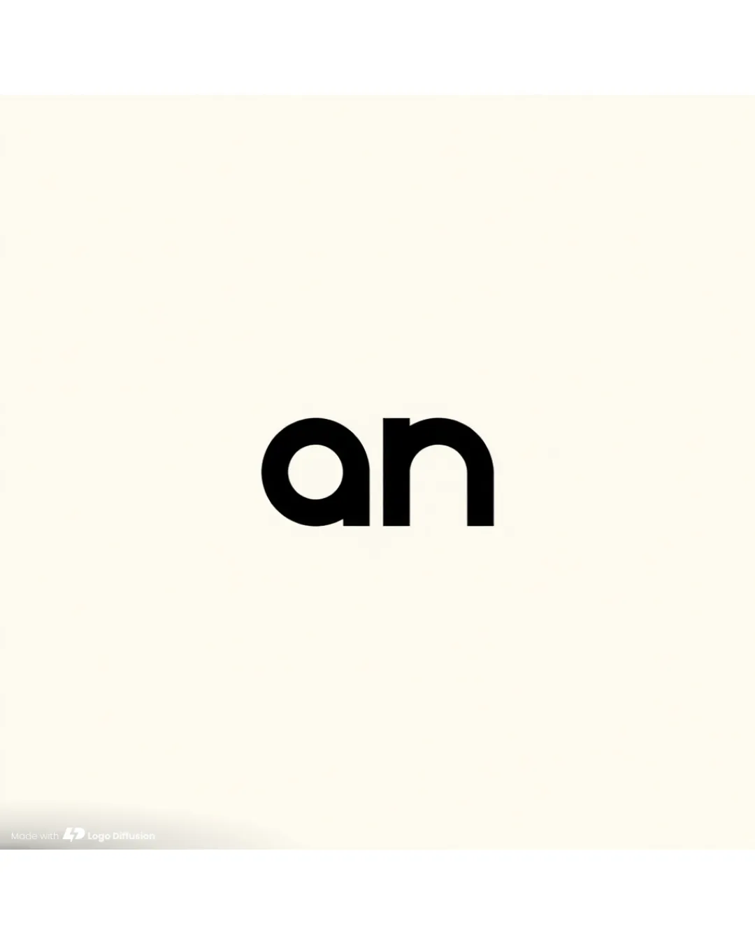
 Logo analysis by AI
Logo type:
Style:
Detected text:
Review requested by Cu0ngDes
**If AI can recognize or misinterpret it, so can people.
Structured logo review
Legibility
Clear and bold sans-serif typeface.
No readability issues due to strong contrast.
Scalability versatility
Simple design remains sharp at small and large sizes.
Suitable for use in print and digital media.
As just two lowercase letters, the design feels nondescript and could be lost or generic in very small applications such as favicons.

200x250 px

100×125 px

50×62 px
Balance alignment
Even spacing and consistent type weight.
Centered alignment provides a clean, professional appearance.


Originality
Simplicity prevents visual confusion.
No unique or memorable characteristics.
Generic presentation; lacks any custom letter modification or symbolic twist.
Aesthetic look
Clean and modern thanks to minimalism.
Entirely plain—lacks visual interest or brand personality.
Comes across as unfinished or default text.
Dual meaning and misinterpretations
No inappropriate symbols or unintentional messaging.
Color harmony
Perfect contrast with classic black on white.
Timeless, professional color choice.
Black
#000000
Off White
#FAF8EF

