Wondering how your logo performs? 🧐
Get professional logo reviews in seconds and catch design issues in time.
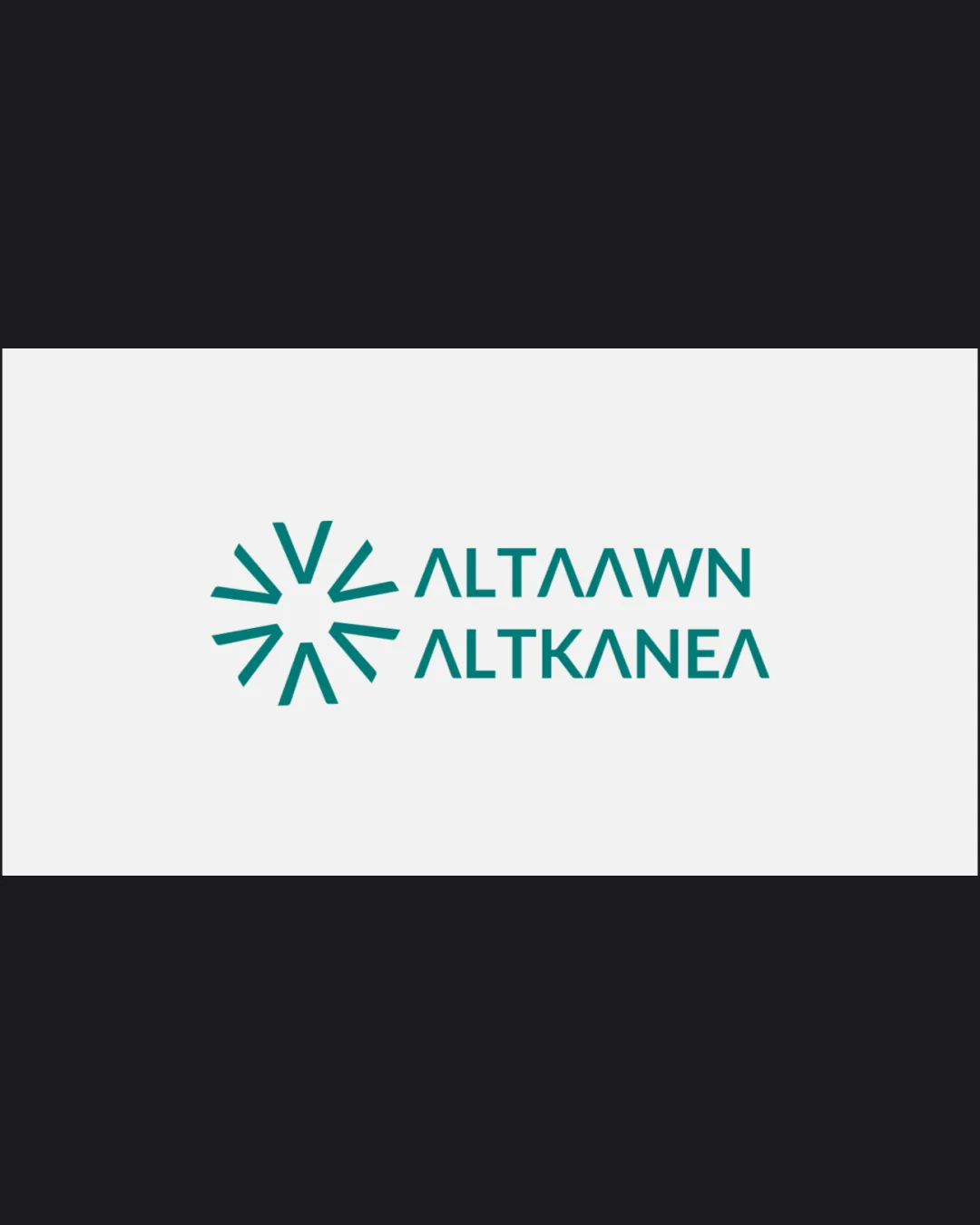
Try it Now!Logo review of ALTAAWN ALTKANEA
 Logo analysis by AI
Logo type:
Style:
Detected symbol:
Detected text:
Business industry:
Review requested by Des.Haider
**If AI can recognize or misinterpret it, so can people.
Structured logo review
Legibility
![]() All caps sans-serif font provides basic readability.
All caps sans-serif font provides basic readability.![]() Letterspacing is consistent, and font weight is appropriate for clarity.
Letterspacing is consistent, and font weight is appropriate for clarity.
![]() The use of stylized 'A' characters can easily be mistaken for 'V', which may confuse viewers and harm immediate brand recognition.
The use of stylized 'A' characters can easily be mistaken for 'V', which may confuse viewers and harm immediate brand recognition.![]() The geometric letter 'E' almost looks like an inverted 'A', which complicates word recognition.
The geometric letter 'E' almost looks like an inverted 'A', which complicates word recognition.
Scalability versatility
![]() Minimalist symbol and bold geometric lines scale well for print and digital uses.
Minimalist symbol and bold geometric lines scale well for print and digital uses.![]() Would likely reproduce cleanly on signage, business cards, and website headers.
Would likely reproduce cleanly on signage, business cards, and website headers.
![]() Fine lines of the symbol might lose clarity on very small applications such as favicons or embroidered patches.
Fine lines of the symbol might lose clarity on very small applications such as favicons or embroidered patches.![]() Logo’s clarity may suffer if reduced to a single color without sufficient contrast on colored backgrounds.
Logo’s clarity may suffer if reduced to a single color without sufficient contrast on colored backgrounds.
200x250 px
100×125 px
50×62 px
Balance alignment
![]() Symbol and wordmark are horizontally aligned and proportionate.
Symbol and wordmark are horizontally aligned and proportionate.![]() Text is neatly stacked and centered relative to the logomark.
Text is neatly stacked and centered relative to the logomark.
![]() Logomark appears slightly heavier visually than the wordmark, causing minor imbalance.
Logomark appears slightly heavier visually than the wordmark, causing minor imbalance.

Originality
![]() Geometric burst symbol is moderately original in the context of corporate identity.
Geometric burst symbol is moderately original in the context of corporate identity.![]() Unified custom letterforms add unique touch to typography.
Unified custom letterforms add unique touch to typography.
![]() Radial burst motif is relatively common in corporate and consulting brands.
Radial burst motif is relatively common in corporate and consulting brands.![]() Stylized letterforms border on generic modern tech sans-serifs, decreasing distinctiveness.
Stylized letterforms border on generic modern tech sans-serifs, decreasing distinctiveness.
Logomark wordmark fit
![]() Geometric theme is consistent between symbol and type.
Geometric theme is consistent between symbol and type.![]() Matching line weights and angles between the logomark and wordmark ensure stylistic cohesion.
Matching line weights and angles between the logomark and wordmark ensure stylistic cohesion.
![]() Symbol's dynamism slightly overpowers the relatively static wordmark, causing a mild mismatch in energy.
Symbol's dynamism slightly overpowers the relatively static wordmark, causing a mild mismatch in energy.
Aesthetic look
![]() Clean and modern aesthetic appeals to contemporary corporate tastes.
Clean and modern aesthetic appeals to contemporary corporate tastes.![]() Teal tone is visually pleasing and professional.
Teal tone is visually pleasing and professional.
![]() Over-stylized typography draws attention away from the name itself.
Over-stylized typography draws attention away from the name itself.![]() Design teeters on looking generic due to the common geometric burst.
Design teeters on looking generic due to the common geometric burst.
Dual meaning and misinterpretations
![]() No inappropriate or accidental dual meanings detected.
No inappropriate or accidental dual meanings detected.![]() Abstract symbol is neutral and safe for broad audiences.
Abstract symbol is neutral and safe for broad audiences.
Color harmony
![]() Monochromatic teal color scheme ensures harmony and professionalism.
Monochromatic teal color scheme ensures harmony and professionalism.![]() Excellent contrast on white background.
Excellent contrast on white background.
Teal
#18847B
White
#F6F6F6
Raisin Black
#232323


