Wondering how your logo performs? 🧐
Get professional logo reviews in seconds and catch design issues in time.
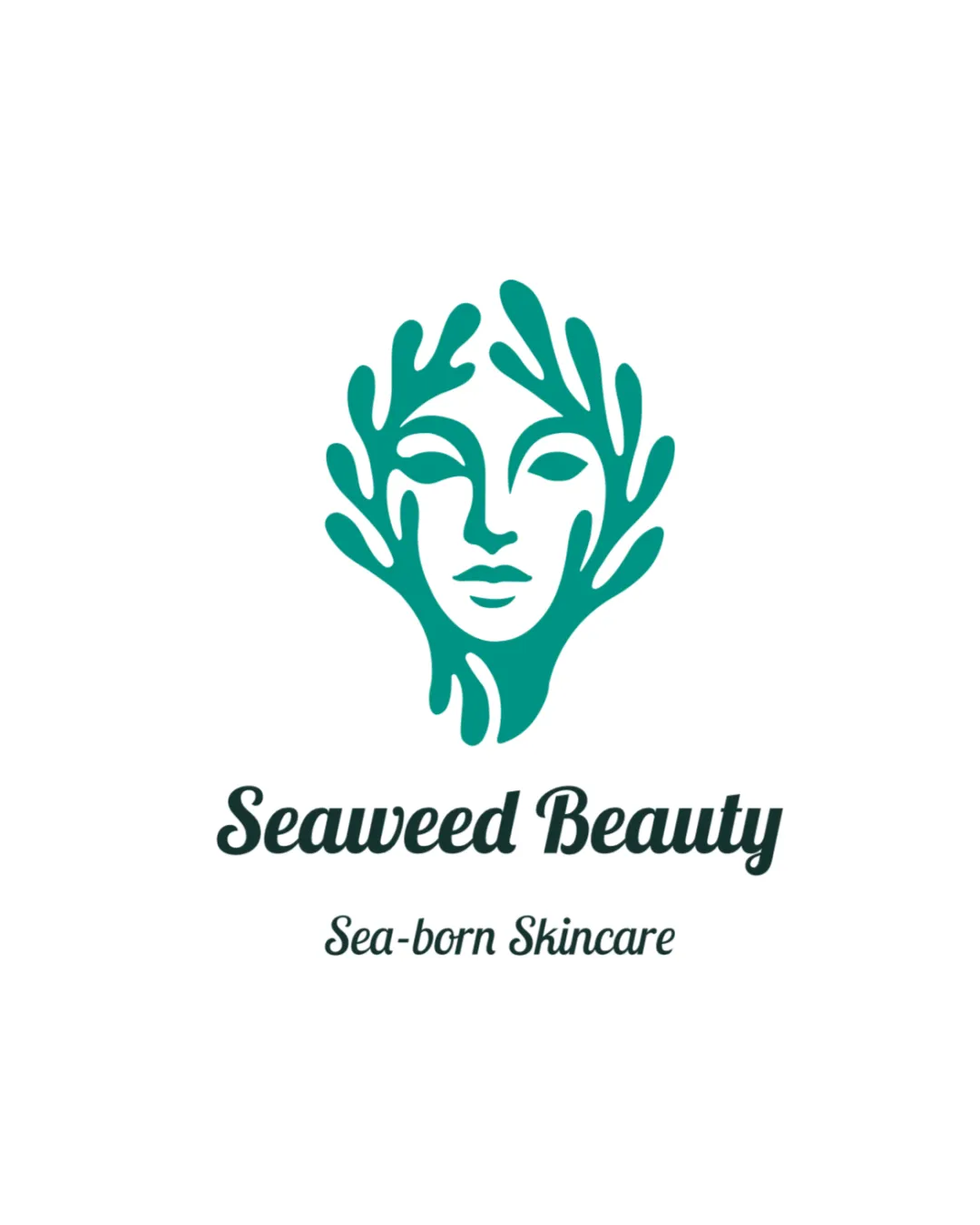
Try it Now!Logo review of Seaweed Beauty, Sea-born Skincare
 Logo analysis by AI
Logo type:
Style:
Detected symbol:
Negative space:
Detected text:
Business industry:
Review requested by Alessa
**If AI can recognize or misinterpret it, so can people.
Structured logo review
Legibility
![]() Both the brand name and tagline are easy to read at standard size.
Both the brand name and tagline are easy to read at standard size.![]() Font choice matches the theme and feels elegant, fitting the skincare industry well.
Font choice matches the theme and feels elegant, fitting the skincare industry well.
![]() Tagline text may become harder to read at smaller scales.
Tagline text may become harder to read at smaller scales.![]() The script style of the wordmark, while attractive, may slightly impact readability for those unfamiliar with the font.
The script style of the wordmark, while attractive, may slightly impact readability for those unfamiliar with the font.
Scalability versatility
![]() Simple color palette aids in easy reproduction across different formats.
Simple color palette aids in easy reproduction across different formats.![]() The symbol is clear and identifiable at larger scales (e.g. signage, packaging).
The symbol is clear and identifiable at larger scales (e.g. signage, packaging).
![]() Thin lines in the face and seaweed may lose clarity at very small sizes or on embroidered products.
Thin lines in the face and seaweed may lose clarity at very small sizes or on embroidered products.![]() The tagline is unlikely to be legible and should be removed for favicon or very small uses.
The tagline is unlikely to be legible and should be removed for favicon or very small uses.
200x250 px
100×125 px
50×62 px
Balance alignment
![]() Excellent balance between the icon and text; both feel visually harmonious.
Excellent balance between the icon and text; both feel visually harmonious.![]() Central alignment creates a professional, cohesive look.
Central alignment creates a professional, cohesive look.

Originality
![]() Clever combination of a feminine face and seaweed, creating a distinctive visual identity.
Clever combination of a feminine face and seaweed, creating a distinctive visual identity.![]() Effective, thematic use of negative space for facial features.
Effective, thematic use of negative space for facial features.
![]() The face-in-nature motif is moderately common in beauty/organic sectors, slightly reducing uniqueness.
The face-in-nature motif is moderately common in beauty/organic sectors, slightly reducing uniqueness.
Logomark wordmark fit
![]() Font style and logomark share an organic, flowing quality, creating a unified appearance.
Font style and logomark share an organic, flowing quality, creating a unified appearance.![]() Scale between icon and wordmark feels well-proportioned.
Scale between icon and wordmark feels well-proportioned.
Aesthetic look
![]() Modern, clean illustration with sophisticated curves.
Modern, clean illustration with sophisticated curves.![]() Minimalism in color and form enhances high-end beauty appeal.
Minimalism in color and form enhances high-end beauty appeal.![]() No unnecessary embellishments; very aesthetic appearance.
No unnecessary embellishments; very aesthetic appearance.
Dual meaning and misinterpretations
![]() No apparent inappropriate or confusing dual meanings.
No apparent inappropriate or confusing dual meanings.![]() Visual metaphor (seaweed as hair) is clear and contextually suitable.
Visual metaphor (seaweed as hair) is clear and contextually suitable.
Color harmony
![]() Color palette is minimal and elegant, using only two harmonious hues.
Color palette is minimal and elegant, using only two harmonious hues.![]() High contrast ensures clarity against a white background.
High contrast ensures clarity against a white background.
Jungle Green
#10A89C
White
#FFFFFF


