Wondering how your logo performs? 🧐
Get professional logo reviews in seconds and catch design issues in time.
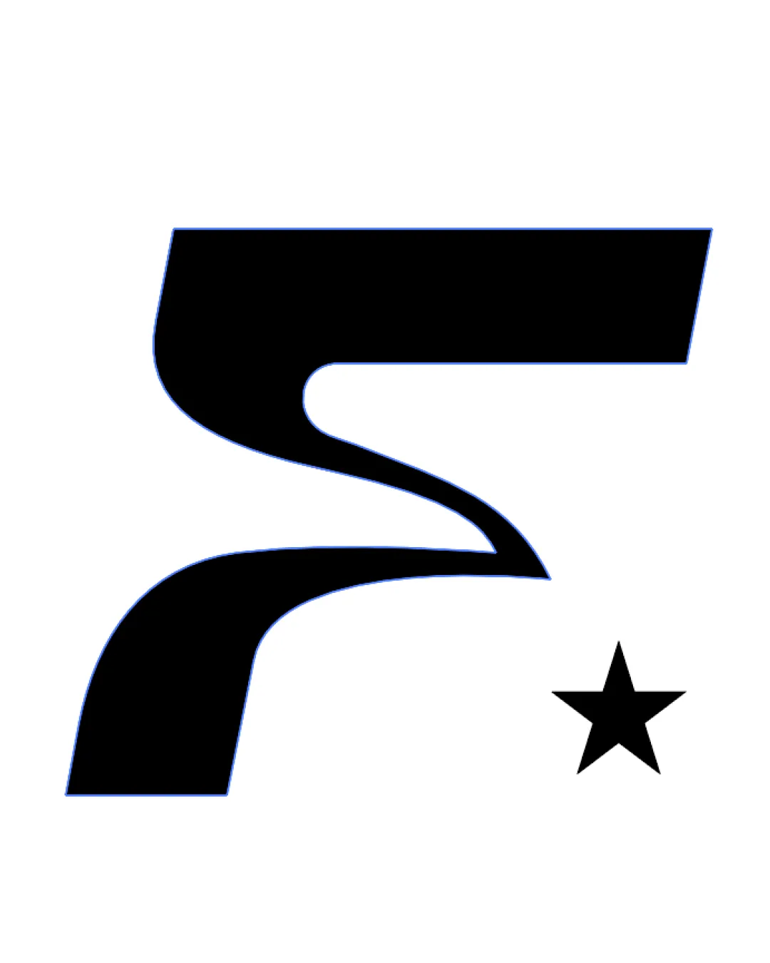
Try it Now!Logo review of abstract geometric shape resembling a stylized let..

 Logo analysis by AI
Logo type:
Style:
Detected symbol:
Business industry:
Review requested by LoneToned
**If AI can recognize or misinterpret it, so can people.
Structured logo review
Scalability versatility
![]() Bold, simple lines ensure good visibility at different sizes.
Bold, simple lines ensure good visibility at different sizes.![]() Works well for digital and print applications, such as business cards and app icons.
Works well for digital and print applications, such as business cards and app icons.
![]() Very thick form might lose clarity at extremely small scales due to lack of negative space details.
Very thick form might lose clarity at extremely small scales due to lack of negative space details.
200x250 px
100×125 px
50×62 px
Balance alignment
![]() The main shape feels visually anchored, with a clear geometric rhythm.
The main shape feels visually anchored, with a clear geometric rhythm.
![]() Asymmetrical weight between top and bottom elements creates slight imbalance.
Asymmetrical weight between top and bottom elements creates slight imbalance.![]() The lower block feels heavier, making the shape bottom-heavy.
The lower block feels heavier, making the shape bottom-heavy.

Originality
![]() Unique, abstract shape with potential for strong brand distinction.
Unique, abstract shape with potential for strong brand distinction.![]() Creative use of geometric forms not typically seen in standard iconography.
Creative use of geometric forms not typically seen in standard iconography.
![]() Ambiguous symbol might confuse viewers as to what it represents without brand context.
Ambiguous symbol might confuse viewers as to what it represents without brand context.
Aesthetic look
![]() Geometric shapes provide a clean and sharp appearance.
Geometric shapes provide a clean and sharp appearance.![]() Color palette is bold and eye-catching.
Color palette is bold and eye-catching.
![]() Very blocky, which can appear rigid or harsh depending on brand context.
Very blocky, which can appear rigid or harsh depending on brand context.![]() Limited visual nuance — may feel overly simplistic to some audiences.
Limited visual nuance — may feel overly simplistic to some audiences.
Dual meaning and misinterpretations
![]() No explicit inappropriate imagery detected.
No explicit inappropriate imagery detected.![]() Highly abstract, reducing risk of unintended dual meanings.
Highly abstract, reducing risk of unintended dual meanings.
Color harmony
![]() Consistent use of analogous green tones keeps palette harmonious.
Consistent use of analogous green tones keeps palette harmonious.![]() Sufficient contrast between main mark and background.
Sufficient contrast between main mark and background.
![]() Use of only green tones may feel one-dimensional and could be limiting for broader brand identity.
Use of only green tones may feel one-dimensional and could be limiting for broader brand identity.
Japanese Laurel
#259A13
Forest Green
#206B0F