Wondering how your logo performs? 🧐
Get professional logo reviews in seconds and catch design issues in time.
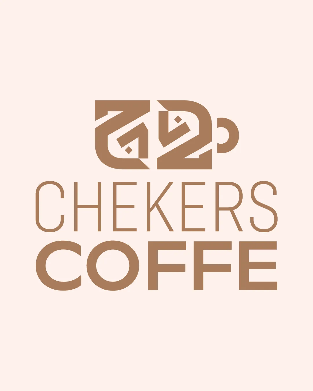
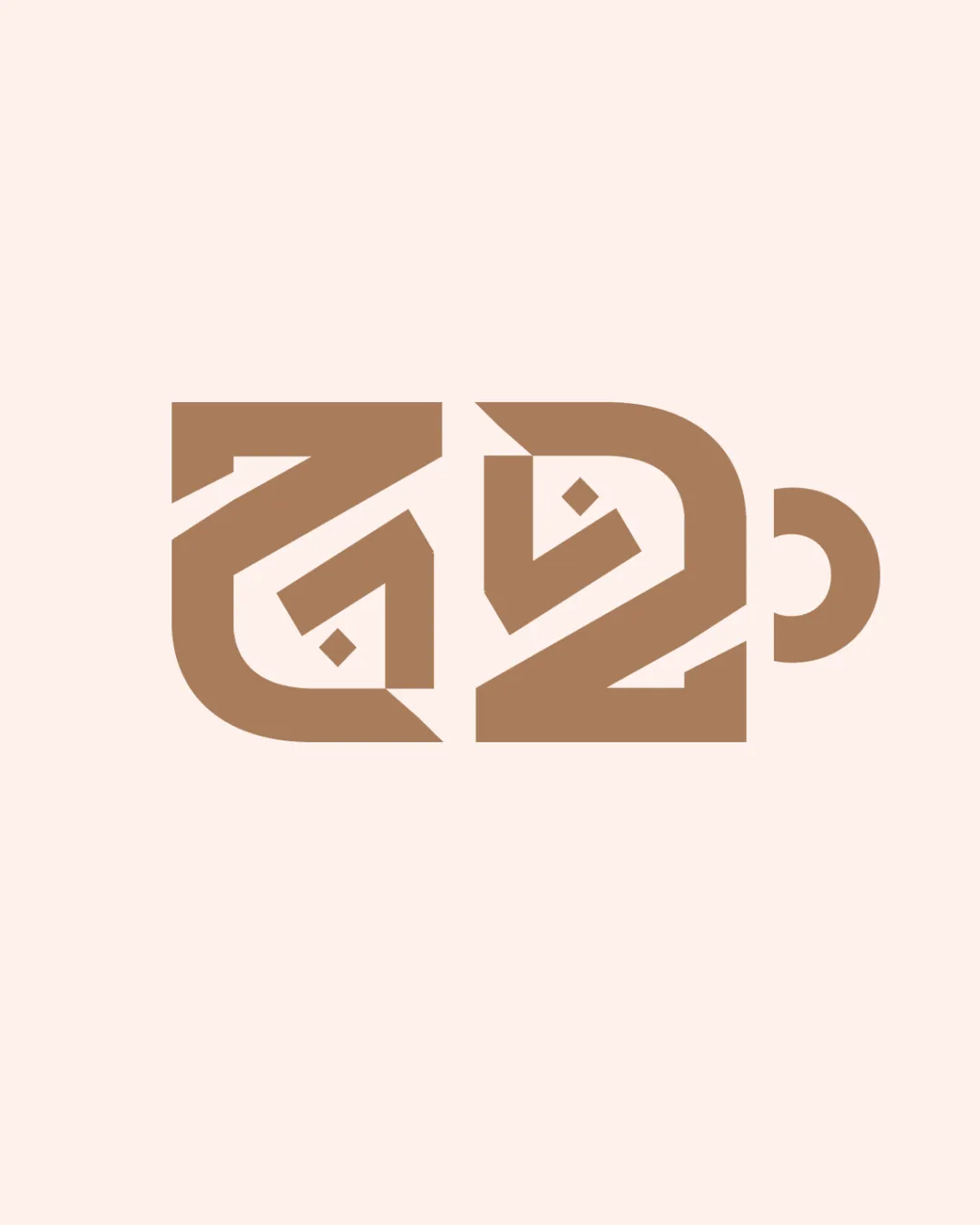
Try it Now!Logo review of stylized Arabic or geometric monogram, cup/mug for..
 Logo analysis by AI
Logo type:
Style:
Detected symbol:
Negative space:
Business industry:
Review requested by Yairdabach1
**If AI can recognize or misinterpret it, so can people.
Structured logo review
Legibility
![]() The monogram is highly abstract, and the intended letters or characters are almost indistinguishable, which severely impacts legibility.
The monogram is highly abstract, and the intended letters or characters are almost indistinguishable, which severely impacts legibility.![]() No clear text for easy brand recognition, making it difficult for users to discern the brand at a glance.
No clear text for easy brand recognition, making it difficult for users to discern the brand at a glance.![]() Viewers unfamiliar with the intended script or abstraction will struggle to understand the logo.
Viewers unfamiliar with the intended script or abstraction will struggle to understand the logo.
Scalability versatility
![]() Strong, bold lines and simplified forms ensure the logo retains most of its detail when scaled down.
Strong, bold lines and simplified forms ensure the logo retains most of its detail when scaled down.![]() Would work well on coffee cups, shop signs, and digital icons.
Would work well on coffee cups, shop signs, and digital icons.
![]() Fine interior details and negative space may blur or become less apparent at very small sizes, such as favicons or small embroidery.
Fine interior details and negative space may blur or become less apparent at very small sizes, such as favicons or small embroidery.![]() Lack of textual backup limits contextual clarity across applications.
Lack of textual backup limits contextual clarity across applications.
200x250 px
100×125 px
50×62 px
Balance alignment
![]() Composed with strong geometric balance, negative and positive spaces are thoughtfully distributed, resulting in a cohesive visual presence.
Composed with strong geometric balance, negative and positive spaces are thoughtfully distributed, resulting in a cohesive visual presence.![]() Symmetry effectively reinforces a sense of stability.
Symmetry effectively reinforces a sense of stability.

Originality
![]() Monogram utilizes geometric abstraction and integrates visual references to its industry (cup/mug shape) in a unique way.
Monogram utilizes geometric abstraction and integrates visual references to its industry (cup/mug shape) in a unique way.![]() Non-generic form, especially for the coffee or beverage sector.
Non-generic form, especially for the coffee or beverage sector.
![]() Letterforms verge on being so abstract that the connection to actual letters or words is nearly lost; could benefit from a slightly clearer representation of the intended characters.
Letterforms verge on being so abstract that the connection to actual letters or words is nearly lost; could benefit from a slightly clearer representation of the intended characters.
Aesthetic look
![]() Minimalistic, modern, and visually pleasing with a unique and memorable form.
Minimalistic, modern, and visually pleasing with a unique and memorable form.![]() Earthy color palette suits the industry and feels organic.
Earthy color palette suits the industry and feels organic.
![]() Abstraction creates a disconnect with audiences unfamiliar with the inner meaning or cultural reference.
Abstraction creates a disconnect with audiences unfamiliar with the inner meaning or cultural reference.![]() Visual cleverness causes minor confusion at first glance.
Visual cleverness causes minor confusion at first glance.
Dual meaning and misinterpretations
![]() No inappropriate or distracting alternate interpretations detected in the overall composition.
No inappropriate or distracting alternate interpretations detected in the overall composition.![]() Cup/mug shape fits the intended industry.
Cup/mug shape fits the intended industry.
Color harmony
![]() Two-color palette is harmonious and natural; excellent contrast with the background.
Two-color palette is harmonious and natural; excellent contrast with the background.![]() Professional, calm, and industry-appropriate.
Professional, calm, and industry-appropriate.
Teak
#B7996E
Almond
#F7ECE7