Wondering how your logo performs? 🧐
Get professional logo reviews in seconds and catch design issues in time.
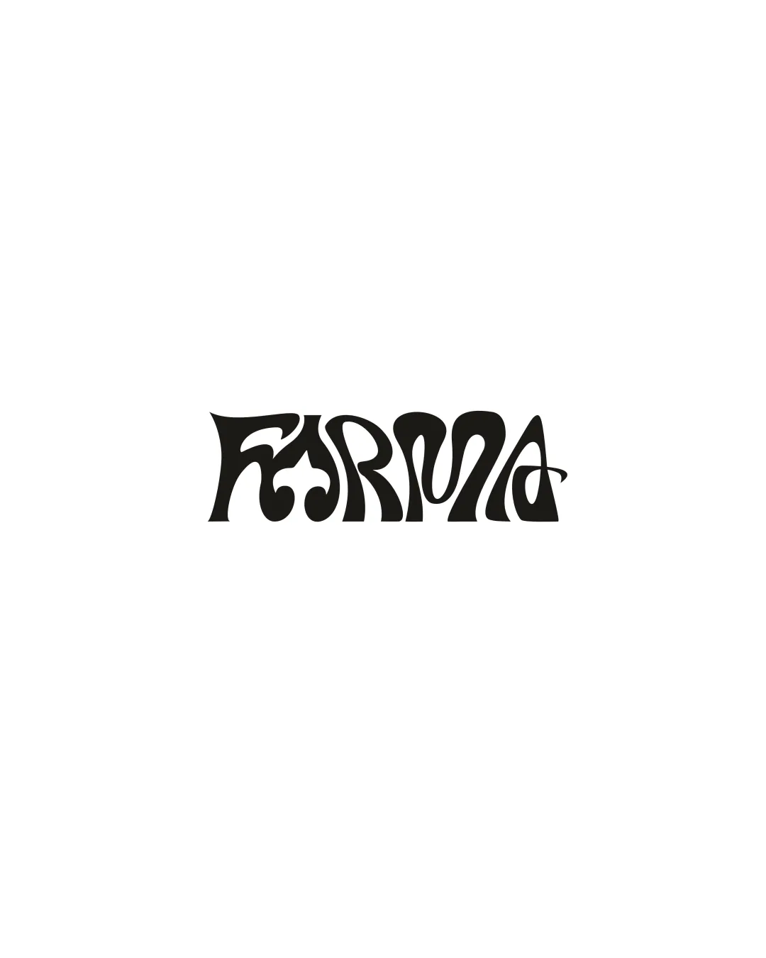
Try it Now!Logo review of abstract number 5 with a star

 Logo analysis by AI
Logo type:
Style:
Detected symbol:
Business industry:
Review requested by Alizeaxtkun
**If AI can recognize or misinterpret it, so can people.
Structured logo review
Scalability versatility
Bold shapes ensure the logo remains visible at small sizes, such as on business cards or apparel.
Simple, clean composition aids scalability across digital and print media.
The thinner central curve might lose clarity at extremely small sizes or on embroidery; the star is also at risk of disappearing if not sized proportionally.

200x250 px

100×125 px

50×62 px
Balance alignment
The large number and star create a clear visual hierarchy.
The weight distribution is mostly balanced due to the strong use of black areas.
Placement of the star feels somewhat disconnected from the main figure, leading to some imbalance and making the logo feel incomplete or awkwardly aligned.


Originality
The abstract treatment of the number 5 paired with a star gives a unique, dynamic flair.
Minimalist execution avoids direct clichés.
Pairing a number with a star is a fairly common motif in sports branding; nothing dramatically unexpected or inventive.
No clever negative space or hidden meaning that elevates the idea beyond surface level.
Aesthetic look
Minimal use of color maintains a clean visual identity.
The overall look is bold and simple, which is appealing for modern branding.
The main shape feels abruptly cut or unfinished, with the bottom left segment feeling misaligned or awkward.
The logo lacks a certain refinement in the transitions between curves and edges.
Dual meaning and misinterpretations
No inappropriate or confusing visual implications detected.
Color harmony
High contrast between black and white ensures maximum clarity.
Monochrome palette is timeless and versatile.
Black
#000000
White
#FFFFFF

