Wondering how your logo performs? 🧐
Get professional logo reviews in seconds and catch design issues in time.
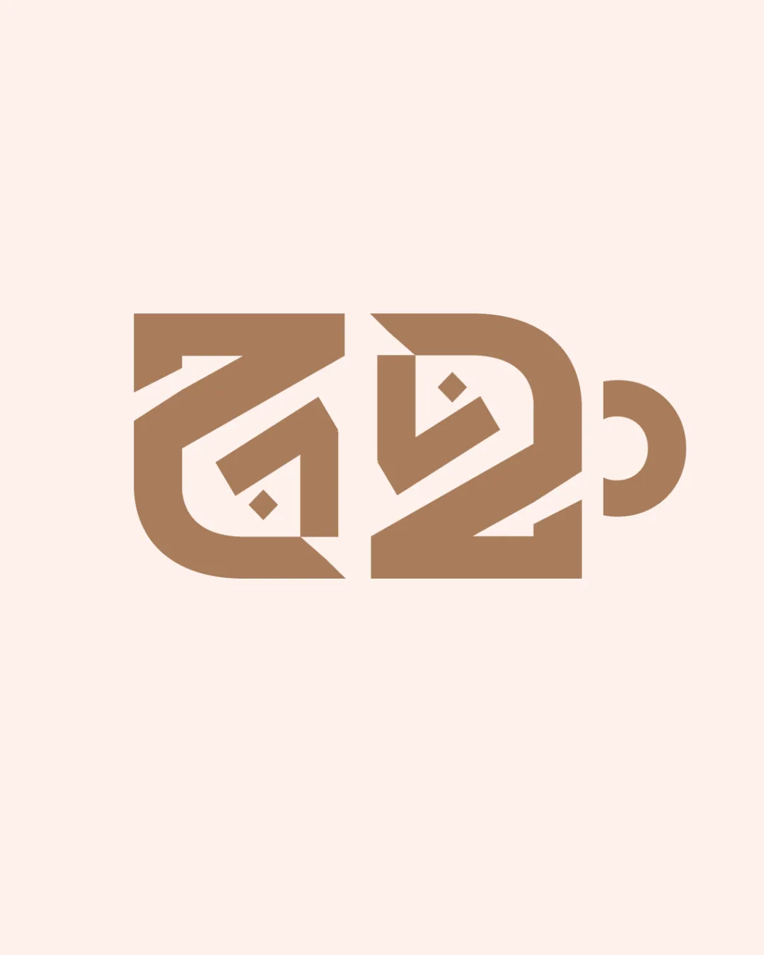
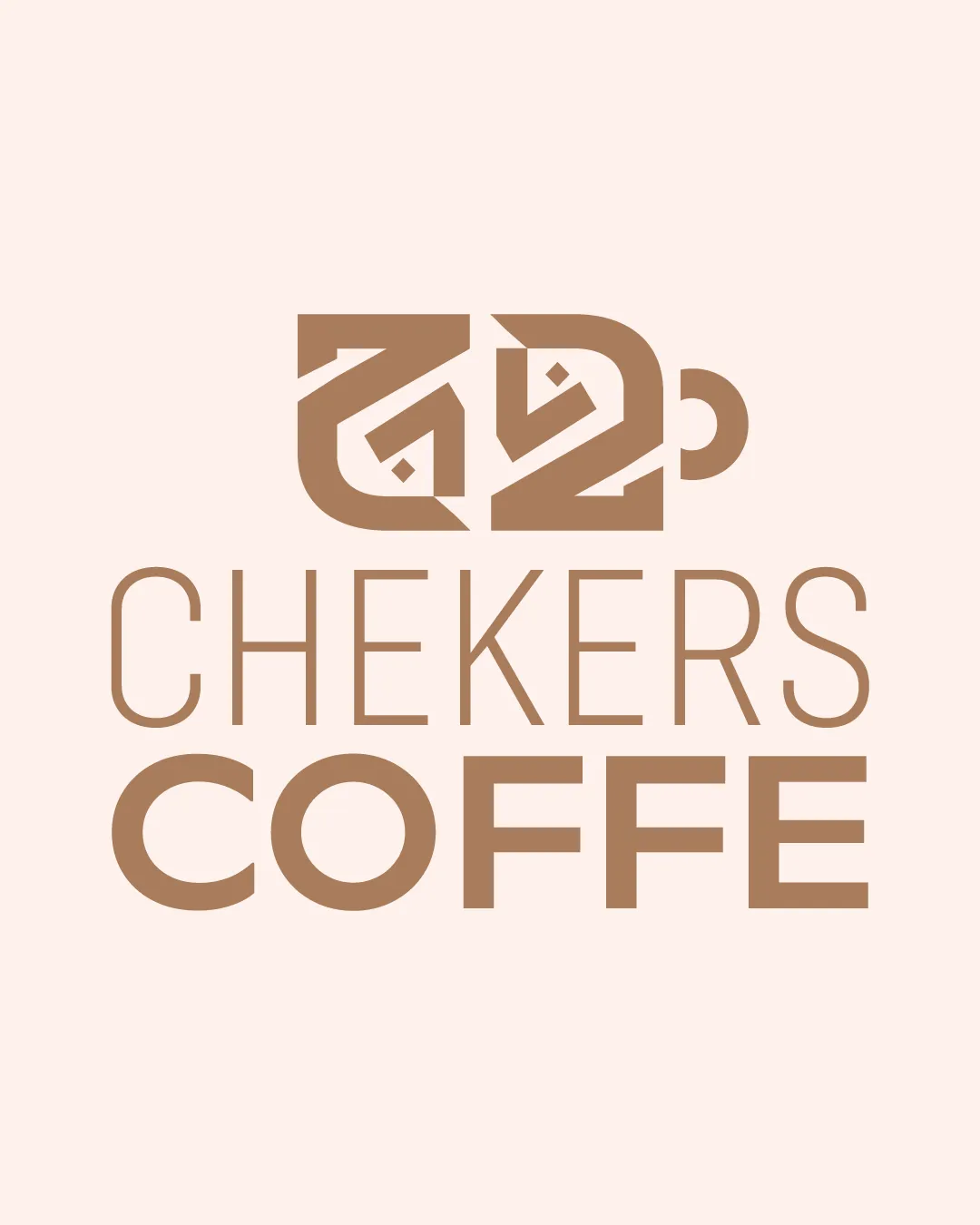
Try it Now!Logo review of CHEKERS COFFE
 Logo analysis by AI
Logo type:
Style:
Detected symbol:
Detected text:
Business industry:
Review requested by Yairdabach1
**If AI can recognize or misinterpret it, so can people.
Structured logo review
Legibility
![]() COFFE is bold and clear
COFFE is bold and clear![]() CHEKERS is fairly readable with modern sans typeface
CHEKERS is fairly readable with modern sans typeface
![]() COFFE is missing the final 'E', which damages both brand clarity and professionalism
COFFE is missing the final 'E', which damages both brand clarity and professionalism![]() CHEKERS may be misread as 'CHECKERS' and the current spelling looks like a typographical mistake
CHEKERS may be misread as 'CHECKERS' and the current spelling looks like a typographical mistake![]() Thin lines in 'CHEKERS' reduce legibility at smaller sizes
Thin lines in 'CHEKERS' reduce legibility at smaller sizes
Scalability versatility
![]() The geometric symbol has thick enough lines for medium-scale usage like packaging
The geometric symbol has thick enough lines for medium-scale usage like packaging![]() Monotone color scheme supports playful adaptation in mono applications
Monotone color scheme supports playful adaptation in mono applications
![]() Fine lines in 'CHEKERS' will disappear at small sizes such as favicons or embroidery
Fine lines in 'CHEKERS' will disappear at small sizes such as favicons or embroidery![]() Complexity of the cup symbol and its inner angular elements may become unrecognizable at small scales
Complexity of the cup symbol and its inner angular elements may become unrecognizable at small scales![]() Readability issues multiply in small digital or print formats
Readability issues multiply in small digital or print formats
200x250 px
100×125 px
50×62 px
Balance alignment
![]() General vertical alignment is sensible
General vertical alignment is sensible![]() Logo arrangement (symbol above text) follows a conventional, readable structure
Logo arrangement (symbol above text) follows a conventional, readable structure
![]() Visual weight is not evenly distributed: the boldness of 'COFFE' below is heavier than the thin 'CHEKERS' line above, resulting in a bottom-heavy look
Visual weight is not evenly distributed: the boldness of 'COFFE' below is heavier than the thin 'CHEKERS' line above, resulting in a bottom-heavy look![]() The cup symbol's horizontal stretch contrasts awkwardly with the narrowness of the text stack
The cup symbol's horizontal stretch contrasts awkwardly with the narrowness of the text stack

Originality
![]() Abstract coffee cup assembly is inventive compared to typical coffee icons
Abstract coffee cup assembly is inventive compared to typical coffee icons![]() Modern geometric style is less common in food & beverage logos
Modern geometric style is less common in food & beverage logos![]() Diagonal lines and nested shapes add visual interest
Diagonal lines and nested shapes add visual interest
![]() The cup silhouette itself is abstract to the point it may not instantly read as 'coffee', which could cause hesitation or confusion for new viewers
The cup silhouette itself is abstract to the point it may not instantly read as 'coffee', which could cause hesitation or confusion for new viewers
Logomark wordmark fit
![]() Both symbol and wordmark use geometric forms
Both symbol and wordmark use geometric forms
![]() Symbol is intricate and visually heavy, while the wordmark is thin and light, resulting in a mismatch of weight and style
Symbol is intricate and visually heavy, while the wordmark is thin and light, resulting in a mismatch of weight and style![]() Cup's angular motif doesn't echo letterform style directly, creating some disconnect
Cup's angular motif doesn't echo letterform style directly, creating some disconnect
Aesthetic look
![]() Earthy color palette works for coffee industry
Earthy color palette works for coffee industry![]() Minimalist direction is appealing for modern cafes
Minimalist direction is appealing for modern cafes
![]() Lowercase/uppercase inconsistency in wordmark with strange spelling ('COFFE') detracts from professional appearance
Lowercase/uppercase inconsistency in wordmark with strange spelling ('COFFE') detracts from professional appearance![]() Overall effect is somewhat generic due to lack of unique brand flare
Overall effect is somewhat generic due to lack of unique brand flare![]() No unique accents or details reflecting a distinct brand personality
No unique accents or details reflecting a distinct brand personality
Dual meaning and misinterpretations
![]() No inappropriate or ambiguous imagery detected
No inappropriate or ambiguous imagery detected
Color harmony
![]() Consistent brown tone appropriate for coffee theme
Consistent brown tone appropriate for coffee theme![]() Color contrast is sufficient for display over light background
Color contrast is sufficient for display over light background
Teak
#B7996E
Seashell
#F6E9DF