Wondering how your logo performs? 🧐
Get professional logo reviews in seconds and catch design issues in time.
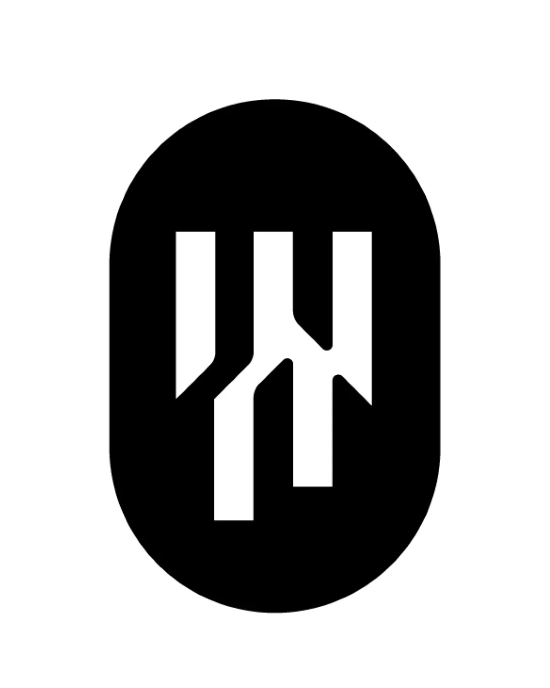
Try it Now!Logo review of Abstract vertical monogram, possible W and N or M ..
 Logo analysis by AI
Logo type:
Style:
Detected symbol:
Negative space:
Business industry:
Review requested by Eluz
**If AI can recognize or misinterpret it, so can people.
Structured logo review
Scalability versatility
![]() Simple geometric structure ensures clarity when scaled down.
Simple geometric structure ensures clarity when scaled down.![]() Monochrome palette enhances versatility for various applications like app icons, product packaging, and embroidery.
Monochrome palette enhances versatility for various applications like app icons, product packaging, and embroidery.
![]() At very small sizes, the internal breaks between the shapes could lose definition, making the letterforms harder to distinguish.
At very small sizes, the internal breaks between the shapes could lose definition, making the letterforms harder to distinguish.
200x250 px
100×125 px
50×62 px
Balance alignment
![]() Strong vertical symmetry and equal spacing create a harmonious and well-balanced appearance.
Strong vertical symmetry and equal spacing create a harmonious and well-balanced appearance.![]() The central alignment within the oval gives an intentional, solid look.
The central alignment within the oval gives an intentional, solid look.

Originality
![]() Geometric abstraction and negative space use provide a distinctive visual identity.
Geometric abstraction and negative space use provide a distinctive visual identity.![]() The letter fusion feels custom and specific versus standard typographic solutions.
The letter fusion feels custom and specific versus standard typographic solutions.
![]() Monograms, especially using negative space in a circular or oval container, are a somewhat common motif in tech and modernist branding.
Monograms, especially using negative space in a circular or oval container, are a somewhat common motif in tech and modernist branding.
Aesthetic look
![]() Modern and clean, with a high-impact monochrome aesthetic.
Modern and clean, with a high-impact monochrome aesthetic.![]() Minimalist approach gives a professional and contemporary feel.
Minimalist approach gives a professional and contemporary feel.
![]() Lacks a certain warmth or personality, which may seem too sterile or generic in broader markets.
Lacks a certain warmth or personality, which may seem too sterile or generic in broader markets.
Dual meaning and misinterpretations
![]() No inappropriate or confusing shapes detected.
No inappropriate or confusing shapes detected.![]() Strong clarity in overall silhouette prevents unintentional readings.
Strong clarity in overall silhouette prevents unintentional readings.
Color harmony
![]() Monochrome guarantees no clashing tones.
Monochrome guarantees no clashing tones.![]() High contrast makes the logo easily adaptable to any background.
High contrast makes the logo easily adaptable to any background.
Black
#000000
White
#FFFFFF